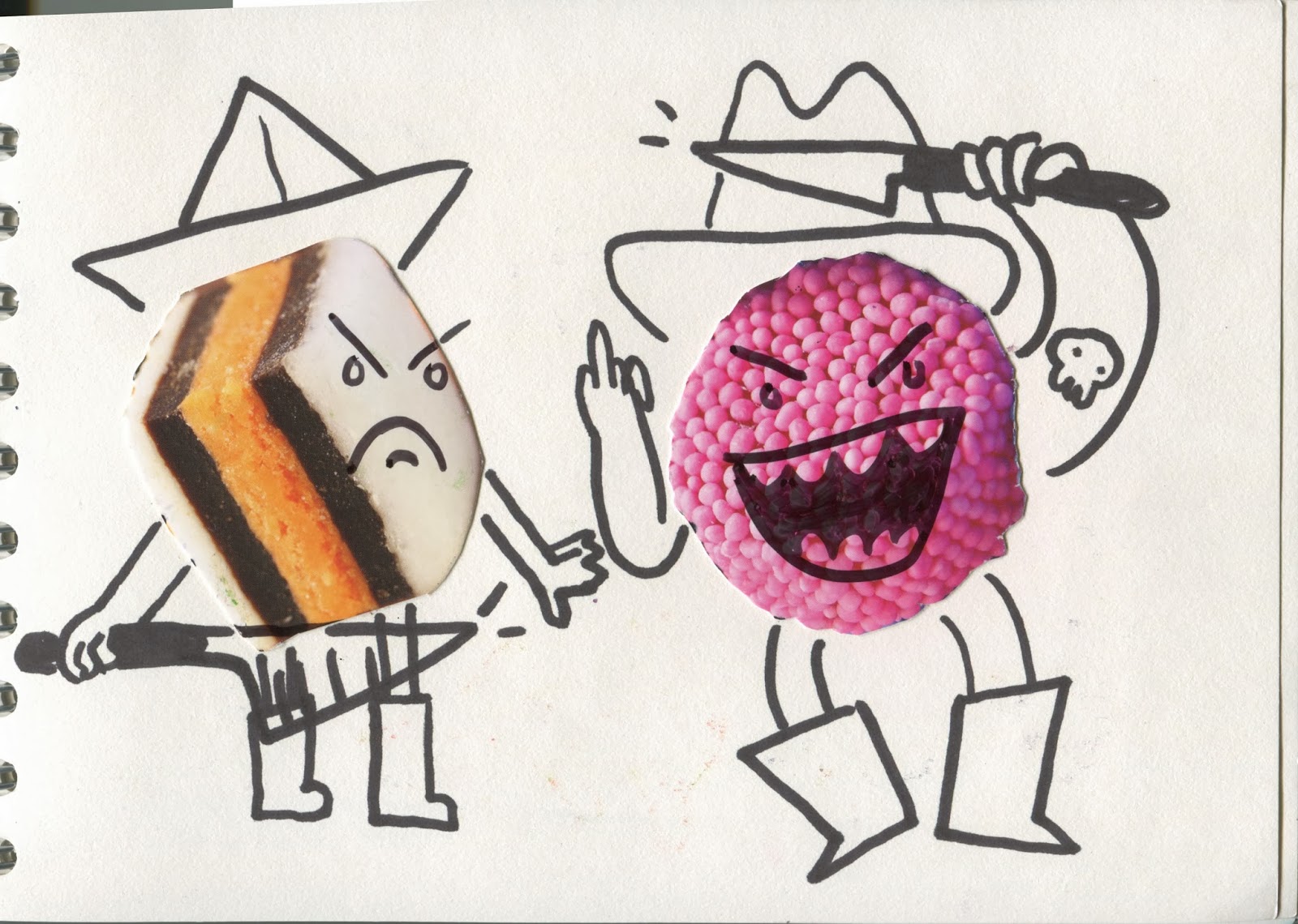
Friday, 21 March 2014

Line of Sight: Transport


In the beginning I decided to try my hand at some animation. I chose stairs as my transport because i wanted to concentrate on shape in this project and stairs can be represented easily with series of shapes. By doing this i learnt that with the stop motion process i had chosen there were marks left on the paper that build up over the gif so that it doesn't match up properly in a loop. If i were to work on it again i would use some masking tape to secure the shapes to the background rather than white tac as thats what caused the marks.  Also using a camera instead of a scanner would be easier for when i was moving the pieces and then had to flip it upside to scan i got confused at which way round it went and which direction things had been going in. With a camera that problem would be eliminated and the process would be quicker as I may not even have to secure the shapes down just sit them on, move them and photograph.
Unfortunately once finishing this it didn't really answer the brief, i'd got too sucked into playing with the animation process. It didn't display a clear example of use of line of sight in an illustration.

So i started a new project. This time my transportation was riding on a hoover because I am advertising a cleaning service at my accommodation and i figured i could combine this project with that by making a poster; my concept being someone riding a henry hoover. I drew out multiple thumbnails, playing with composition and depth of my piece. The first ones i tried were just side on and seemed very flat and i wanted to improve that. I tried having it ride off into the distance but that angle to draw at left little for character design so i decided on a front facing piece. Then i drew it at a perspective as if it was coming towards you. I added the lines and the fading of the colours from green to blue to exaggerate the speed and motion in the picture and directing the line of sight to the centre.


Then I added a small box with the info in so that i could use this as my advertisement.


Wednesday, 12 March 2014

Composition

In this task I was to draw something, to reach a final decision i had to thumbnail different ideas for the composition. This let me see which composition worked best for the image i wanted to show.
I wanted the pirate to look scared. Out on the wandering sea, but i wanted the sea in the image as well but i also wanted the face to be a focal point, so i decided to do the close up frame with the ocean reflected in his eyes.


This piece was another task where we were to consider composition, but also depth. This was the final design i came up with, I think drawing it from above made the guy look more dangerous and you can see what he sees below. 
We were meant to etch this image but i got mixed up in the induction and drew a new thing. I wanted to play with the different textures i could make. I used a tool that had a rolling spiked wheel in ti to scratch the surface and create the fog. The etching produced really accurate lines but a lot of ink seems to be transferred to the paper all over rather than a clean print from the lines alone.


Screen print work

For this session we were put into groups of six and told to make a Zine (hot dog fold) that has a theme, concentrating on only using a 2 colour palette for screen print. Our group chose a theme of pies. It was obscure enough that we could all make it our own. 

The first two i made a weird monster to inspect the pie.


For my final one i drew a giraffe like creature with a pie on its back. I used a dot pattern to show shadow, hopefully they aren't to small to work on screen print.
Collage

Here is a selection of the collages I did throughout the week.


After working with the collage I learnt that the first step to making a successful collage is to have a variety of materials and relevant images. I feel the ones that turned out better in this week were the ones where rather than trying to create an image of an actual pirate i instead tried to use the pieces i placed to give the sense of piracy and to illustrate the life of a pirate.


Shape

I started my shape exploration with collage. I used simple bright colours and worked under my theme of pirates.


I like how this one turned out especially the overlapping patter built it up so it had a 3d effect. I also like how the colours contrast from each other.


For this one i scribbled on the page then looking at the shapes it created i drew pirates from them. This forced me to try new shapes and it was fun to play with.

For these two i made stencils in thick cartridge paper then used my thumb to blot ink onto it which created a really interesting texture.


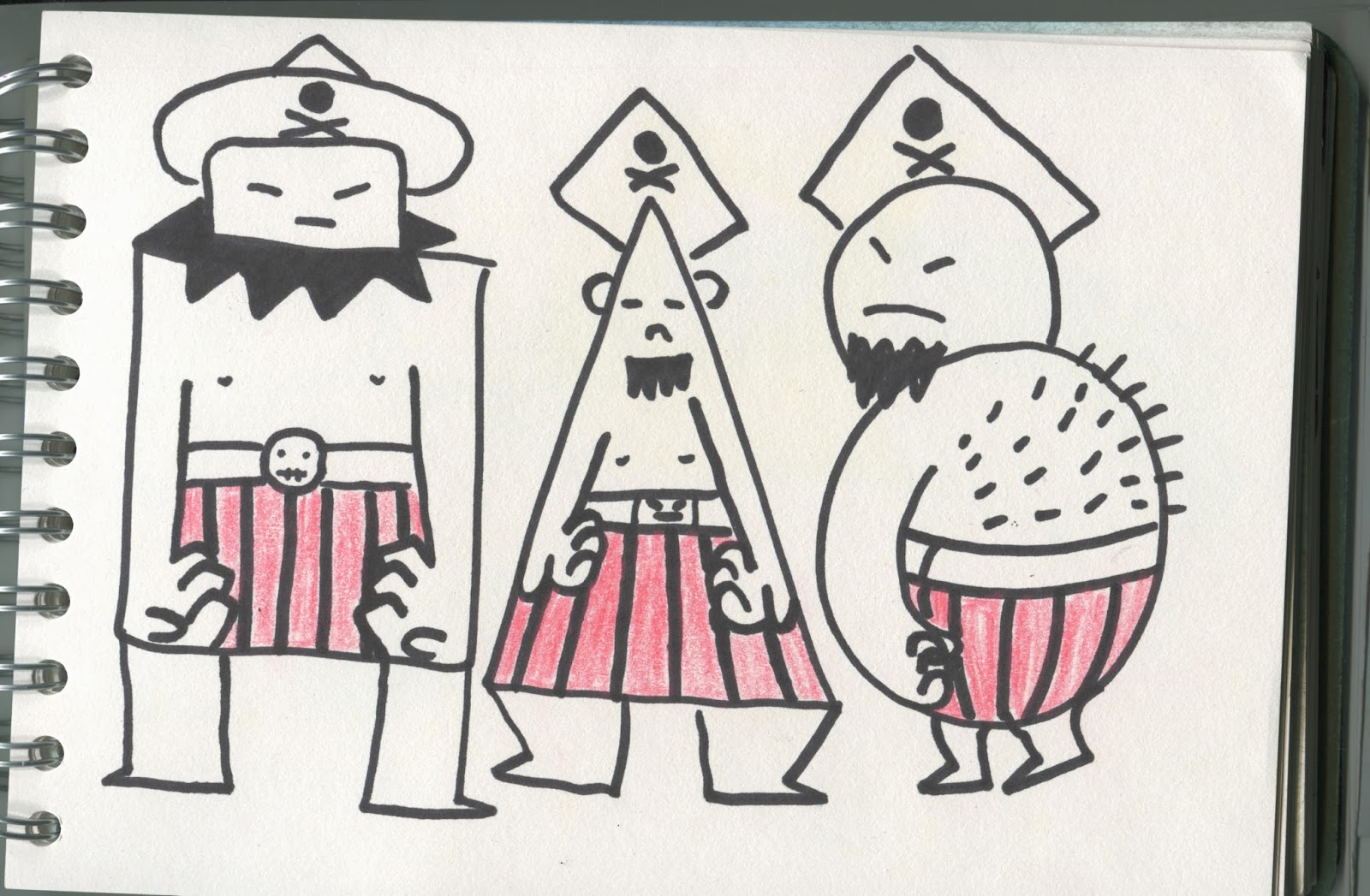
For this one i started with a shape for each one and built the character around that.


From this exercise into shape I have learnt:
1. To experiment with unusual shapes and push myself to try new things.
2. Collage can be used to create a stacked 3D effect.
3. Trying all the media showed me the value in experimentation with it.