Friday, 27 February 2015
Thursday, 26 February 2015
Wake up in sunny snow.
So this one is also based off of the Chemical Brothers track. This one is based on the fact that I misheard the lyrics at first. I thought it said 'how does it feel like to wake up in the snow?' but the right word was actually sun. But I thought it would be fun to do one based off of my mistake because its still technically linked to the song but it almost definitely wont be recognisable with it.


I decided early on that the colour scheme for this one should be very minimal, only using blues. So i can get the sadness across It may be an oversimplification but I think with this one I should just keep everything simple seen as it started at such a bizarre point.
at first I tried just free hand drawing it on photoshop. turns out it's a lot harder to draw digitally and my attempts were sad comparisons to my hand drawn attempts.
Once I had cleaned up my final character and placed it the face just didn't look right. The faces I draw are always unmistakably cartoony and child like. That style just didn't fit in with the rest of the image. So I erased it and did some of my favourite eyes to do; the gaping holes of doom.
Overall after completing this one I think that my success with textured brushes was just a fluke and it's definitely something I'm going to have to work on. I think because snow is such a light reflective surface I wasn't really sure how to even add believable texture to it. I don't really like how this one turned out, the textures for the snow I did are just too reminiscent of microsoft paint's spray paint tool.
Wednesday, 25 February 2015
Playful Cities
I've been trying to think what I could make our online piece since I already know that I want it to be an animated comic. The animation would only be on one panel so the rest of it is yet to be designed.

I decided that to show the lack of imagination and excitement in todays age would be to directly compare it to 1960 when futurism was booming and the moon landing was still fresh in people's minds. My idea was to have some panels showing things that were happening in the 60's that show people's excitement towards the future. Then showing the distinct lack of that in this time period.

For the animated panel we figured it could be simply us going through the ten years. Since animating a whole city would be ridiculously hard for my animation skills, we decided to have it work like one of those video's where people take a picture every day and then layer them together. So we are doing an image for each year passing. Rosie is concentrating on her character design for this and experimenting with the changes in clothing/hair and how to make the characters look like their ageing believably. I'm drawing out the city, I've set on the rough shape I want it to be set out in. I thought maybe instead of showing ground the city can sit on top of a oval of colour so that it works as a kind of floating spot image. It's been hard trying to think of all the changes that could happen within the city, I'm not sure how similar to have each stage either. I think this will be something I do by drawing the first one and then tracing a rough outline and changing it slightly, so that they work as a more congruous sequence.

Rosie showed me this book called 'have you seen my dragon?' by Steve Light. The buildings in it really inspired me. The lines are slightly scrawly and the angles are skewed, it gives the whole image charm. It seems naive and friendly, I think this is something we want to achieve. One of the reasons I chose Rosie as a Partner was because I liked the charm in her work. Also our vision for how the future could change in the next ten years is very naive. We've taken giant leaps in technology that would take decades to perfect and we've slapped them in. The whole concept is kind of naive, but I think it's battling against the cynicism that has become the norm in todays society.

My first try at a city, this one is represent this year that we're in now. I coloured in blocks of colour first and then worked on top with ink and I think it worked really well. I was worried that colouring the city would get too crowded because there's so many surfaces and different parts but by just doing a sweep of colour over the entire building it makes it all sit together. I think I'll use this kind of technique for the final city colouring because its a lot more time efficient than colouring in every detail. Also it's simplicity adds to the naive and playful aesthetic.
Things to remember in city design:
Skewed angles
Decorative roof/border panelling
Line as texture
Sweeping colour washes
Skewed angles
Decorative roof/border panelling
Line as texture
Sweeping colour washes
Push the playfulness!
Sitting in a gutter screaming symphony
I've decided to tackle the secret 7 brief because it seems like something you can really play with and the boundaries of what you can and can;'t put on are left wide open.
Chemical Brothers- Let it be This is the first song I picked to draw about. I decided to look up the lyrics so that I could base the image off of something. I did this because the image has to relate to the piece but not so obviously that it gives away which one it is.
For this piece I based it off the line 'sitting in the gutter screaming symphony'
This was the first idea I liked, someone floating down a gutter. But the little character didn't look right. He didn't look distressed enough to fit the song i think.
So I got to drawing a more distressed character and instead of a paper boat a glass bottle. Because I feel the paper boat indicates some choice in being there and boats normally represent rescued rather than trapped, so the glass prison fitted a lot better. Unfortunately my knowledge of convex glass and the effect of an image inside is poor at best. So I drew them separately to be pieced together on photoshop later.
At first I was just filling in with colour but I decided that to make the distress a key factor then there needed to be distressed aesthetically too. So I started playing with the textures brushes. I'm not normally one to stray far from block flat colour and this was a new learning experience for me.
In honesty I didn't really know what I was doing with it, I was just adding things to see how they looked and going from there. The road texture was all because I'd started a new layer without realising. The combination of the two textures gave me the road texture I ended up with.
The droplets spattered on the road were actually just me trying to make a cobbled effect but the blue pallet just made it look like water drops and in looking at them in that perspective they are way more effective as water droplets than badly coloured cobbles.
Here I started on the textures of the pavement. From my experiments on the road texture I've learnt that you have to think about it in parts. first I tackled the big obvious lumps and bumps in concrete.
Then I started adding an all over texture in a much darker colour to be the general roughness of concrete.
Finally I added big cracks in the pavement because the textures I used made it look like a flat object rather than a angled material. The cracks just reinforce the 3d effect.
I coloured the little man in red and yellow with a kind of tribal pattern on. This was actually taken from my 505 project where I was trying to draw humanoid creatures that are insect sized.
Adding the bottle and water textures completed the image so that pretty much every inch was heavily textured. I really like how this piece went. I think even though I was new to texture work I got the hang of it in this piece.
Thursday, 12 February 2015
U.G.L.Y You ain't got no alibi
We had a session on our visual journals and Eleanor asked us questions about what we are researching with it and what our focus was. At this point I don't really know so I need to do some more exploration drawing and thinking until I can answer the questions.


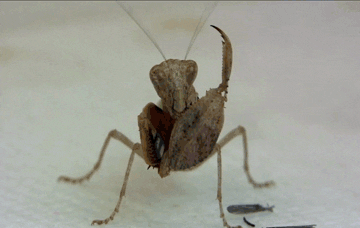
1. I know a small amount about mantis's mostly all from the youtube video; True facts about the Mantis. I know basic biology in skin and plant cells. I know I want to make a comic.

In this one I tried to make it look kind of aquatic with the plant life growing off him. I think I need to play with the posture more because it's new to have something with such an awkward shaped torso. But I guess it would make dynamic angles look more impressive because there's more body to distort. I think the blue and purple is too complimentary to the green, it's too calm a colour pallet for such a crazy face. So I think I'm going to try mixing some pink instead, it's more contrasting and it's a pallet I've been using in my personal work with my lizards.
I got the idea of a kind of documentary style introduction to my creature from Michael Deforge's comic where he shows his deer like creatures mating ritual.

I started a bit of a comic idea here. The mantis is in a clearing in the grass, he does this funky little dance and clasps his claws together. Then X-ray mode to see inside and he's making babies on his own, so he's technically cloning himself. Then he was going to spray the babies out machine gun style. But I wanted the cross section of the claw to be more realistic and to have figured out all the organs that are in there. I looked at some cell diagram to get an idea of how to do the insides of the claw:
So far I've got a layer of cells to reinforce the claw structure and the other thing is the egg sac although I don't really like how it looks right now. There needs to be more organs in it because I want to fill it completely with different parts to make an organised chaos kind of filling.
Now I've done some more drawing I have a slightly clearer idea of what I want to do although it's still pretty open to exploration.
Visual Journal research and proposal extension questions:
- What do you already know?
- What do you want to know more about?
- What will you do to find out about it?
- What themes are you interested in exploring?
- What subjects are you interested in exploring?
- What texts have you been exploring?
2. I want to know more about insects so that I can find all the weird one with peculiar abilities and then I can combine them into my own characters that I base on them. I want to know more about the organs that I could have inside.
3. I'm going to watch documentaries on weird insects and explore visually the x-ray images I could make with reference of anatomy diagrams.
4. The life cycle. Character.
5. Bug life. Biology. mating rituals. life spans.
6. I haven't explored any yet. But I think I'll need to read up on insects and their anatomy.
Budget Overlord and Character Wizzard GO!

Me and Rosie are doing the Wet transfer brief. We have to show ourselves in 10 years time. The main parts of the brief to keep in mind are:
The deliverables are 1 print, 1 online piece and research presented in either 4 image or a 1 minute video.
Concept is key.
We decide the target audience and why.
Celebrate the person you'll be in 10 years.

These were just two quick sketches I did before our session today.
I put a jet pack in because it was the only thing I could think of that indicated 'future'. Then I thought what is the world like in 10 years and how would that effect the person I will be.

Talking with Rosie we were discussing idea's and we both like the idea of using 60's futurism.
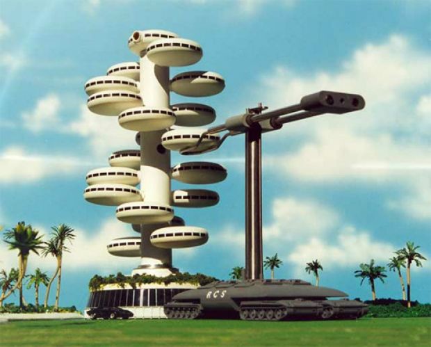
Big bubbly buildings, chrome and glass everywhere. But I also wanted it to be 'green' like in the future we push expanding our forests and plant life and just integrate them into our cities and lives.

Rosie had the idea of making it Biotech, she referenced Farscape:
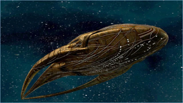
The ship is part mechanical and part biological, a living ship.
I had the idea of solar tattoos that could charge up on solar energy and then through some sort of transfer pad on your fingers you could power hand held items. Then I was thinking how we always have issue with people tramping grass to mud and so we have tiny little sections for trees and grass and plaster our pavements/roads everywhere else. My idea is that we just build the wildlife back up over the pavements. A tree could be planted on top and with careful root manipulation it can steady the structure further.


I was wondering about how we could light up under the pavement shelters so that people could see at night. I was going for organic and natural and I figured glow worms and fire flies could work, it turned out Rosie had been thinking the same thing. Both of our inspirations for the idea: Groot.


I thought for under the pavement shelters if the roots of the growing tree were manipulated it could be made into a firefly habitat and they could light the night.

I was trying to figure out ideas for building and they were starting to look too mechanical and its hard to make them fit with the plant life. Me and Rosie talked and we decided that we don't want the chrome of the 60's futurism and we think at this point we're aiming for a rich pastel pallet. Also the solar panels are big and not aesthetically pleasing and she said that maybe they could be like leaves as in photosynthesis. So in our future we have harnessed the power of photosynthesis to create energy.

I tried doing house designs that are more nature-y, I was kind of stuck for idea's mixing the two concept of plants and building wasn't quite gelling in my mind. Rosie saw the one that's like a plant growing berries and she said maybe draw t like a bluebell, she drew me some examples and then I made the bottom one. I really like how it turned out because it's like the bottom piece is glass and all futuristic and the top is extravagant and keeps in touch with the 60's flower power.


A larger drawing of the house plan. I put some steps round the outside so that you can sit out in the fresh air. My idea for them came from ames and the giant peach where the peach rolls down the hill and gets a fence stuck in it that wraps around and makes steps.


I made the solar panels into leaf panels but kept them the same kind of shape because it means I can add big wobbly shapes to put them in and that can draw in more of the 60's style.
We've assigned each other a main area of design each to prepare for the presentation boards in two weeks.
I'm in charge of back grounds and large tech.
Rosie has characters and hand held tech.
And then we're going to meet every Thursday to work together and keep in contact about the project in the mean time by sending each other updates and questions.
We are now in charge of keeping each other in check so that neither one of us gets behind which were both known to do. We figure the guilt of letting someone else down will kick our butts into gear.

Subscribe to:
Comments (Atom)