
Pearson's narrative is something I really enjoy, the panelling in everything we miss had lots of panels that just showed things in the background and things in passing. Normally this is a narrative technique more common in Japanese manga where panels are used to show the atmosphere around or to highlight what all the characters were doing at the point of crescendo. It's a technique I really enjoy because I think it draws you into the story more and it conveys the emotions using colour schemes and perspective. Another thing Pearson does is where he shows a sequence of movement in multiple panels without words. Its feels like there is more importance in his characters, like they are the drive for the narrative. Instead of the action pushing the story on to the next part, he takes time to show the characters and their reactions. I think one of the main reasons for liking Luke Pearson's work so much is his understanding of character, his characters are rounded and have depth to them and that element makes the story so much more enjoyable.
Seo Kim

I recently bought cat person. It's a comic I've been eyeing up for a while but I didn't get it because it was a little pricey and I wasn't mad keen on the style. But after a sale at travelling man I have my very own copy. The drawing style s something that grew on me from the minute I started reading just because it so suites her style of humour. Most of the comic strips were autobiographical and I thin that worked well because finding humour in everyday life is something we can all get in on. The humour is silly and playful and the illustration compliments it and in some pushes it further. In some of the strips the part that made me laugh the most was the drawing rather than the actual narrative. In one it shows her losing her temper, on it's own a relatively uninteresting story, but on her final panel of it her character was very roughly drawn with rigid lines for hair and oversized wonky green eyes. The emotion was in the drawing, in the way it had been drawn and that's what gave it the humour.
Jeffrey Brown

Jeffrey Brown is the illustrator whose comics I have the most of. I like how in his first comics his style was this kind of scrawly and simple and it was his narrative that pushed the work. But n a llot of recent work he has shown that he can do some really pleasing coloured pencil sketches. The colour addition to his work made it more eye catching and the colour pencil medium matched his naive playful style. Brown's work is normally pushed by personal experience and I like how his autobiographical work lets you in to some really private moments. His work is so personal and interesting that the style came second to the narrative. But in some of his more recent works that are fiction based like the star wars line, his drawing style has burst into bright and playful imagery although the narrative is still very strong.
Jesse Jacobs

Jesse Jacobs was an illustrator I found out about in the summer. By this you shall know him is a story of how the world was created. The first thing that caught my eye about this comic was the colours, a really simple colour scheme but clearly considered as it suites the space setting for a lot of the panels. The detail in the plant life was something that really interested me and set me out trying to do my own high detail drawings. The panelling that he uses can be unconventional in parts but they lead you along and let you drink in each detail one at a time. The line as pattern helped achieve high contrasts in a limited colour pallet, but the pattern also represented the character. Every detail in his work seems to have been thought through, he takes you on a journey in his comics to his own universe.
Michael DeForge
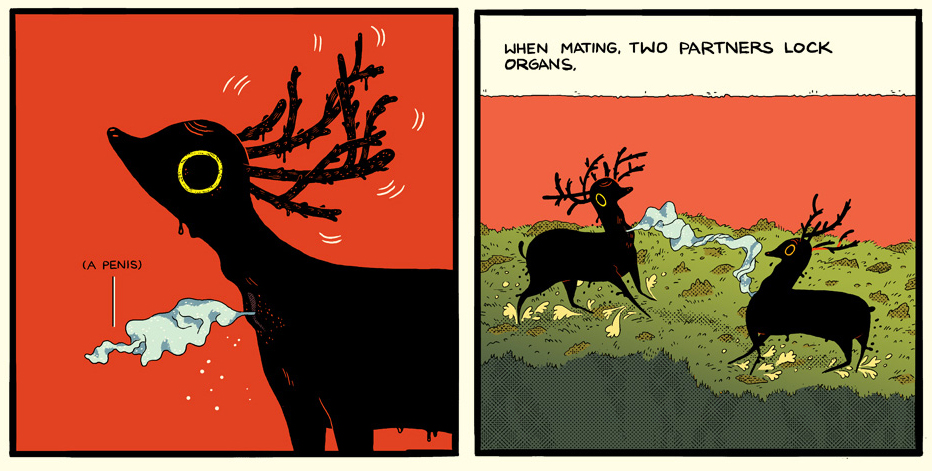
Michael DeForge seems to balance on a tight wire of detailed grossness and visually pleasing. His images are slightly unsettling and yet beautiful. His colour schemes are relatively life like but he always tend to slip in one bold colour. I like how it makes the characters stark and severe against them. Also each colour seems to hold an emotion, seeing as it is so much more vibrant than the others it feels as though it holds some significance. His characters that he creates are quite similir to real life animals, he seems to contort them into his own style though. By making the deer a solid black colour without clear structure and pieces it seems like one whole mass that wouldn't have to conform to the nature of an actual deer. There is something different and almost toxic about it, you can just imagine it snapping over backwards and charging like something out of a horror movie. I think that's a thing I lie about his characters, they look like at any minute this could turn into a much darker story. But a lot of the stories in 'some stories' are just introducing you into his world that he created for himself. The thing that sets DeForge from other illustrators for me is the massive expanse of his imagination. As he introduces a narrative it seems to show you how this universe is, like the Stacy face story.
I think out of all these illustrators I've chosen to talk about DeForge is the one that I resonate with the most. I really enjoy his style and it makes me want to create my own distorted characters in their own universe. In the work I've enjoyed the narrative is very strong, which rings true to me because I don't really like comics where it's just a display of character and no real substance. I can appreciate the craft but to me a comic isn't a comic without a story. In my own practice narrative is not my strong point and something I need to work on. The two I picked up in the shop purely based on aesthetics were the Deforge and the Jesse Jacobs comics. The unusual shapes and small details added in really attracted me and I like the contrast in colours in them both. Jesse contrasted with colours and pattern and Deforge has contrast in big coloured in background and then jet black characters or his one bold colour. The style they show I think influence me more than the other illustrators I chose because the characters they use aren't normal and nice looking but playful, extravagant and weird. This appeals to me because I love to make my characters weird and I revel in the unattractive.
No comments:
Post a Comment