Monday 21 October 2013

The true value of Norman Rockwell

We were each given an article to read and told to find 5 images that represent what is said or that are related to it.
I was given 'The true value of Norman Rockwell, America's Patriot Painter. The Guardian'

My first image was found simply due to a quote in the text 'a beardless Abraham Lincoln'

My second image is that of Betty Grable I have chosen this one as the article talks of how at the time of Rockwell's Rosie this was the ideal woman. So Rockwell strived to make Rosie as much an inspiration and idle to woman as the current celebrities such as Grable.

This is an illustration of the book 'Of mice and men' i chose this image as the article talks of how Rocjwell illustrated through the times of hardship in America and bringing faith back into the american dream. And this book is based around the american dream and the recession.

I chose this image because much of the article was about how his work pushes freedom and gives hope back to the american people and encourages them. 

And finally I chose J. Howard Miller's poster for its similarities in purpose to Rockwell's Rosie.

Tuesday 15 October 2013

Photoshop Induction 1

 Above is the original image we were given in our Photoshop induction. Our task was to clean this image up and restore it to a more professional standard. I used the heal tool to get rid of 'blemishes' and then played around with layers and used selection tools and paint brushes to neaten it up.

And above is the image after some experimentation and play with the Photoshop tools.

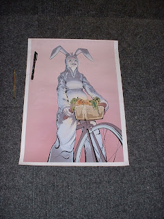
 The second image we had to fix was this one. We worked with cropping and perspective to fix the angle the picture was taken at. And i used the patch tool to cover up the pen.


Monday 14 October 2013

Summer 10 cont.

Continuing the project from the summer 10 brief, i picked five themes that another tn could be made from.
1: Bad Dancing
2: My attempts at cooking
3: Beards
4: The songs that are stuck in my head
5: Things I get out of breath doing

after playing with the ideas on a big sheet and having a peer review I decided to go with number four but incorporate the images I created for number one and the style of using colours that I discovered in number five; an overlay of pink and green line work that looked disco themed.

I decided to make my poster like a club poster for a night out. The first thing I decided to complete was finding a logo that would communicate the poster simply. I experimented with ways to represent that it was going on inside my head; I t the lightbulb was a more subtle way than just drawing a brain. I got opinions from my peers on the experimentation I did with element of my logo before deciding on a finished logo.

Bulb shapes

Bulb Screws


Colour placement

Then I moved on from logo design to my dancers. I knew I wanted multiple naked dancers with simple line work so that they could be easily transferred to work with the pink/green colour overlay. 


With all the elements sorted I started to grid up my design to scale. I measured out grids where I wanted all the different parts of my poster so that everything would be level and professional. Using the light box I could trace through the details without the grid lines to get a clean copy with everything in line.
The light box was also really useful for the colour overlay on the dancing people as I could trace the same figure exactly the same with each colour so it was consistent.


The finished product.

In retrospect I feel I should have experimented more with line thickness but because I did all my practising on a5 i didn't see the effects that the line work would have on the finished scaled up piece. Also i feel the colour was good but there should have been more work with block colour in larger areas as the whole poster isn't very eye catching and quite bland.
Things I did like though were the bordering (suggested in a peer review on my original summer 10) and the logo because i worked out every element separately I felt proud of how it came together.


Summer 10 Brief

Left: Something I'd rather not have done was running home from work which is only 3 miles but I am not the running type. Right: Something beautiful, a previously clean shaven friend grew this magnificent beard.
Left: Something I've been thinking about is a design for my tattoo or to extend the one I already have. Right: I Learned how to pan fry a steak medium rare just the way I like it.
 Left: Something I heard was the theme tune to the Smiler at Alton Towers because they repeatedly played while we were queuing for the full hour and a half. Right: Something I ate was Biltong because for my boyfriend's birthday I built him a meat drying box.
 Left: Something I wore; I worked at a night club and there were multiple theme nights on which we had to dress up for our shifts. Right: Somewhere i found myself was in Nottingham helping a friend move house with just three of us as no one else turned up.
Left: Something scary was being in the lake in the lake district because I find water terrifying. I had a safety float, i held onto the boats ladder and kept my legs up against my chest the whole time but I did it. Right: Something I discovered is that I lack musical talent, this is me tying to play the ukulele.

This project helped me get back into the swing of things and got me to finalise the design on the character i've been sketching of myself lazily over the summer. As an improvement borders were suggested by a peer to frame the pictures in and to make the edges more clean cut and professional. I learnt that putting brusho inks on larger surface areas makes them bleed into the paper and look unproffessional even though i used watercolour paper. perhaps trying a different brush or method of application with the brushes.

Wednesday 9 October 2013

Butt Planning Sheet

I decided to use the word Butt on the tee shirt to my advantage and got some ideas down on paper.
I used a bit of word play with the word butt, because tee shirts work well when it's just a simple pun. 'I can't believe it's not BUTTer' one was popular among peers but I didn't like it as much as an idea and where the word butt was on the tee made it awkward to fit the text around it. The cigarette butt I liked but I felt it was a really simple design and there wasn't a lot of playing around I could do with it. I decided on the naked dancing people with big butts because it just simply made people smile when they saw it, because Butts are hilarious. Plus there was a lot of play that could be done with them practising different dance moves and faces. But always making sure the butt was in the foreground and the main point of attention.
From the comments of my plan sheet from other people in the class its clear to see that silly humour and word play was popular.

Tuesday 8 October 2013

Butts Teeshirt

For this brief we were asked to out a design onto a garment. Anything we wanted. I had just got a teeshirt with the word 'BUTT' on it, free from a freshers fair.
I went with the theme of Butts and ended up drawing lots of naked dancing people because i felt that having a top with the word butt printed on it was hilarious and I should continue that theme onto my designs.