Monday 18 November 2013

End of Module Self Evaluation

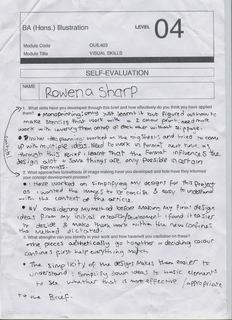
  • I have worked on developing my characters and the specific drawings of them  want to do by using reference so that they are anatomically correct. This skill has helped me as I developed it through the briefs in my final one I think it went best as you could see the big difference between my first draft and my informed drawing.
  • During this module I have tried different methods to image making; mono printing, collage, working with brusho and other inks and experimenting with different thickness's of pens. I think that they have informed my conceptual development process as I now have a variety of processes to choose from when I'm thumb-nailing ideas and can decide which is most appropriate as I know a range of different effects I can get using the method and also things that don't work well in certain media's like fine detail with mono-printing. 
  • Strengths: 
    • Drawing development process. To capitalise on this I will keep drawing things and try to use reference material where needed. Also I will keep adjusting my designs until I have an appropriate image that is aesthetically pleasing. I will also try to break larger designs down into single elements so that I can concentrate on one small part at a time to construct in the best way. 
    • Experimentation with media: To capitalise on this I will keep attending workshops wherever  can to improve my knowledge of methods. I want to become familiar with each process so that I can confidently decided whether or not a media is appropriate to the brief and message so that I don't waste time on any ideas that are simply not going to work. 
  • Weaknesses:
    • Blogging. I have only blogged my briefs after completion so I have forgotten a lot of the thought process when I come round to writing them up. To address this I am going to try and blog every day or two, just short blogs to go over what I'd done that day, the decisions and thought process so that I can document the whole process more thoroughly which will help me to see where things have gone wrong or to identify and weaknesses in my process.
    • Colour management. In my work I love to play with colour and tend to go over the top and make my pieces too loud and obtrusive or just far too crowded. To combat that I have tried to set myself a colour limitation so that I don't use too much. But I feel in this module I didn't consider the meaning of the colours or the effects they would have on the final aesthetic but rather using colours I like or jumping too quickly to a palette without considering it. To combat this in planning i will not just pick a colour based on how it looks but also try to judge if there is an appropriate colour that could add more meaning to the pieces.

Action Plan:
    • Know the strengths/weaknesses of the media I use
    • Reference drawings so they are anatomically correct.
    • Consider colour more thoroughly.
    • Blog throughout process.
    • Develop each element to its best.
    • Continue thumb-nailing ideas and coming up with a wide range.
    • DRAW DRAW DRAW!

Studio brief 2 Photoshop task

Taking the 5 a5's we did for studio brief 1 we were given the task to re-invent them by using Photoshop. We scanned in the drawings, cleaned them up then played with textures, layers and brush effects.


this bottom one was done in a sketchy fashion and so I tried to leave some of the lines in, only clearing up the excess lines outside of the figures. I learnt through this piece especially that using ctrl + U lets you adjust the hue/saturation, colour and brightness; this helped me adjust the colours until I got the one I wanted, this will be useful for me in the future as I struggle to find colours that compliment each other but with this tool i can slowly change it on the image and see all the possibilities to make a more informed decision.

Sunday 17 November 2013

A Matter of Opinion

My quote that I chose was 'Complex ideas can produce simple things'

The first thing I did was come up with a sheet of possible ideas to work from.

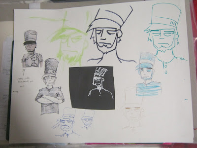
One of my possible ideas was how you could pile a lot of complicated things onto a fire but they all burn the same. This lead me to an idea for a comic that involved a man who's family were killed in a car accident burns all their possessions in his house but afterwards feels a sense of relief and is ready to start moving on. My simple part was to be his smile. But this idea was instantly complicated and the storyline lead to some difficult character design and facial expressions to get the mood right and with only two weeks for the project i decided this idea was a   more than i could handle in the time but not before I did a draft design and some character development.


I really liked the look of the character i came up with for my comic idea so i decided to use his basic design to fuel my next idea.
In this idea a chef creates meals that look really simple but take a lot of complicated ingredients and preparation methods to make.
Panel one is to show him (my chef) stood by his table of ingredients and tools looking stern and ready.
The second panel i want to have a sense of movement in it as it is to represent the cooking process.
The final panel will be to display the meals.

I decided to, using the base of my previously designed character, create my chef and decide on which media was best suited for the tone of the piece.
My favourite was the one where the uniform is made out of newspaper, it sets it apart from the skin even though its still in black and white. I also thought with this method instead of using any newspaper to make his uniform I could use extracts from cooking books so that the media is relevant to the image.

HALF WAY CRITS


Onto the second week: I drew out my character a couple of times in my sketch pad to decide whether I should combine the collage with colouring and if so what colours.

I preferred the green but after asking some other students no one was in agreement with me so I decided to run with the blue uniform. Although it was commented that if it was left as white it would look more realistic as a professional chef is in white, but I felt that it would make the piece too colourless and when showing the complicated part I wanted it to be colourful as a way of showing the complexity.

I decided to draw some of the elements for the first two panels.


After drawing out the plan for my second panel I decided that putting colour in the lines separating the images looked better and less crowded than the other way around. So I decided that i wouldn't be using colour on my chef character of the ingredients and tools and rely on line work and the quantity of those elements to show how complicated it is.


I planned out 3 meals so that I had a variety of ingredients and tools to draw that were actually related to the final meals I'd show in the last panel. Then I decided on the colours I would use, I wanted earthy tones for the food and the cooking process but I decided as a main background that they would all share would be a fiery one. Brusho to me seemed like the most appropriate choice as it would create the most fluidity as the colours merged into one. To create my brusho backgrounds and collage paper I worked with a spray bottle to create textured colour.

With everything planned out i only had to make the final piece.


 FINAL CRITS


Self evaluation

Strengths:
Well planned out character.
Good textures used
Referenced drawings

Weaknesses:
Quality of cutting/smudges etc
Fluency between panels.

Action plan:
When using brusho wear gloved to avoid finger prints and smudges.
Plan time better so I'm in less of a rush when it gets to the production stage.
Continue to use reference material as it informs my drawing.


Tuesday 12 November 2013

'A day in the life of' brief

'The true value of Norman Rockwell, American patriot painter' is the article I was given.
The three words I chose to represent the content of my article were; War, America and United.


Week 1:


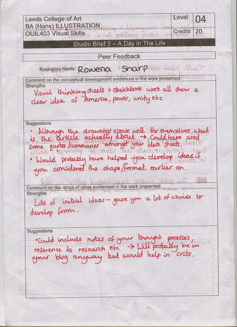
After the midweek crits I realised I had read the article and misunderstood it. so I wrote an action plan and re-read my article.
Since I had already used up a week of my time I decided to work in the meaning of the article into some pre-existing idea's I made this past week. Luckily I wasn't too far off with my themes and most slipped in easily. 
The main point of the article seemed to be that people were unhappy that Rockwell's painting were being sold. There seemed to be a theme of greed and so I decided I would like to have one of my two colour pallet to be green to represent the greed. I also decided to represent that theme with the presence of money in my images.


I did an workshop in mono-print and really enjoyed it, so I decided it would be a good medium for my work as the overlay of two colours could create a third colour and it forced me to work in simpler shapes and think about how the overlays would work in planning them out.

These are my stencils which I made with sketches and the light box. I used the light box so that they would overlay the same and it would successfully create the images I wanted.


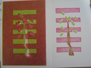
Mono-printing went well i used the stencils and then did a couple of prints after I had printed with the stencils a couple of times and then peeled off the stencils and printed from the left over imprints.

This one on the right was the first print that i did on a thicker paper just to eliminate excess ink but the colour quality was really nice and the red was red rather than the pinkish tone it went on the following prints.

This was another first print so the colours were really rich, this one was actually my favourite print but part of the brief was that the pieces work together as a set and this one, being printed on the thick paper, was darker and different from the later prints which had a slight gloss finish.


The top one was an overlay of the ones where I peeled off the stencil and printed from the ink plate.

The one on the left and the one below were examples of where the prints slipped and I put them on wrong. In future if I make all the stencils lie in the same place on their respective pages I can draw guidelines on newsprint and line up my printing plate, stencil and paper the same way each time. 


These are my final prints.