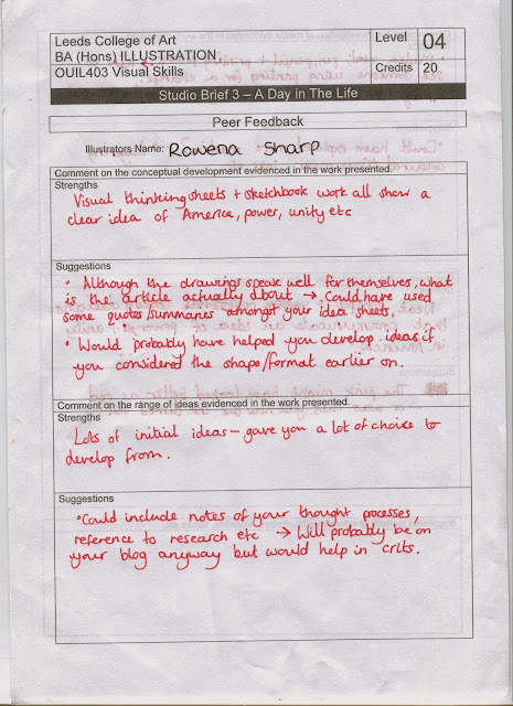
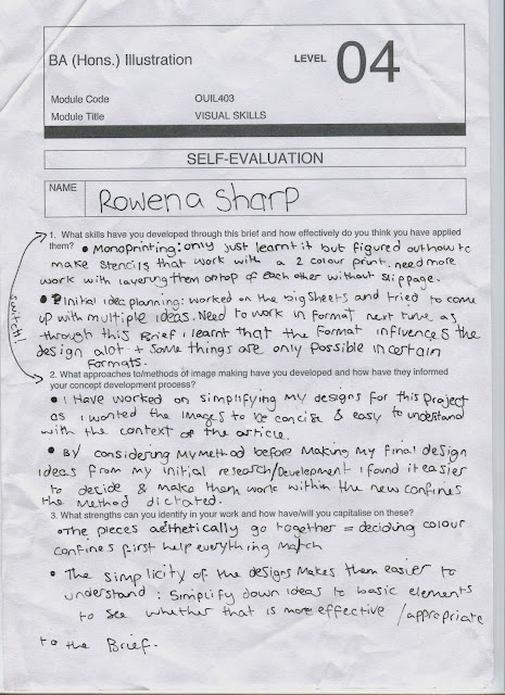
The three words I chose to represent the content of my article were; War, America and United.
Week 1:
After the midweek crits I realised I had read the article and misunderstood it. so I wrote an action plan and re-read my article.
Since I had already used up a week of my time I decided to work in the meaning of the article into some pre-existing idea's I made this past week. Luckily I wasn't too far off with my themes and most slipped in easily.
The main point of the article seemed to be that people were unhappy that Rockwell's painting were being sold. There seemed to be a theme of greed and so I decided I would like to have one of my two colour pallet to be green to represent the greed. I also decided to represent that theme with the presence of money in my images.
I did an workshop in mono-print and really enjoyed it, so I decided it would be a good medium for my work as the overlay of two colours could create a third colour and it forced me to work in simpler shapes and think about how the overlays would work in planning them out.
These are my stencils which I made with sketches and the light box. I used the light box so that they would overlay the same and it would successfully create the images I wanted.
Mono-printing went well i used the stencils and then did a couple of prints after I had printed with the stencils a couple of times and then peeled off the stencils and printed from the left over imprints.
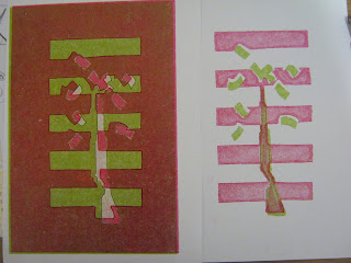
This one on the right was the first print that i did on a thicker paper just to eliminate excess ink but the colour quality was really nice and the red was red rather than the pinkish tone it went on the following prints.
This was another first print so the colours were really rich, this one was actually my favourite print but part of the brief was that the pieces work together as a set and this one, being printed on the thick paper, was darker and different from the later prints which had a slight gloss finish.
The top one was an overlay of the ones where I peeled off the stencil and printed from the ink plate.
The one on the left and the one below were examples of where the prints slipped and I put them on wrong. In future if I make all the stencils lie in the same place on their respective pages I can draw guidelines on newsprint and line up my printing plate, stencil and paper the same way each time.
These are my final prints.


No comments:
Post a Comment