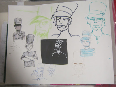
The first thing I did was come up with a sheet of possible ideas to work from.
One of my possible ideas was how you could pile a lot of complicated things onto a fire but they all burn the same. This lead me to an idea for a comic that involved a man who's family were killed in a car accident burns all their possessions in his house but afterwards feels a sense of relief and is ready to start moving on. My simple part was to be his smile. But this idea was instantly complicated and the storyline lead to some difficult character design and facial expressions to get the mood right and with only two weeks for the project i decided this idea was a more than i could handle in the time but not before I did a draft design and some character development.
I really liked the look of the character i came up with for my comic idea so i decided to use his basic design to fuel my next idea.
In this idea a chef creates meals that look really simple but take a lot of complicated ingredients and preparation methods to make.
Panel one is to show him (my chef) stood by his table of ingredients and tools looking stern and ready.
The second panel i want to have a sense of movement in it as it is to represent the cooking process.
The final panel will be to display the meals.
I decided to, using the base of my previously designed character, create my chef and decide on which media was best suited for the tone of the piece.
My favourite was the one where the uniform is made out of newspaper, it sets it apart from the skin even though its still in black and white. I also thought with this method instead of using any newspaper to make his uniform I could use extracts from cooking books so that the media is relevant to the image.
HALF WAY CRITS


Onto the second week: I drew out my character a couple of times in my sketch pad to decide whether I should combine the collage with colouring and if so what colours.
I preferred the green but after asking some other students no one was in agreement with me so I decided to run with the blue uniform. Although it was commented that if it was left as white it would look more realistic as a professional chef is in white, but I felt that it would make the piece too colourless and when showing the complicated part I wanted it to be colourful as a way of showing the complexity.
I decided to draw some of the elements for the first two panels.
After drawing out the plan for my second panel I decided that putting colour in the lines separating the images looked better and less crowded than the other way around. So I decided that i wouldn't be using colour on my chef character of the ingredients and tools and rely on line work and the quantity of those elements to show how complicated it is.
I planned out 3 meals so that I had a variety of ingredients and tools to draw that were actually related to the final meals I'd show in the last panel. Then I decided on the colours I would use, I wanted earthy tones for the food and the cooking process but I decided as a main background that they would all share would be a fiery one. Brusho to me seemed like the most appropriate choice as it would create the most fluidity as the colours merged into one. To create my brusho backgrounds and collage paper I worked with a spray bottle to create textured colour.
With everything planned out i only had to make the final piece.
Self evaluation
Strengths:
Well planned out character.
Good textures used
Referenced drawings
Weaknesses:
Quality of cutting/smudges etc
Fluency between panels.
Action plan:
When using brusho wear gloved to avoid finger prints and smudges.
Plan time better so I'm in less of a rush when it gets to the production stage.
Continue to use reference material as it informs my drawing.


No comments:
Post a Comment