Strengths:
This is the module where I had a turning point with colour. Being showed programs that can generate pallets for you with a certain amount of control. This helped me with a lot of my work because I have a habit of doing all the line work and finalising my work before I've even thought about the colours I'll be using. This hasn't changed that habit yet but it's helped make the whole colour picking process less stressful. The other thing that helped was having the brief layout colours already, in the Propercorn brief I decided just to use the colours that they already had associated with their brand on their packaging. Having a colour pallet that already worked made it a lot easier to work with instead of considering every colour there was a select amount of options and it was more about balancing the colours to create an aesthetically pleasing image.
Line as texture has been a growing element in my work this year, because the competitions were almost like a break from real work where I can draw what I want, I decided to just play with what I like which is grossness. Line as texture makes the whole image seem rough and abrasive which makes it off putting straight away. Melting and drips have been a big part of this like in my Threadless brief, I'm just enjoying playing with form at the moment.
Thought bubble showed that I could get a lot of projects done quickly and to a deadline. I managed to organise a stock list and floats money. I also made stands, I think its been useful to learn how to make my own display stands because it means I can present something at a rush and on a budget. Thought bubble was most useful for talking to other illustrators. It was a new experience, we were given gold wrist bands to signify that we had a table and it was like being in a secret club. You could instantly talk to any other seller and just flash them the bracelet and your in. One of the younger guys we spoke to I'm still in touch with as he works in Leeds. But we go in to the shop and chat with him, its like seeing into what our lives might be like in a year.
Texture brushes were something I experimented with in this module. In the secret seven brief, I was trying to create a distressed aesthetic for one of the album covers I chose to illustrate. It was new and I'm not yet sure exactly how to use it, my first attempt just seemed to be a beginners luck fluke. But I used them in my tiny teepee submission as well and I think this is a technique I will try and perfect a bit more because it can more easily show intangible themes.
Weaknesses:
Thought bubble was probably filled with the most mistakes in this module, but I expected to make mistakes because the whole convention scene was very different to what I'm used to and I wasn't really sure how to present my work or what to present even. I think my main mistake was that I was just generating pointless work in a panic because I just felt like I had to have a good range of things to show but my drawing had progressed so much over the summer that I didn't want to include anything old because there would be a drastic difference in quality. My work needed to have some constraints so that it fits somewhere in the creative market, audience and purpose are something I'm going to consider more in future projects. The presentation of our stall wasn't at a professional standard I think that was partly down to not knowing how to display properly or the table dimensions but also because a lot of the things like table cloth and price tags were last minute things that I almost forgot. Also when we did sell things we hadn't thought about how to package them and therefore we had nothing, it makes it look like the piece doesn't matter and it makes people see it as less valuable. I think that overall in the thought bubble brief I undervalued my work, I didn't put enough time and effort into each piece because I valued quantity over quality, I under priced them and I didn't package to a professional standard.
Research has been a weakness in this project, I think that if I had put more research into the We Transfer I would have realised my mistake earlier and planned the comic accordingly. I think the comic leading up to the gif was the weakest part of the response and I feel its down to poor planning. I think I needed to get more interested in each project and invest the time to research but I've felt so rushed and under pressure this year that I haven't felt able to really invest in each project and research it fully.
My presentation boards were a weakness, at first I wasn't sure what information I needed to include but then it became more about the layout of the boards themselves. A lot of people's I saw looked really professional with mock ups of the products in their environment. Where as I just had a jumble of information about colours and reference images. I feel more comfortable with the presentation boards when I'm allowed to talk the group through them because without that I didn't really put a lot of text on the boards because in feedback I was told it looked too wordy. I need to work on how to communicate a project without words so that in future working with live briefs I can send back and forth my progress on the project easily and clearly.
I think my main weakness though has been my habit of planning ridiculously time consuming ideas, I never feel like something simple is enough and I end up just getting really stressed out that I won't be able to finish my project and then I'll end up changing it at the last minute to compensate for not being able to finish. I think for future projects I should start with a simple idea and build off of it. Because if I propose a pack with multiple elements I can just make the initial idea the others grew off of and then after that each extra thing I complete is a bonus and if I don't finish they can still be proposed. This way I can still have my crazy way too much work ideas but present them in a way that makes it okay that I've only actually fully made a handful of them.
Conclusion:
Overall I think this module presented a very steep learning curve, it's been a dip into the world of professional illustration. I have enjoyed doing the smaller competitions and they wee things I didn't even know run constantly. I plan to continue doing Tiny Teepee and off life regularly and when we reach the summer holidays I'm excited to go out and find competitions to do to keep the creative juices flowing. I think I've improved my ability to explain my projects, mostly down to the presentation boards. I was in a crit the other day and had to explain my project and my whole mind went jumbled and I forgot chunks and just said a load of random topics that are included without any real information like size, paper, print methods, digital/analogue etc. I think that the presentation boards weren't just for showing others what the project is about, it also helps organise your thoughts into an understandable format.
Thursday, 23 April 2015


Threadless: Peanuts
So at first when I heard the theme was Peanuts I instantly thought of the nut. I wasn't even aware that the Charlie Brown comics were called Peanuts. So my first design as snoopy in a peanut costume, I was pushing the gross textures and so I completely covered his skin in drips and marks and spots. The only issue with doing this is that I chose to draw it to scale at A3 and it was really time consuming to fill the space with texture.


This one was too big to fit in the scanner in one piece, I was planning on doing a whole set of characters in peanut costumes but it took so long I decided it wasn't worth the time and I wasn't acheiving anything or learning anything by repeating the same design. I think I've just got too use to working in sets and sequences. So for this one I decided to do Charlie, Snoopy and Woodstock all together and gave them the creepy eyes I've enjoyed drawing lately. Again I was just pushing the gross, it is a creative crutch I use but when given the choice it's what I enjoy drawing.


I did this one of Woodstock trying to keep the design relatively simple. I used a big permanent marker to draw it which was a big step away from my fine liners. The line quality was actually smoother but I don't like the rounded edges at the ends of lines. I think I should have gone back in with my fine liners just to adjust the tips of lines to make them pointed. I need to look into getting some thick chisel tip markers because then I could achieve the line quality and sharp edges.


Off life

This was a quick brief I did for off life. They just want something sequential that is no more than 4 pages. I chose to do it because I found a piece of paper in my room with a comic strip idea scribbled on it and I really liked it, I'd forgotten all about it.
I picked my colour pallet on coolors but then I ended up incorporating the green selection I had for the We Transfer brief. It contrasted nicely from the orange, but the shades are all relatively low saturation and stops the clash of colours being too abrasive.
The writing I used didn't really work though because half of it is in black and half of it is done in white digitally. I thought that because it was my handwriting there wouldn't be much difference but the media has really separated them aesthetically. I think the black worked for the title but the rest should have all been in white. But since I don't have as much control digitally I should have drawn out the writing in a thicker pen, possibly a berol felt tip, then change it into white using the colour channels digitally.
What I have learnt from this though is that all those silly ideas I have for comics that I never do or write down could have actually been good comics. So from now on I'm going to have a book that is specifically for writing down ideas for comics or prints.
WRAP


I added some of my favourite leaves to draw so that it wasn't just a wrapping paper of decaying skulls, this makes it seem kind of jungle and tribal.


I coloured it in using slight variants on the primary colours because I thought it would be contrasting and eye catching. But it made it gaudier than I expected so I played around with the hue/saturation tool and made 3 other options. I submitted all four to the competition.
Tiny Teepee
The word was storm and the only constraint is a square format. I chose my colours on coolor first because I wanted to start with a pallet so I could eliminate outlines and just draw straight in colour. I tended to stick to round shapes because the brush is already round and it helped ease me into working in shapes instead of lines.

I don't really like this one that much, I think maybe because it doesn't have a clear concept. I don't think it really works as a picture for the word storm.
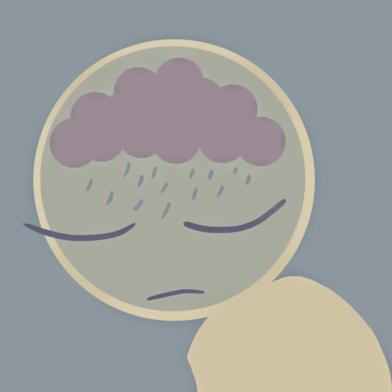
I liked this one much more, it had a clear concept and the whole thing just seems more balanced. I think it also works better as the other one is just floating spot illustration whereas this one goes off page. There's just something about it going off the page that makes it seem more natural .

I went back in with textured brushes because I thought that although I liked the design the finished piece looked flat and there were just too many straight edges, very clinical. So I used the textured brush to add shadow to the cloud to make it look more angry and voluminous. Then I added the texture around the edges, I did this because the blue background was far too cheerful a shade, but I didn't want to replace it altogether because it complimented the other colours. This way the image is framed while the illustration still goes off page. I added extra blobs of texture further in as well; it makes it look like the darkness is seeping in, makes it seem claustrophobic.
Wednesday, 22 April 2015
Wednesday, 1 April 2015
Research Boards
In class we were supposed to be making presentation boards to represent our project but our brief specifically asked for 4 images on research.
Since fate has given us an extra day to work on these boards we started out by giving each board a specific section of research to show. Because a lot of the work is just imagined there wasn't actually that much research to show but we have decided to show our drawing as research as well were not sure if to them this will count as research or not.
The four boards were:Futurism, colour scheme, drawing as research (back grounds) and drawing as research (characters)
We split it so we had a board each to work on then Rosie made the We transfer board template for us both to work on then when she'd finished her slides she emailed me them to apply the colour scheme and add the boxes around images. At first I was just making them because the images on my boards looked messy and just thrown in. So i made a square frame using the colours of the project as a theme. With this box I could also regulate the image size so that they are all in the same format which I think makes them look more professional.


We managed to submit on time and I think we pulled it off in the end, even if the end was immediately preceded by mass stress.
Subscribe to:
Comments (Atom)