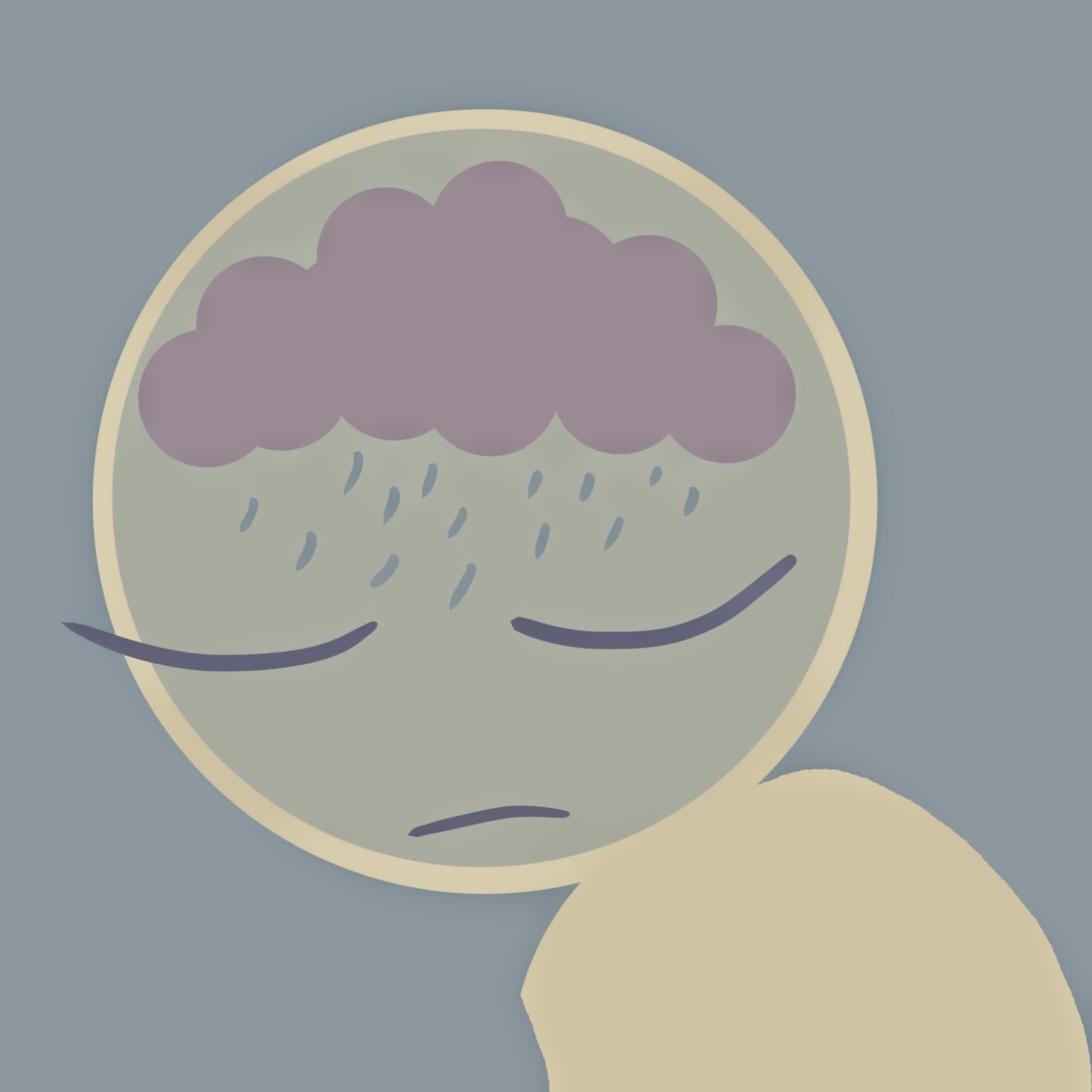
The word was storm and the only constraint is a square format. I chose my colours on coolor first because I wanted to start with a pallet so I could eliminate outlines and just draw straight in colour. I tended to stick to round shapes because the brush is already round and it helped ease me into working in shapes instead of lines.
I don't really like this one that much, I think maybe because it doesn't have a clear concept. I don't think it really works as a picture for the word storm.
I liked this one much more, it had a clear concept and the whole thing just seems more balanced. I think it also works better as the other one is just floating spot illustration whereas this one goes off page. There's just something about it going off the page that makes it seem more natural .
I went back in with textured brushes because I thought that although I liked the design the finished piece looked flat and there were just too many straight edges, very clinical. So I used the textured brush to add shadow to the cloud to make it look more angry and voluminous. Then I added the texture around the edges, I did this because the blue background was far too cheerful a shade, but I didn't want to replace it altogether because it complimented the other colours. This way the image is framed while the illustration still goes off page. I added extra blobs of texture further in as well; it makes it look like the darkness is seeping in, makes it seem claustrophobic.


No comments:
Post a Comment