The research brief we got right at the beginning, the take a seat project, was a new and interesting way to come up with ideas. Basically just letting your mind wader while you sat was helping me to come up with ideas. I think the questions worked best for me because they could be answered as ridiculously as I wanted and that gave a lot of room for play. Also in the beginning research stages of this project I found that the drawings I did where I was playing with the different kinds of people I saw walking around the town at clubbing hours. This showed me that it was a subject that I could have fun drawing which is one of the reasons I chose to go along the line of alcohol and clubbing for my further research.
Unfortunately I only did two take a seats instead of three, looking back I should have organised my time better so that I could fit in a third one. When I presented my further research into my chosen subject I feel that I researched a good amount but I didn't stop to consider what of the research would be relevant to my project. So I ended up with a lot of facts that I didn't use at all, I should have done more observational research; looking at the way people move when they've drank, look at the posters used to advertise club nights and more research into that area. I tried to do a broad range of research so that I had a lot of options to choose from to base my book on. But I ended up with a lot of written fact based things that I didn't find as interesting.
I feel the research into the layout of clubs was the most influential on my concept. Its what made me think that clubs were set out to herd people through which is what I got the idea for my plot from. I feel that I didn't build enough on my concept, that there was room for more elements of the club herding like the money and the sexualisation. I could have included the different kind of cocktails I founds or had them up as posters on the walls. I think I picked a concept to use too quickly as I didn't leave time to think of multiple ideas so that I would have a choice to develop from. At the beginning my initial message that I wanted convey was that happiness rather than alcohol was addictive, but this was quite a complicated message to communicate so I decided to just make it so that it mocked the way clubs work and how we still go to them. But that left me without a strong message, because it is a light hearted story it doesn't really stand for or against clubs, rather just showing an aspect of them in an entertaining light. Therefore I wasn't really satisfied with my book as I think it just didn't have a clear view of what it was trying to convey. An aim for my next project would be to try to simplify the ideas I come up with so that I can get my head around visually communicating more effectively, and so that I don't end up rushing to finish and sacrificing quality.
When I was changing my character I spent time looking at other work to get some ideas on what I wanted, I came across the little hero character by Patrick Q (http://patrick-q.deviantart.com/art/Little-hero-Boy-124692451). For the page where the pile of drunk people are asleep I got the idea for using block colour over the entire person from some of Kelsey Heinrich's work, she uses block bright colour to fill in entire characters and its a simple way to make them stand out from each other in a crowd and to avoid using too much colour it gives it a much calmer tone. In my next project I am going to look into more contemporary illustration as I'm in the designing and developmental stages because I always end up feeling disappointed in my final piece and don't really like the style but I haven't put enough effort into looking at different styles and learning new techniques.
In my image making process I tried to develop my character for the best visual results. My first hurdle was the decision to change my character as I just didn't like the design of the other one and found it awkward to work with. Since I hadn't drawn the new character much and wasn't used to it, I set myself the task to play with the character and get to know how to draw it fluently. The book Facial expressions: A visual guide for artists by Mark Simon was a great help in making the characters emotions more believable and to get a wider range of facial expressions in so that the character didn't seem flat. The thumbnail plan of my book gave me rough guides to the panels on a page and what kind of images I wanted to show. This made my first drafts easier because I knew roughly what they were meant to look like, giving me more time to work on the visual aesthetic of it. My aims, in light of my book, for my next character work is to try playing with full body poses as I still struggle to draw a consistent body form. Also to try and draw characters from more dynamic angles as I mostly drew from a front on view and with less of these simple and boring images it will give the characters depth and a 3d form.
Admittedly I didn't do enough work for this project over the Christmas break but I feel that I planned my time enough to complete my book to a good standard. I think that I was reasonably critical of my work while I evaluated it at certain points but nearer the end of the project I changed stuff less because I didn't want to cause a sudden larger amount of work to do. My aim for my next project will be to have more evaluative moments, especially near the beginning of the project in the design and development stages, I'll try to question as much as I can to demand the best form my work. Again my blogging has come afterwards, I always forget to set time aside to blog what I've done and since I don't always have access to a camera it can be difficult to document so for my next project I am going to keep a notepad that I will write down all my thoughts regarding the project and all the critical decisions I make. This way when I blog I'll be able to include my thought process at the time instead of blogging retrospectively.
With my book I was trying to mock the way clubs are made to herd people through in an entertaining way. I'm not sure I got across a specific opinion on clubs and instead just gave an amusing story about how they work but one of my aims was to entertain so that went well. One of my challenges for this project was not using speech in my comic, I found this difficult and that's why I relied a lot upon facial expression to convey what was happening. I tried lots of different panelling compositions because I wasn't really sure of how to structure it visually. So for my next comic/book structured project I will look into the design of comics and how they tell a story. Looking at panelling, expressions, poses, angles and how the plot flows.
ACTION PLAN:
1: Plan time from the very beginning of a project.
2: Consider what is relevant.
3: Simpler concepts.
4: More initial ideas/concepts.
5: Look at more contemporary illustration and learn from it.
6: Dynamic angles.
7: Blog notepad.
8: Learn more about the structure of a comic.
Monday, 27 January 2014
Final Crit


Aims:
To document my organisation methods: photograph and blog my timetables and check lists.
Use criteria as headings where appropriate: Use key words from the criteria in my blog titles to label what I'm doing.
Flag your critical incidents and how these problems were solved: Talk about the problems I encountered while working and what I did to resolve them.
In the final crit I was given feedback by Jessie:

She says since she can't see my blog she an only go on the body of work and previous crits but it seems to be covered.

Here she mentions how it is a 'tricky idea perhaps to visually communicate' I feel that since she was in previous crits with me, and already knew the kind of message I wanted to get across, she found it easier to see what was happening and it made more sense. I'm not convinced I set it out well enough for it to really work the way I wanted.

Talks about how I've developed my characters.


We also left a sheet out for general comments on our work and some students from the FE course were in the room too.


Sunday, 26 January 2014
The Factory: Bound and printed


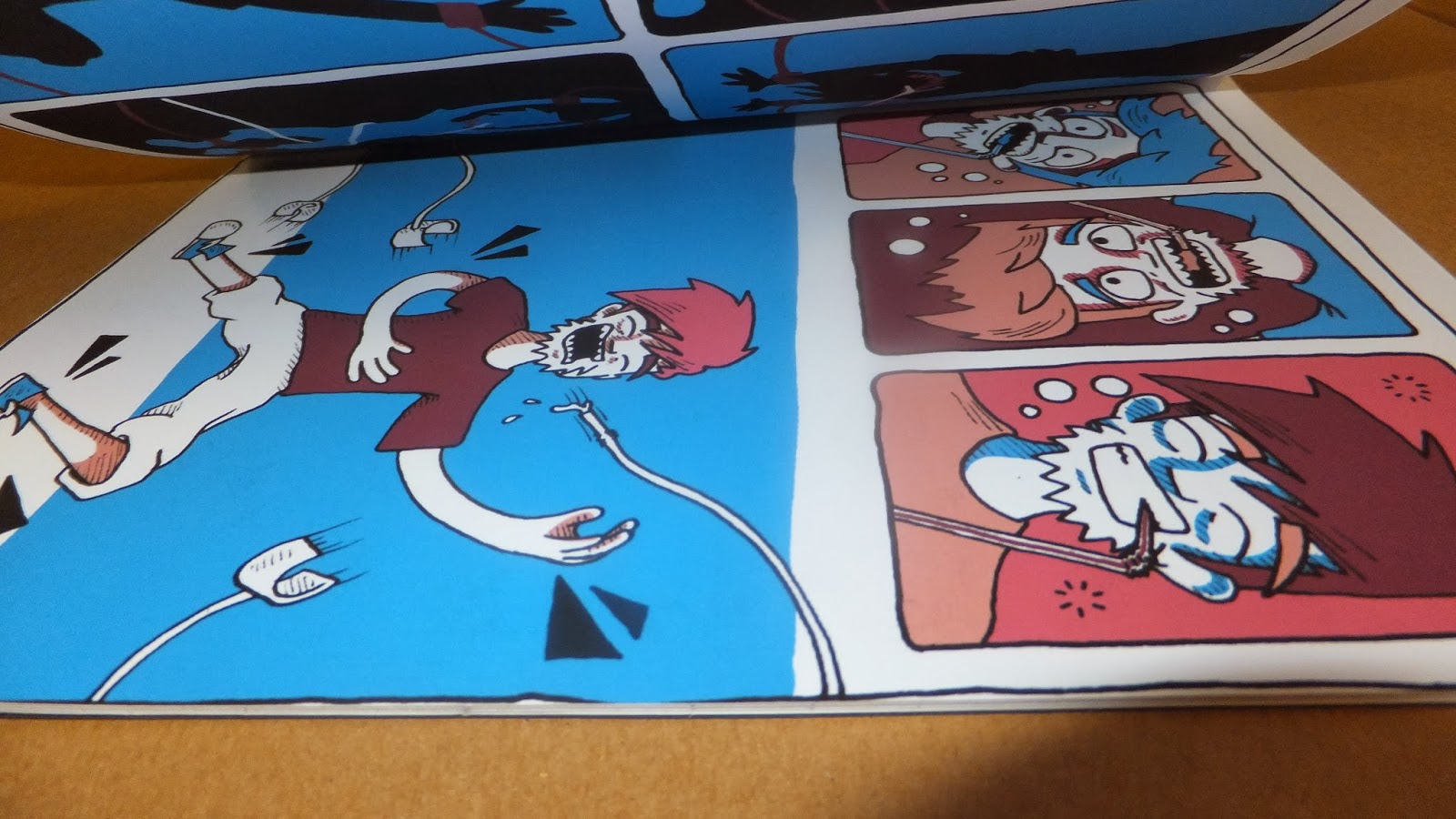
The first issue I had once I'd scanned in and cleaned up my sketches was the colour pallet. In my original tests I decided upon using blue ad orange but on screen it didn't look right and it just didn't work with some of the pages as there were too many open areas touching each other for an even colour balance.
I experimented with the hue and saturation tool on Photoshop, I also tested a mix of different hues of orange and blue to find a matching one. While I was playing with the hue and saturation tool I came across the combination of the blue, skin tone and pink for the hair. I Lightened that skin tone in some tests so that it made the white look like a more convincing skin tone. Then I chose a 4th colour to use: the purple for the shirt and eyebrows as I wanted something in a similar colour to that of his hair.
For this first page I added in the van digitally using the same colour scheme as the rest of the artwork. I wanted to simplify my earlier design so I just addressed the factor of identifying what the black holes people are being sucked into above, so I chose to just display the van. I made the blue swirl and made the wheels an oval at an angle because I wanted to give it a sense of movement and speed.


I inserted most of the posters on this double spread on Photoshop using the transform perspective tool.


The left page here was one of the first images I worked the new colour scheme into. I feel like this is one of the most balanced pages, where the colour scheme works well. Whereas with some of the other pages the colour scheme causes a large amount of white spaces.


I really like the way the silhouettes came out here. I had to draw out the entire character and then black it out to do this but it went well.

I had to use reference of my flatmate Hollie for these poses. There were a lot of awkward angles that I couldn't get the hang of without a guide.


I decided to single out my main character by colouring all the other people in block colour. I continued the colour scheme and coloured them in rows so that they looked more structured and balanced.

This was a last minute design as I'd cut my book down to 19 pages, so using saddle stitch binding I'd have an extra page. I thought this image of him fallen asleep was a nice way to round it off.

While I was binding I had trouble threading the string through my holes and ended up damaging my middle spread by stabbing a couple of holes in it.

I'd have liked to have done this neater in retrospect, I thought it would be a little quirky looking just hand drawn quality but I feel i should have had at least a rough guide ruled out to make it neater.

While cutting down the edges of my book I found that I hadn't left enough bleed around the panels. I should have measured out the size of my book on card and used it as a guide, instead some of the pages have the 0.5cm guttering i planned and some have it almost completely cut off.
Wednesday, 15 January 2014
The factory Continued...
I've started developing my drafts into my final artwork; Redrawing pages and inking up some of my drafts to be traced or photo shopped in.
First I had to make some cuts, due to the amount of time I had left I couldn't complete all 28 pages I planned at a good standard so I'd rather simplify the plot line than sacrifice some visual quality. I entirely cut out the ending scenes I had planned of my character waking up in bed and having a flyer on the floor. I simplified some pages so that there were less panels; for example the pages where he is first caught in the clamps. Instead of having a panel on every limb being caught I simplified it by making it into one image mid action of him being caught.
I also got rid of some of the unnecessary pages such as the ones of him dancing as there were a lot of those. Also the page that was just displaying the lights dancing around his face was mixed with him trying the drink at first and beginning to like it. I made sure the pages didn't looked cramped and cut down what I could to make it a manageable size to develop and make.
This is the front page. During a tutorial I was told the grass verges and road around the van weren't really needed. I felt like the top panels were nice and simple and the bottom just didn't go with that so I'm going to experiment with different ways to draw the van in and create a sense of movement with it.
For this double spread the signs of what you see in a club are all down the walls like posters. But drawing the posters at an angle got really confusing so I've measured out the boxes and drawn them flat then i'll use Photoshop to adjust them to the right angle.
For this page I really liked how the draft had turned out so I adjusted some of the features to better it then inked it up and I'm going use Photoshop to put it into the scene digitally.
I based this page off one of the colour experiments I did because i liked the facial expression.
I decided to hand draw the panels but draw out the lines first with a ruler because I like the look of it all being hand drawn and slightly wiggly but there's a fine line and it also has to at least be roughly the right shape.
This is my plan as it stands. My digital print session is on Monday at 3pm and by then I have to have all the pages drawn, and cleaned and coloured on Photoshop. I only have three double pages left to draw and my plan for tomorrow is to get in early and get all my scanning out of the way so I can start cleaning up my images.
The Factory
I planned out my story page by page so that I could have a structure to work to and so I enough time to develop and refine my images.


(These pictures are from later in the project looking back once I'd'd already made adjustments.
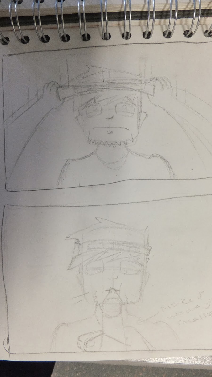
Then i started drawing out some drafts of the panel.
At this point I decided I didn't really like the look of this character. His head was an awkward shape to draw, I hadn't figured out his body proportions and I felt it was hard to do different facial expressions on him.
So I started out playing with different faces to see if i found a new character to develop.
I liked the bottom face because it looked cartoon-y and his big squidgey eyes ware good for shaping into different expressions.
then I startded drawing out drafts of my panels again using my new character, doing all the drafts helped me to learn how to draw him consistently and fluidly.
All the while i had pages where I just played with drawing him in different moods and positions.
This one was just me playing with his position but I really liked it so I inked p the main detail and edited it into my plan.
This was my first go at drawing the bar man, I wanted him to look creepily happy with his grin like almost in pain.
I just really love this super grumpy face.
Playing with some colour for shadow.
above is my first attempt at my big double page spread of drunk people all asleep in a pile. I this first one I tried to draw them in matching detail to the characters throughout but filling an entire double spread with the many detailed characters was too time consuming so I looked at doing it another way.
I did wavy lines to draw the characters within and downed the detail.
In the photo below i was referencing a book of people doing facial expressions, it really helped with creating more believable emotions. Then did the blue shadow again and I decided that's the colour I want to use in my final piece.
Testing out different colours.
A draft of a page where I experimented with blue and green but I've decided the green doesn't show enough contrast to the blue for it to represent the light to the blue's dark.
I played around with an orange highlight because its opposite blue on the colour wheel so its a complimentaary colour. The contrast is high which is what i wanted and the brightness of them makes it look fun and one of my aims is for t to be fun and entertaining.
Subscribe to:
Comments (Atom)