

The first issue I had once I'd scanned in and cleaned up my sketches was the colour pallet. In my original tests I decided upon using blue ad orange but on screen it didn't look right and it just didn't work with some of the pages as there were too many open areas touching each other for an even colour balance.
I experimented with the hue and saturation tool on Photoshop, I also tested a mix of different hues of orange and blue to find a matching one. While I was playing with the hue and saturation tool I came across the combination of the blue, skin tone and pink for the hair. I Lightened that skin tone in some tests so that it made the white look like a more convincing skin tone. Then I chose a 4th colour to use: the purple for the shirt and eyebrows as I wanted something in a similar colour to that of his hair.
For this first page I added in the van digitally using the same colour scheme as the rest of the artwork. I wanted to simplify my earlier design so I just addressed the factor of identifying what the black holes people are being sucked into above, so I chose to just display the van. I made the blue swirl and made the wheels an oval at an angle because I wanted to give it a sense of movement and speed.


I inserted most of the posters on this double spread on Photoshop using the transform perspective tool.


The left page here was one of the first images I worked the new colour scheme into. I feel like this is one of the most balanced pages, where the colour scheme works well. Whereas with some of the other pages the colour scheme causes a large amount of white spaces.


I really like the way the silhouettes came out here. I had to draw out the entire character and then black it out to do this but it went well.

I had to use reference of my flatmate Hollie for these poses. There were a lot of awkward angles that I couldn't get the hang of without a guide.


I decided to single out my main character by colouring all the other people in block colour. I continued the colour scheme and coloured them in rows so that they looked more structured and balanced.

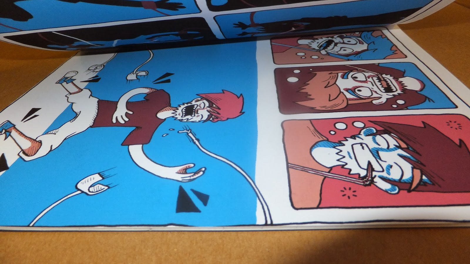
This was a last minute design as I'd cut my book down to 19 pages, so using saddle stitch binding I'd have an extra page. I thought this image of him fallen asleep was a nice way to round it off.

While I was binding I had trouble threading the string through my holes and ended up damaging my middle spread by stabbing a couple of holes in it.

I'd have liked to have done this neater in retrospect, I thought it would be a little quirky looking just hand drawn quality but I feel i should have had at least a rough guide ruled out to make it neater.

While cutting down the edges of my book I found that I hadn't left enough bleed around the panels. I should have measured out the size of my book on card and used it as a guide, instead some of the pages have the 0.5cm guttering i planned and some have it almost completely cut off.
No comments:
Post a Comment