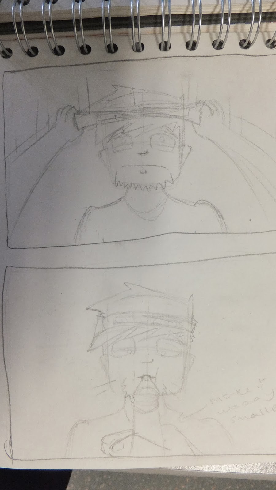
(These pictures are from later in the project looking back once I'd'd already made adjustments.
Then i started drawing out some drafts of the panel.
At this point I decided I didn't really like the look of this character. His head was an awkward shape to draw, I hadn't figured out his body proportions and I felt it was hard to do different facial expressions on him.
So I started out playing with different faces to see if i found a new character to develop.
I liked the bottom face because it looked cartoon-y and his big squidgey eyes ware good for shaping into different expressions.
then I startded drawing out drafts of my panels again using my new character, doing all the drafts helped me to learn how to draw him consistently and fluidly.
All the while i had pages where I just played with drawing him in different moods and positions.
This one was just me playing with his position but I really liked it so I inked p the main detail and edited it into my plan.
This was my first go at drawing the bar man, I wanted him to look creepily happy with his grin like almost in pain.
I just really love this super grumpy face.
Playing with some colour for shadow.
above is my first attempt at my big double page spread of drunk people all asleep in a pile. I this first one I tried to draw them in matching detail to the characters throughout but filling an entire double spread with the many detailed characters was too time consuming so I looked at doing it another way.
I did wavy lines to draw the characters within and downed the detail.
In the photo below i was referencing a book of people doing facial expressions, it really helped with creating more believable emotions. Then did the blue shadow again and I decided that's the colour I want to use in my final piece.
Testing out different colours.
A draft of a page where I experimented with blue and green but I've decided the green doesn't show enough contrast to the blue for it to represent the light to the blue's dark.
I played around with an orange highlight because its opposite blue on the colour wheel so its a complimentaary colour. The contrast is high which is what i wanted and the brightness of them makes it look fun and one of my aims is for t to be fun and entertaining.


No comments:
Post a Comment