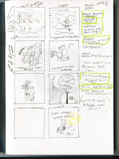
Help:
At first i was going to have the flag signals for help across and block colour capitals behind them, i thought this worked because it is reminiscent of the proper cover and it'd be bright and cheerful.
But then all my other ones started being character orientated so i swapped this one out for the idea of the prop guy who did the photo shoot for the original cover, i've shown him carrying all the flag props and tripping, yelling out 'Help'. I'm kind of enjoying making the covers like really lame puns because it adds a sense of humour to this project.
Starman: I have a little character perched in clouds with the piggy stardust lightening bolt on his face, i thought this was kind of nice because Bowie is dead now and HE is the star man in the sky. Not sure if it doesn't fit in with the 'puny' nature of these covers.
Smells like teen spirit: I just went with the obvious, a teenager with a weird whisky cloud around them…because teenagers do smell. that is my only humour there.
Who want to live forever: This one was hard as there isn't really any puns that fit in with this and its a bit more sad and serious than others. I have three figures moving from solid to nothingness as they drift away. This was meant to like represent death.
Go your own way: I honestly just went for the most obvious this here, a little sign saying your own way. but i think i might need o add more to that image as its very simple.
Mr Blue Sky: This is my favourite because its just a man but his face is sky. Sometimes i think the simplest most stupid jokes work the best and this one is my favourite.

No comments:
Post a Comment