Tuesday, 31 March 2015
FATE
The deadline has been extended to tomorrow! It's like they knew we'd need just a little extra time. Managed to get the pieces done but haven't evens started to get the research boards together and we couldn't possibly do them up to any decent standard in the amount of time we would have had left.

BAM

I had to erase some of the detail on the foreground shrubbery because the text didn't stand out from it enough. So I finished colouring and put the text on, I made it white because I think I already used as many colours as I should be allowed. Acceptably 11 colours isn't exactly the reduced pallet I was thinking of at first but I think since this piece is to work just as a print that it needed more colours to make it 'pop'
Now I just need to colour and place the online piece and then we can start the research boards. The deadline is today!
Monday, 30 March 2015
COOLOR RAMPAGE
I am just racing against time colouring right now. I need to get it done. Panic stations are lit!


I have an 11 colour pallet for the print based piece and for the comic panels of the online piece.
Again I've chosen mostly greens so that the nature can be varied and layered. The red, orange and yellow are what I plan to use to colour buildings and bricks, the blue is to be used on metal formations and the purple is mainly to add some dark contrasting tones to the piece.
Friday, 27 March 2015
I am COOLOR than you
So since I tend to struggle with colour pallets I was really going to be relying on Rosie for help there. She showed me a couple of things she uses to help her with colour pallets, one thing was going on site selling embroidery thread and clicking on the sets of colours then just eye dropping them to use on photoshop. I think this was a good way to deal with our project because we wanted to use colours that were almost pastels but still with some playful brightness coming through. The embroidery threads as a rule tended to be slightly desaturated colours and hues that would easily fit together. But the best site she has found to use is COOLOR. This site actively suggests 5 random colours that share similar values or compliment each other. You can then decide when you like a colour and 'lock' it down like in a fruit machine. Then get it to randomly choose the other colours keeping that colour in mind.


These were the colours I have selected to use in the animated comic. I used most of the colours to create greens because I know as time progresses in the panel there is an upsurge of nature and everything become green and leafy.
The original non green colours I started out with were just blue, red and yellow. Those were the ones I picked on my own but once i'd coloured one city in the primary colours looked to clumsy and bright. It gave it a patronising, child like colour scheme and I think it lowered the quality a lot. Luckily Rosie was there to help. We played with the hue/saturation tools to get a look at similar colour schemes and then we swapped in ones we liked using the select colour range that we were just taught about. It made the whole swapping colours process way easier. I think thats something that I should use more often because sometimes I just stick with a colour scheme I know doesn't work because I've already coloured so much in and I'm unwilling to redo all my work.
With the hue saturation tool and Rosie's colour wizard powers we realised that the blue was too powder blue whereas we wanted something slightly greenish maybe a dark aqua colour. The red was too brilliant red and the brightness took attention away rather than smoothing over it. So we changed that to a darker burgundy. And finally the yellow was just too diluted and pale sunshine yellow so we made a richer golden yellow to contrast from the more reserved blue and burgundy.
Here are the final coloured ones (bar two that I sent to Rosie because she said she had some time free to colour and it could save us more time we can use to make our presentation boards with) I think were cutting this a bit close to the deadline but now the pressure is on were working a lot better, were bouncing ideas off of each other and helping with each others jobs. Oddly I think the pressure of an impending deadline has helped us to loosen up and just focus on what needs to be done instead of having time and just getting in a tizzy about what to do next.
Wednesday, 25 March 2015
A world of change

In replacement for my comic panels on the 60's I decided to use the whole decade as comparison to our lives now. I've used a format I used to love playing with in first year, in fact its how I did my border image on this blog,

I've found it's an easier way of showing an image that is depicting something intangible. I can give a sense of something by showing lots of examples of it interlocking into one image. It tends to get a bit over the top and messy though so I tried to keep it down to 2 or 3 layers of images.

The next panel was to try and show how we are now. I decided to not use the circle format and layering for this one because I'm trying to show a drastic change in opinions and lifestyles. I think this one looks stark and sad in comparison which is what I wanted.

This was part of my original comic panel designs. I liked the idea of the buildings sagging over and looking sad and used. I used the dotted cloud to try and represent the boredom. I think i'll colour the people themselves all grey to show that they are living a grey life void of excitement.
Thursday, 19 March 2015
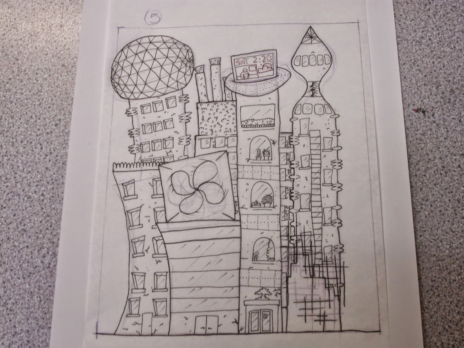
Print idea established
.jpeg)
This is my plan for the print piece back ground. I made the foreground shrubbery because for one it frames the city and stops it just being a floating spot illustration like in the animated sequence. But I did it mainly because I plan to put the text there and I needed a less detailed back ground to put the text on top of because my text is patterned and transparent in places so I need it to stand out.
I put the trees at the sides to continue the natural frame around the city but I mainly chose to do it because of a new line as texture style i've been doing.

Here is the same texture I used on the muscle clinging to this skull. It gives a grainy texture to the pieces. I keep trying to expand my line as texture skills because in recent work detail is something I'm pushing to the max.
Wednesday, 18 March 2015
Font Fun

This is the text I have created. I only did the word imagine in it for one because it is a time consuming task but mainly because Imagine is the main theme of our.. It's all about imagine what could come and the excitement that comes with it.
In all this text took me about an 2 hours to do because I spent a really long time trying to get the measurement of the outlines done properly so that the whole thing would look like a regulated font and not just a jumble of hand drawn letters. Fred has pointed out that as illustrators font and typography is not a strong point so I tried really hard to make this good so that looking at it no one would have any idea how much I struggle with simple typography. It's all about faking it till you make it.

This is it cleaned up and set up so that I can change the colour of it in one swoop easily. I had to get help off of Adam to make photoshop do exactly what I wanted for this though. My knowledge of channels and interacting with them is poor and I forgot how to do it. Now I must remember that cmd and clicking on a channel will select everything in that channel.
I'm not sure if orange is the colour I will use I just picked that at this point because I know it heavily contrasts from the greens I was using. But I'm wondering if the pattern detail inside the lettering will transfer over the print successfully.
Tuesday, 17 March 2015
ABORT MISSION

Remember this lovely comic plan. All based off the 60's futurism coming from the excitement of the moon landing. The moon landing was in 1969 not 59. I even read it as 69 but my brain was like yeah 69 comes before 60. I feel rather silly having based my ideas for the comic off of this...
Sunday, 15 March 2015
Ten Year city
I finished the cities, i'm realising at this point that these may be quite time consuming to colour as there is a lot of detail on them. I'm thinking that we should try and keep the colour scheme relatively simple so that it makes the large amount of detail more palatable. I think if I just went in and covered it in every colour, which I tend to do when left alone to colour, it would look too loud and busy. But luckily we appointed Rosie the Colour Wizard so she has to help condense my selection of colours.

Rosie was worried that because I'd done the buildings in such detail that it would be a shame to cover them up with the characters but I think that if they are the right sized then they would only take a section of detail out in the centre bottom. I made it so most of the more dramatic changes are at the tops of the buildings so that it would be seen over the characters heads. I think the fact that the characters are drawn with a more minimal approach to detail that they will balance out the image and give it a centre to focus on.
Wednesday, 11 March 2015
Tracing til the cows come home

I was thinking about the comic and how it would start, at this point I only have 2 panels but I think that to get the message across clearly there should be like a narrating voice over the panels in text.

We were considering the layout for the animated comic panel and we decided that because we want to display the characters in front of the buildings that it will have to have them quite close up in the foreground of the image. Therefore we decided to cut off at about half way through the thigh. This way the image looks more like as photograph that would be taken as well.

I started drawing out my cities. At first I just did a rough outline of each stage on tracing paper. I did this so that I could figure out the technological gap between each year and to make it flow. Also with drawing it on tracing paper I could overlay them so that each cityscape is a similar shape to the last so you can see where the improvements are happening. A lot of the elements run through 5 or 6 of the 'years', this is because we felt a thing that was pushing our project forward is that instead of just showing in ten years time we are showing the progression till ten years time.

I directly traced some elements like cracks in the buildings so that I could make them grow bigger as time went along.
I managed to get 6 of the cityscapes done today.


But now I've done 6 of these in as many hours I'm very sick of drawing buildings so I've left the remaining four for another day. Next thing to do is to plan out the rest of the panels leading up to the animated one. Especially because I think that to make them congruous, any characters in the panels will need to be drawn by Rosie. Apart from that things seem to be coming together and we're managing to work this project as a team.
Tuesday, 3 March 2015
GIANT NOSTRILS OF DOOM
The Maccabees - Go Was the final song I decided to do. From what I understood of the song it was about a break up. About two people who were having problems and were trying to fix it but at the same time knew that their attempts were futile and there was only one course this could take.


This was my initial sketch. I was trying to make the image balanced and equal. Looking at it now I don't think I made the pushing apart urgent enough and instead once coloured they look like they are just leaning on each other. It was also pointed out that my eyes of doom without any other facial features just look like two giant nostrils. So I have accidentally created battling nostril creatures that live in a cardboard box.
The box was there to represent the sagging and falling apart life they shared. I decided to go down a route of brighter colours in this one to make it bright and eye catching.
I wasn't really sure what kind of colours to use so I was going down my usual route which is choose colours that I think go together and then when they inevitably don't I use hue/saturation tool to change the colours.
These colours somehow look too light and innocent. These are the colours of a small boys toy and that is not what I'm going for.
This seemed more close to a good pallet but the green of the box doesn't fit in with the rest of it.
Now the box was a more fitting colour I added a background colour to make them less stark looking on the black background. The pink however was too close to the pallet of the monsters and I felt like it needed something contrasting to make it pop and feel balanced.
In the end I quite like this one for the design and composition but I'm not sure I ever found the right colour pallet. Maybe bright colours just wasn't the way to go in the first place. But as usual I have come to the conclusion that the weirder and gross looking the more fun I have drawing it. This secret 7 brief gave me a steep learning curve in the way I deal with the drawings I scan in. The colouring and texturing I do digitally can drastically effect the way the final piece works. I think working to such rough themes gave me time more just to figure out what it is that I want to draw. And it seems that weird and dark grungy things are my forte at this point. And i'm ok with that because I enjoy it a lot more and get a lot more satisfaction from it. This brief has taught me more about the way I work as an illustrator and the way I think than about working towards a professional brief.
Monday, 2 March 2015
Throw away your television
Digital Witness - St Vincent is the next song I tried. I based this one off of the line 'What's the point of even sleeping?'
I was kind of going of the feelings of I don't need a bed, I can see everything. Showing people's addiction to digital stimulation and how people will willingly sacrifice sleep for it. So the big third eye is his digital eye and its always open even though them other eyes are closed. The bed is burning up to show that it is no longer needed, I started naming all the files for this one 'Throw away your television' after the Red Hot Chilli Peppers song because I think the songs have a similar message in respect to our technology addiction.


I tried to make a television static texture that I could layer over onto the eye to make it more obviously digital.

But it just didn't look right. maybe it would work better in a green hue but then I think I would loose the distinction between the pupil and the rest of the eye. I've tried to make it look piercing by adding little lines leading into it.

This is the point of the picture I want people's eyes drawn to.

Again I think my control over textured brushes is a little rusty but I seem to be figuring it out. At least this went better than the snow one.
Subscribe to:
Comments (Atom)