I was thinking about the comic and how it would start, at this point I only have 2 panels but I think that to get the message across clearly there should be like a narrating voice over the panels in text.
We were considering the layout for the animated comic panel and we decided that because we want to display the characters in front of the buildings that it will have to have them quite close up in the foreground of the image. Therefore we decided to cut off at about half way through the thigh. This way the image looks more like as photograph that would be taken as well.
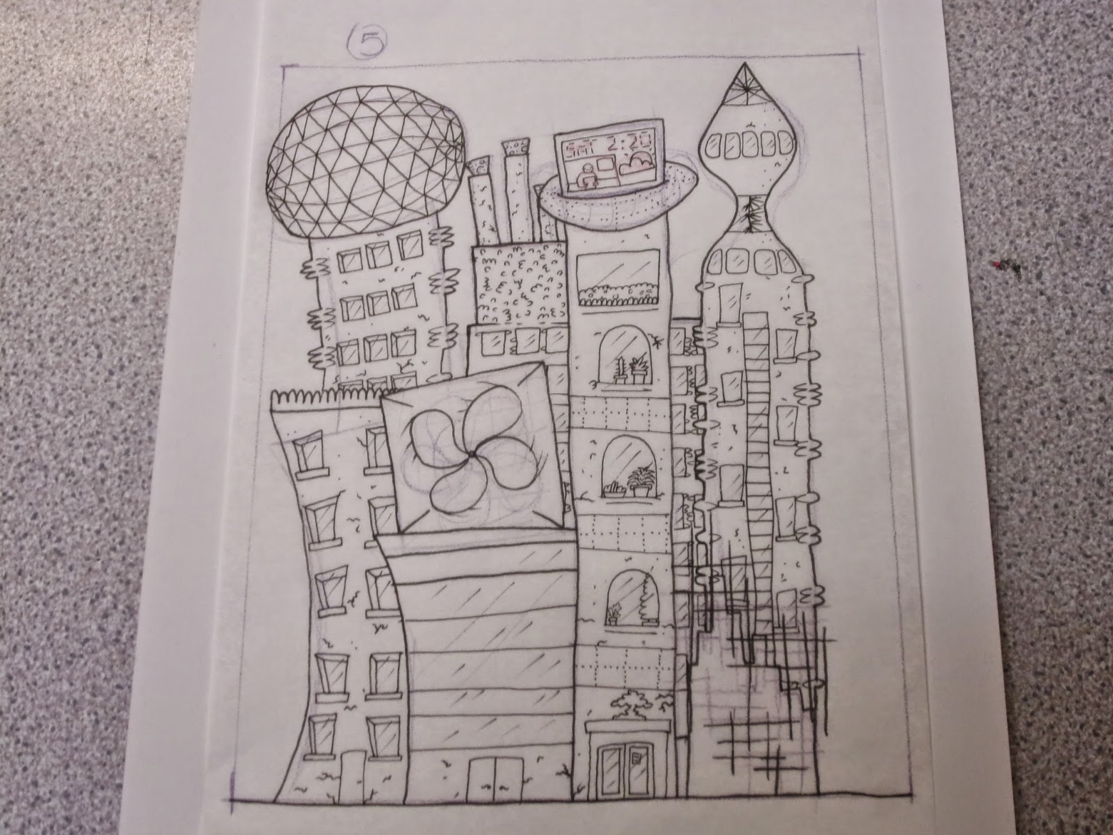
I started drawing out my cities. At first I just did a rough outline of each stage on tracing paper. I did this so that I could figure out the technological gap between each year and to make it flow. Also with drawing it on tracing paper I could overlay them so that each cityscape is a similar shape to the last so you can see where the improvements are happening. A lot of the elements run through 5 or 6 of the 'years', this is because we felt a thing that was pushing our project forward is that instead of just showing in ten years time we are showing the progression till ten years time.
I directly traced some elements like cracks in the buildings so that I could make them grow bigger as time went along.
I managed to get 6 of the cityscapes done today.
But now I've done 6 of these in as many hours I'm very sick of drawing buildings so I've left the remaining four for another day. Next thing to do is to plan out the rest of the panels leading up to the animated one. Especially because I think that to make them congruous, any characters in the panels will need to be drawn by Rosie. Apart from that things seem to be coming together and we're managing to work this project as a team.


No comments:
Post a Comment