Quantity
I think I printed too much of my prints. I was being overly optimistic with it, some sets had 20 or 30 copies. I only sold a handful of things and by printing so much I only increased my losses.
Next time I will do small set of between 5-10 copies at most, this will make transport easier and storage.
Pricing
The prices I gave my things were quite under priced I think my screen print was £5 and everything else was between £1-3. I think by giving them such low prices it made it obvious that I was not a professional or at least not up to the standards of the other people in the main room. I was pricing with myself in mind because normally when I go to thought bubble I only have a certain amount of money with me and so I'm very picky about what I buy and like to get lots of small cheap things. But I think that it's not really down to price, it's really about whether people like your work or not.
Presentation
The stands worked well on space saving but by being individual stands they were flimsy and easily knocked over, next time I would like to make a tiered stand that could hold multiple prints. Its a more sturdy design and the majority of table display stands were of a similar design. The price tags we used were just arrow shaped post its and I think that we should have used something sturdier, the post its fell off quite a lot and we had to stick them directly on the comics and it made people unsure on which they were allowed to pick up and purchase.
Student Life prints
These didn't sell well at all and they received little interest. I think the issue was that at first people thought that they were three different sets because they are packaged together. And then I put a little sign but it would have been clearer if I put individual stickers on them and packaged them properly. I think doing a project on being a student was a little cliché, most people have done something on being a student before. But I never considered it from a buying perspective, I don't tend to buy prints specifically aimed at student because they normally make sweeping generalisation. The idea of a student buying it seems weird now its more like a present you'd receive off some relation who doesn't know much more about you other than you are a student.
Jump
I think this was one of my most successful comics. It still didn't sell masses but more than most of my other products. I think the size caught a lot of peoples attention, mainly women. As a woman I am always drawn to things that are miniature versions, like travel shampoo and baby shoes. So I think the size added a lot of charm to the piece.
This was a comic I ended up trading with another person who was selling. I had been over to her table earlier and bought a comic but expressed great interest in a tiny comic she made about ant puns. She came over to our table and offered it up as a swap. I never realised that I could go round and offer up trades to other sellers. It was a good way to chat to people.
Procrastination
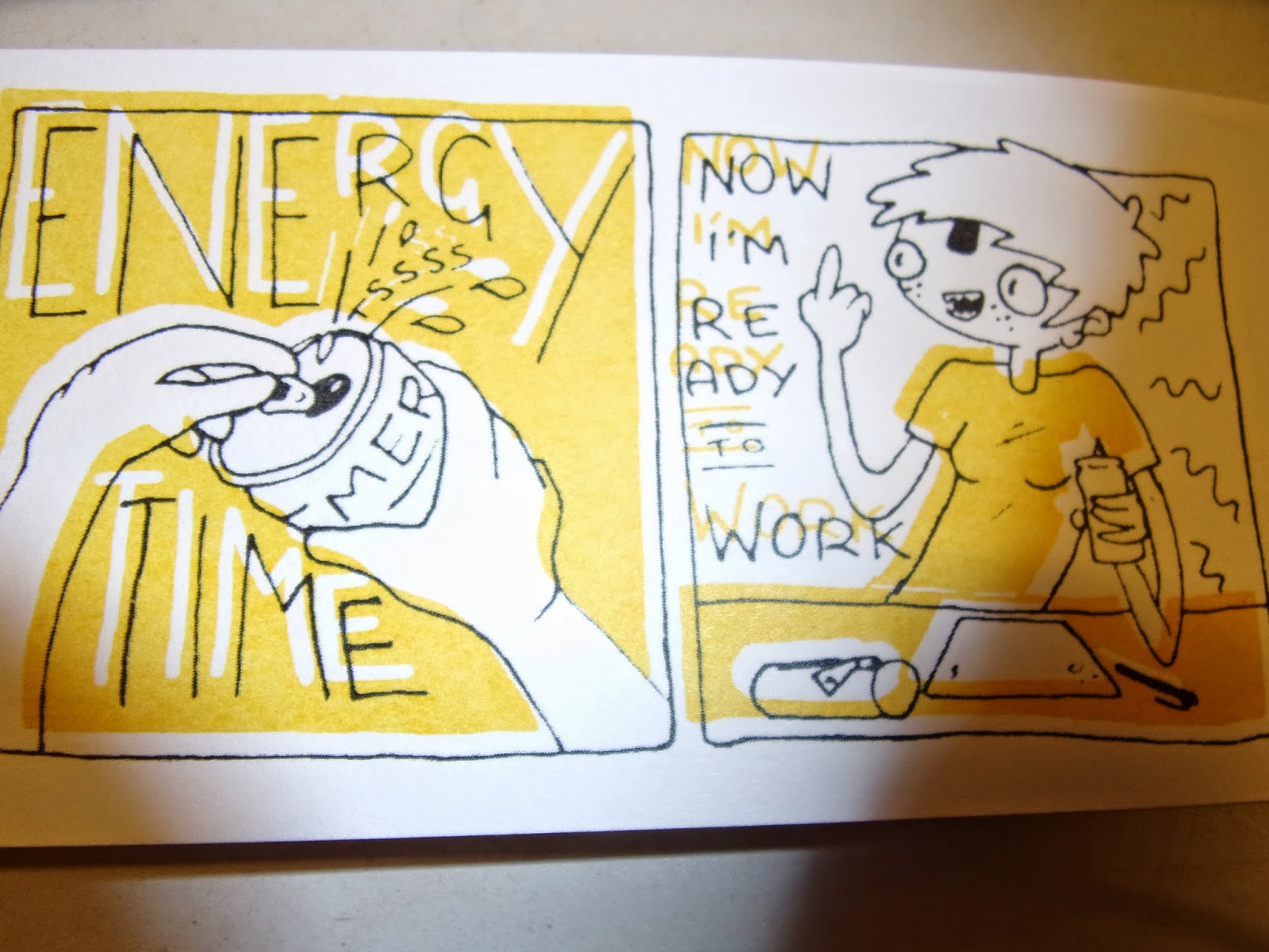
This was my favourite comic I did, I enjoyed making it and it was something everyone could relate to. Unfortunately my screen printing skills leave much to be desired and I think I butchered my design with it. But I sold two of them and they were my proudest sales. The first one paid £5 and I was really excited that someone would hand over note money for my work. The second one was on the second day though at which point I'd reduced the price to £4 in the hopes of encouraging more sales.
Ugly Simpsons
I think this piece didn't work because it had an unclear audience. The recognisable characters drew in children which I thought was great because I figured since it was only a pound a print it was within a child's price range. But a couple hours in I realised that I'd drawn Maggie holding the middle finger up. Children had been coming over interested in the Simpsons and then the parents would swoop in when they saw the obscenity. I think in future if I do any work aimed at kids I should have it in a separate section and obviously labelled so. If we have a tiered display stand next time then the things with adult references in can go at the top out of reach of children.
Amazon woman
I only sold one of these and it was to Hollie because she was sad no one bought one because it was her favourite. I think that having an illustration class around all the time we've started to appreciate work for different reasons and we see it in a design aspect. But to some one without any of that it was just a woman's face in green and purple for no apparent reason. I think my projects need a clear purpose and audience before I start because otherwise I end up making just a random drawing, its not illustration because it illustrates nothing.
Socialising
The event was really good for making creative acquaintances, we went round and chatted to people who were selling. One guy works in Leeds and was a recent graduate, he rested our minds on certain things and says that he doesn't really have any trouble getting illustrative jobs, which is reassuring.
Our table was next to Dilraj Mann who I ended up chatting to because Hollie was still at college printing off comics when the convention started. I had been singing to myself under the assumption that no one could hear me since no one had reacted to my noise. It turned out he could hear me. The whole time. But after the initial embarrassment we had a lovely chat. It feels encouraging to have some one like him liking my work.
Kristyna Baczynski came over to our table and bought two of my comics which I was really happy about. Because most of the day people hadn't even approached our table so I'd spent most of it chatting and eating snacks continuously.
We also chatted to these american guys who had done a load of risograph prints, the layering of colours and textures in their work was highly enviable and beautiful. We chatted to them about how they started up their own studio and got their first risograph printer.
I think going around and chatting to people was the most useful thing that I did at thought bubble. It answered a lot of questions about what happens to us after uni and how hard it is to get jobs. It was also just nice making friends in the illustrative world. I like talking to the people at similar stages in their career as me because it's a fun comparison and in 1 years or so they'll be my competition and it'd be great to already have those connections.
Sunday, 30 November 2014
We came here to sell comics and kick butt

I made a list of all of the things I had made, how much it cost me, how much I was selling it for and the maximum profit. I was being very optimistic.

My paper I cut to the right size. Its split into what will be used for what print and how many copies. This is so my printing will run smoother, because I'm going to be in repographics for a while waiting for these to print, I don't want to anger the print guy by being an unorganised mess.

Last minute I had an idea to do caricatures, while they aren't my forte I can do portraits on the spot decently well. I have a disclaimer for attractiveness not guaranteed so people are pre warned. Their just a pound because there's a lot of sitting about and it'll be a fun thing to fill my time with.

I made a box and filled it with ready cut paper for doing the caricatures, I cut a large amount so that I could also spend my time drawing for fun. I always found in past years that I feel more comfortable approaching a table if the person behind is otherwise occupied. It feels weirdly intimidating to have them staring and grinning at you like maniacs trying to sell their work.

All coloured in and ready. I made a border out of the colour pallet I used to colour the main advert in, I really liked how it turned out, its simple and it frames it. It also looks like an intro slide from saved by the bell.

This is our table all set out with prices and ready to sell.


About 3 hours in I realised that no one looked in my comic and it's probably because the cover is boring and also because they may be unsure if it's something they can just pick up and flick through since its significantly higher priced than my other products.

Here we are looking like cool professional illustrators.

We came here to sell comics and kick butt.
Packaged and Pretty

I was binge watching Malcolm in the Middle and packaging all of my prints. For my student life ones I've packaged them as a set of three, I was thinking of selling them individually but I thought that since I created them as a set it would look weird if I sold them separately.

I separated them into three piles so that I have even amounts of each one being shown on top. This way I can show the other prints in the pack without having to print out any stickers with them on. That would be a bit pricey and it already cost a lot for the table and tickets, so I'm trying to budget here.

My jump comic was originally going to be a print but the panelling wasn't very interesting and it didn't really work as a print aesthetically. So I printed it on A5 to make hot dog books because I think that although the panelling isn't very imaginative the narrative still flows so it can work as a comic.

I printed a lot of copies. It took a really long time to fold them all, but it was really satisfying to have a big pile of tiny comics. I think I made it harder on myself by printing it on thick paper but in my budgeting madness I found that its cheaper to bring your own paper to repographics and that was all I had. I think if I had done it on a lighter stock it would have been a lot easier to fold them all and they might have stayed shut and not splayed open like in the photo.

I tied them in little packs like the student life prints but I didn't sell them this way, this was just for transport. Because of the thick paper making them splay open I couldn't just stack them up. So I tied them up in packs of ten to transport to the venue.

These are the labels I made because I realised last minute that others were going to have business cards on their table and I didn't have one. I made these with my logo I drew last year and then my name and blog addresses.

I made them that shape because when you glue the legs together they sit on corners of things. I displayed them on each piece of work so that every one who bought something would get one.

I made these stands because we weren't sure the exact measurements of the table and we weren't sure what we could fit on. These were to save space, I chose the slate coloured hard board specifically because the colour goes well with the colour of masking tape. That way I can just make them with tape and not worry about it showing as long as the tape is put on in straight lines.

This was my mini production line as I was making quite a few stands, better to have too many than not enough.

They work as a uniform set and I think that makes them look better, since they look worse than the professional made ones that other people have on their tables but at least they're up to a decent standard. And light weight for transport.
Saturday, 29 November 2014
Screen Print is my nemesis
So while I was trying to think of different mini projects to do to use for my Thought Bubble table I did a large amount of procrastinating. So I thought why not capitalise on it. My comic is entitled Procrastination, the narrative is mainly wordless and the images worked as like an hourly comic sequence. It showed the rises and falls of my concentration on the work I'm meant to be doing. It was meant as a light humorous comic that was about something that everyone can relate to.

These are my positives for screen print. I positioned the pages myself on Photoshop and figured out where they'd be by making a paper model. The panels don't all line up perfectly but I thought that since the subject was like a flaw, and a common one at that, that people suffer from. That the aesthetic of the comic would suit it more if it wasn't totally clean and professional looking. Obviously I want a certain amount of professionality because it had to stand up next to real professionals at thought bubble which s a little intimidating. But I wanted it to just stand alone as a light, humorous comic and just for fun. So a slightly wonky and hand drawn aesthetic will suit it best.
Unfortunately whenever I tackle screen print it doesn't quite go to plan. I think that when I'm creating something for screen print from now on I need to think about how I'm drawing it and how it will transform to print. I normally draw in really thin fine liners and the thin lines never expose as well as I'd hope. I think I need to take advantage of the possibilities of layering colours. The bigger the surface area of each positive the more likely it will expose well.

Like in Drew Millward's work. In a lot of his work I've noticed that he can do prints that only use 2 or 3 colours but then he uses them and overlays them to create other colours to use. And since those colours are made by blending colours from the inks you're already using they go with the pallet.

So everything was going well in my printing until I reached my black layer. Which is always the one in my work that goes wrong due to the tiny lines I used. The screen half printed and half bled out on my pages. I had a limited amount of time and prints, because of that tried to fix the screen by re-washing it and degreasing it thoroughly but each time it still didn't work and in the end I'd used up all my prints and ruined quite a few of them.

These are the rejects showing the worst of what was happening. The yellow on a lot of them was thick at the bottoms of panels and went orange. I think while I was pushing the ink through the screen I was pushing too much so at the bottom of each panel where it suddenly cut off it left a bulge of thicker ink. But I kind of like that effect, it works in with my idea of having a more hand made feel with little mistakes that add charm.

This is the point that I realised my mistake in having the panels all free drawn and wonky. Cutting out the pages I ruined some more of my comics by cutting the bottom of my panels off. I think what I should have done is measure out all the panels straight and accurately in pencil an then put my ink in free hand but try to stick to the lines. Knowing my hand the minute I try to draw over a straight line it wiggles so it would still get that hand drawn feel. But with the measured guidelines there's less variation in the positioning of the panels.

A big issue was the front covers. Most of the covers black in only partially printed or not at all. The front cover was pretty important to work as well as its displayed on a table and that's the bit that draws people in. I had to come up with a quick fix so admittedly just went over them in pen, being sure to miss some little spots and let the line be thicker in some spots. So that it still looked screen printed.

Some of the pages misprinted and I think I liked these ones the best. The slip in colour gives it a sense of charm. Maybe this is too big a slip but think it' showed me something I like in screen print. I think from now on I will purposely let my screens slightly misalign. I think that if I'm controlling the slip I can get it to a stage where it's just a slither out of line and gives that playful aesthetic.
Ugly Simpsons Cont

I wanted them to be instantly recognisable as a fan art kind of thing. So I decided to draw them sat on their famous couch.

Because I was trying to push the 'Ugly' factor to the max I was using lots of wiggly lines. And I tried to use line to highlight the most unattractive parts, like rib cages and knobbly knees and Homer's clothes struggling to cover his fat. I think that I ended up having Santa's little helper looking like an over-sized rat rather than a dog but I think the recognisability of the pose and the characters will make up for that fact.

For the colour scheme at this point I planned to use the Simpsons colour scheme but to adjust the saturation on the colours so that everything looks dim and bleak.
Thought Bubble: Ugly Simpsons

So this was just one of the little drawings I was doing in a lecture and I really enjoyed it and it ended up looking like Lisa and Bart Simpson. Around the same time Hollie had just bought this Lisa backpack at Culture Vulture and it it truly hideous and that's why its great.


So I decided to do a run of the Simpsons family but in my gross style. It's a bit of a cop out on design but I think it'll be something fun to do and that with the recognisability of a pre existing brand the product will be more eye catching.
Tuesday, 18 November 2014
Propercorn
I decided to pick propercorn for my brief because its a relatively open brief which I think means that a lot of different practices will be going for this and I think a bit of good illustration could stand out. The target audience is 20-35 year olds and since I'm in that category I figure it will give me an easier time catering to the audience. This company know that the best way to someone's heart is through their stomach and they have offered free popcorn for those taking on their brief which I must admit was a big factor in my decision. But mainly I picked it because I looked at their pre existing designs on packets and adverts etc and their light, bright and happy and a designing style I can definitely get behind. And hopefully it will be something that my own style will compliment and work with.
What is the brief problem?
How can they creatively bring to life the ethos 'done properly' to the customer?
What is being asked to be done about the problem?
Find the daily touch points of their customers and create something to communicate why propercorn is good and they should get it.
What is the brief trying to acheive?
To draw in a larger clientèle of 20-35 year olds.
What is the message?
That propoercorn is healthy and made properly. The properly makes it sound more natural like its not all chemicals and e numbers its almost like home made.
Propercorn is THE snack to have on the go for time poor, culturally savvy, young professionals.
Who are the audience?
20-35 year old professionals who are on the go and health conscious.
How will the message be delivered?
The brief was very open on this point. the only information being that it should happen in the daily touch points of their targeted audience. It can be illustration, animation, extension of their packet designs or a way to revolutionise the corner shops they are stocked in.
Who will benefit?
The company. People searching for healthy popcorn. Me if I win.
Can you forsee any problems?
The brief being so open is a little worrying for deciding what format I will use.
I eat way to much free popcorn
With the age range of the audience being so big it could be hard to target the designs to them specifically. I'll maybe just have to target it to the 20-25 year olds because that way I can use our class as guinea pigs and cater to what they like.
Project Proposal: Moving pictures
I intend to poduce:
A 60 second sting advertising a documentary on Terry Pratchett's life
The content will focus on:
His Alzheimers
Quantity (the vast amount of books he's written)
Adventure
I will be aiming to communicate:
The effects of alzheimers
A sense of fun
The universe in which his fiction lived
This will be to an audience of:
Pratchett fans
18+ adults
sci-fi enthusiasts
Concept review:
Comment on the selection of themes, content, concepts or messages:
Good focus on author's life
A really nice approach to Terry Pratchett's experience of alzheimers as opposed to standard uses of concept
Comment on the visual concept of the proposal:
I like that you're using mixed media forms of animation- perhaps explore more bits? try making puppets and maquettes
Comment on the clarity with which the audience and or the context has informed decisions relating to format, duration, media and content:
More context - decide somewhere it would eventually go
More contextual research
Comment on the extent to which the planning of time and resources has been effectively considered in order to enable the production of the proposed work in the time available:
Clear work has been done, needs more organisation and research.
What do they need to do?
Add context to back up your work
Do more experimentation
Storyboard and plan what you're actually going to do
Revised proposal:
I intend to produce:
A 60 second sting advertising a documentary of Terry Pratchetts life using elements of both hand drawn and stop motion animation.
The content will focus on:
His Alzheimers
The universes he creates with his fiction
Adventure
I will be aiming to communicate:
The effects of Alzheimers
A sense of fun
The universe in which his fiction lived
To an audience of:
Adults
BBC watchers
Pratchett fans
Project Proposal: Printed Pictures
I intend to produce a hand bound book of prints.
Then content will focus on Adventure,unravelling and pace.
Then content will focus on Adventure,unravelling and pace.
I will be aiming to communicate the affects of pratchett's alzheimers, to show a positive view of his life so far though and to express the crazy pace at which he wrote books.
my chosen audience would be sci-fi fans, avid book readers and general Pratchett fans.
i was thinking about context, like where it would go in the real world, so far the only thing to mind is like when you get a dvd and it comes with a little illustrated booklet of information and descriptions, like a blurb.on a book
Proposal Review
Comment on the content of the proposed idea:
Got the initial idea. But it needs padding out and more planning it seems like a really rough idea. Possibly doing something through the years and displaying him before the alzheimers.
Comment on the proposed formats/products of the project proposal:
Tiny books > fit in with quotes and research
Comment on 3 strengths that you have identified in the proposal:
The wool > possibilities with binding
Thought about binding and presenting
(3 was left blank which probably says a lot about my proposal)
Comment on 3 things that you feel need further clarification or consideration in the proposal:
Images and content of the book
Images and content of the book
The purpose of it
Where it would be in the real world
In retrospect of this review i've decided to rewrite my proposal
I intend to produce:
A small hand bound book. ranging from 5cm^2 to 15cm^2
The content will focus on:
His life as a journey
A sense of adventure
Unravelling - the effects of his alzheimers now.
I will be aiming to communicate:
The effects of alzheimers
A celebration of his life and works
And the importance of adventure
This will be to an audience of:
Sci-fi fans
Book readers
Terry Pratchett fans
Tuesday, 11 November 2014
60 frame animation

At first I wasn't sure what to do for my animation. I wanted to do something based on the rules of being a hero/villain from Pratchett's 'The last hero', but after planning out a couple frames I realised that this was far too ambitious for 60 frames.
Turns out 60 frames works out to about 5 seconds so after this discovery my plans down sized a lot. I decided to try quotes as a starting point for this.
I really liked the one 'You can't die with an unfinished book'. I wanted to do this one because its similar to my ideas for the print side of this module. death has become a presence in my print work and I thought it'd be a fun character to animate.


I drew out 36 frames. I worked like I did for my other hand drawn animation. I have a base drawing and only draw the moving elements on each frame. I only did 36 frames because I figured out with the frames and elements I had already drawn I could just reuse and photoshop into the correct frames.
Unfortunately once i got this to the digital part of the process my plans fell apart. A lot of my componants weren't lining up to my base drawing and all I could remember was how long it took to piece together last time. With that in mind I made an executive decision to start from scratch but draw it digitally. Animating digitally for me was a much better option with the way I like to do it. Animating smaller elements isn't an issue when you can instantly copy and paste the base onto every frame.
I worked with my second favourite quote from my list 'Build a man a fire and he'll be warm for a day. Set a man on fire and he'll be warm for the rest of his life.'
since I had spent so much time on my previous animation idea I was a little short of time by this point but I stayed until I was kicked out to finish it.Animation

This is a plan for my cut out for my dragon frame workshop. I made his hat detachable so that I could have his head opening up and pouring his brains out.

This is a little stop motion gif I made before the Dragon frame workshop so I used a scanner to make this. The issue with the scanner being that I can't see where the pieces were before I moved them but also I kept knocking the pieces around and the static from the scanner caused them to fly out if i opened the lid too zealously
In my Dragon Frame group we took the session more as a play session just to figure out how all the things worked and get to grips with the programme, so our animation wasn't much related to our project other than we used our motifs. But I really enjoyed it and I'm quite pleased with resulting video. I think that stop motion is something I will pursue further as I found it really rewarding for the work I did and I could straight away see the animation building in front of my eyes.

I decided to try my hand at a hand drawn animation. I planned a simple shot that consisted of individual moving components. I figured I could work off a base drawing and then I'd only have to draw small parts at a time. I did each element on tracing paper and worked towards 25 frames for each movement so that i could make a second worth of animation. I also tried to make my last match up with my first so that i could loop the animation into a gif. For the more complicated parts like the legs and the flippers I only did 13 frames so that I could repeat them back on themselves in reverse order so i could be sure they'd match up again.

Once on photoshop I realised how much time it would take to piece the drawings together into their frames. As expected with repeated tracing there were some inaccuracies and most frames had to be ammended in some way to fit the base drawing. It took me an entire day to put together digitally and make the gif but I'm pretty pleased with the result. Although I wish instead of block lines on the legs i'd made them wiggly instead so that it looks like the legs are swooping forward fast.

When i say wiggly lines i mean like this one i did for PPP last year. The wiggly lines when she flumps over in the sleeping back. I like doing that rather that straight line because it suggests more movement and speed.
One day = One second

Project Proposal: Print
I want to make a book of prints.
I want the book to be hand bound.
The content should focus on the themes Adventure, unravelling and pace.
I'm aiming to communicate the affects of Pratchett's Alzheimers.
My chosen audience will be sci fi fans, avid book readers and general Pratchett fans.
With the hand binding at this point I'm quite set on using red wool because i want it to link to the unravelling mind.
I'm not sure on size yet as I think I need to do some more print work before I decide on that. But an idea I was throwing around would be to do a series of tiny print books. To pair it with a quote from his book the last hero that talked about how the fact that something is big doesn't make anything more amazing, the fact that it is there at all is amazing as is.

The first print


I drew my image on photoshop which is something I don't normally try as I just scan drawings in and colour digitally. Drawing digitally was a new experience, after a while of trying to draw and getting the wrong angle on most of my lines I decided to give up and try a different approach. I got pictures off the internet of roughly what I wanted and put them on a lower layer so I could use them as direct reference.


On this one my print slipped and bled a bit. It was good getting a reintroduction to print though because it refreshed me in how to solve these problems.

The red was meant to fill the space but I actually really liked it when there is a slight fault in the line up, the white gives a good bit of contrast and makes the brain look shiny. I started purposely misaligning some after this so that i could achieve the same effect.
So for my print idea I decided to roll with the whole unravelling idea. I used deaths hand to hold the other end of the string but now I see it in ink it looks a lot more like this is a quick thing and he's going to die. Been wondering how to make it look more like something that will last longer, a struggle.
Possible visual ideas:
He could be holding the growing amount of wool coming from his head like its a burden he has to carry.
expiration dates for his brain and his body that differ.
trying to put the elapsing wool into books.
Subscribe to:
Comments (Atom)