So while I was trying to think of different mini projects to do to use for my Thought Bubble table I did a large amount of procrastinating. So I thought why not capitalise on it. My comic is entitled Procrastination, the narrative is mainly wordless and the images worked as like an hourly comic sequence. It showed the rises and falls of my concentration on the work I'm meant to be doing. It was meant as a light humorous comic that was about something that everyone can relate to.

These are my positives for screen print. I positioned the pages myself on Photoshop and figured out where they'd be by making a paper model. The panels don't all line up perfectly but I thought that since the subject was like a flaw, and a common one at that, that people suffer from. That the aesthetic of the comic would suit it more if it wasn't totally clean and professional looking. Obviously I want a certain amount of professionality because it had to stand up next to real professionals at thought bubble which s a little intimidating. But I wanted it to just stand alone as a light, humorous comic and just for fun. So a slightly wonky and hand drawn aesthetic will suit it best.
Unfortunately whenever I tackle screen print it doesn't quite go to plan. I think that when I'm creating something for screen print from now on I need to think about how I'm drawing it and how it will transform to print. I normally draw in really thin fine liners and the thin lines never expose as well as I'd hope. I think I need to take advantage of the possibilities of layering colours. The bigger the surface area of each positive the more likely it will expose well.

Like in Drew Millward's work. In a lot of his work I've noticed that he can do prints that only use 2 or 3 colours but then he uses them and overlays them to create other colours to use. And since those colours are made by blending colours from the inks you're already using they go with the pallet.

So everything was going well in my printing until I reached my black layer. Which is always the one in my work that goes wrong due to the tiny lines I used. The screen half printed and half bled out on my pages. I had a limited amount of time and prints, because of that tried to fix the screen by re-washing it and degreasing it thoroughly but each time it still didn't work and in the end I'd used up all my prints and ruined quite a few of them.

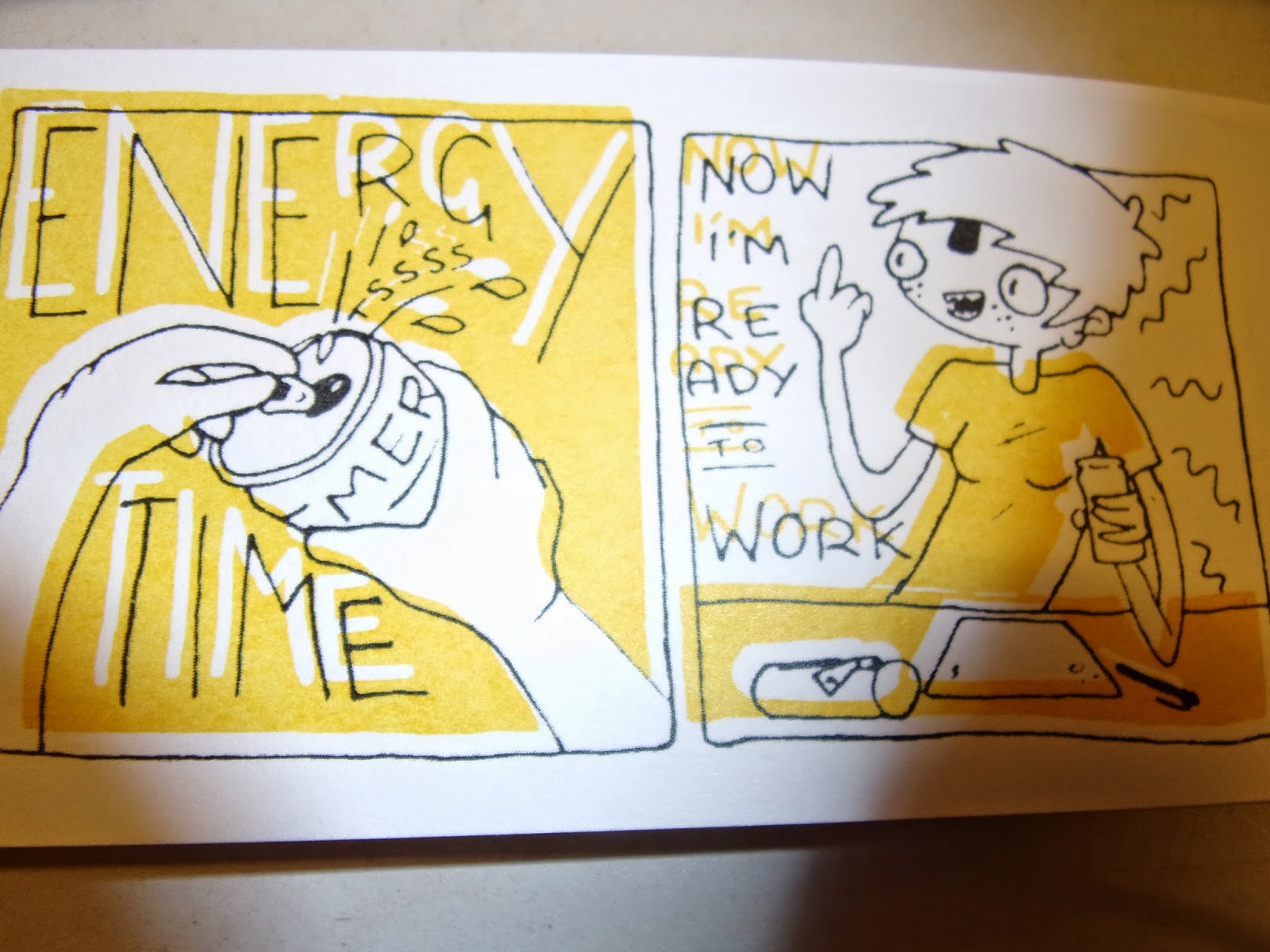
These are the rejects showing the worst of what was happening. The yellow on a lot of them was thick at the bottoms of panels and went orange. I think while I was pushing the ink through the screen I was pushing too much so at the bottom of each panel where it suddenly cut off it left a bulge of thicker ink. But I kind of like that effect, it works in with my idea of having a more hand made feel with little mistakes that add charm.

This is the point that I realised my mistake in having the panels all free drawn and wonky. Cutting out the pages I ruined some more of my comics by cutting the bottom of my panels off. I think what I should have done is measure out all the panels straight and accurately in pencil an then put my ink in free hand but try to stick to the lines. Knowing my hand the minute I try to draw over a straight line it wiggles so it would still get that hand drawn feel. But with the measured guidelines there's less variation in the positioning of the panels.

A big issue was the front covers. Most of the covers black in only partially printed or not at all. The front cover was pretty important to work as well as its displayed on a table and that's the bit that draws people in. I had to come up with a quick fix so admittedly just went over them in pen, being sure to miss some little spots and let the line be thicker in some spots. So that it still looked screen printed.

Some of the pages misprinted and I think I liked these ones the best. The slip in colour gives it a sense of charm. Maybe this is too big a slip but think it' showed me something I like in screen print. I think from now on I will purposely let my screens slightly misalign. I think that if I'm controlling the slip I can get it to a stage where it's just a slither out of line and gives that playful aesthetic.
No comments:
Post a Comment