So the other week the word was adventure and I decided to try and push myself into trying something that would be appropriate for children's illustration. Because I want to enter the pan macmillan prize and I'm painfully aware that my work is not really appropriate for children so I wanted to try and push that side of my practice. I also was trying to get side profile accurately.

We just watched 'The song of the sea" which is a beautiful 2D animated film. I nicked an idea from it, when the children were travelling across fields you could see under ground and animals in their burrows.
-%20Photo%20Credit,%20Copyright%20Saloon%20-%20The%20Big%20Farm%20-%20Melusine%20Productions%20-%20Superprod%20(2)-0-2000-0-1125-crop.jpg?k=1844880a6a)
I based my concept on my childhood, when we'd go on walks and my older brother would get a big stick to walk with so we looked like the picturesque hikers. And I would always try to pick an as big or bigger stick than my brother. Competitive sibling rivalry; I thought it would be popular because its something people can relate to. I made the younger child much younger though because it made it more endearing. It took me quite a while to figure out how the little girl would lean pulling the stick. Children's bodes are so weirdly proportioned. Their ribs are almost at their hips and they are mostly leg. But i managed out on like my 6th attempt. I also traced the boys face from my initial sketch straight onto my final, because I felt it just went right the first time and that's what caused me to make the decision to do it profile, along with being heavily influenced by the previous nights movie.
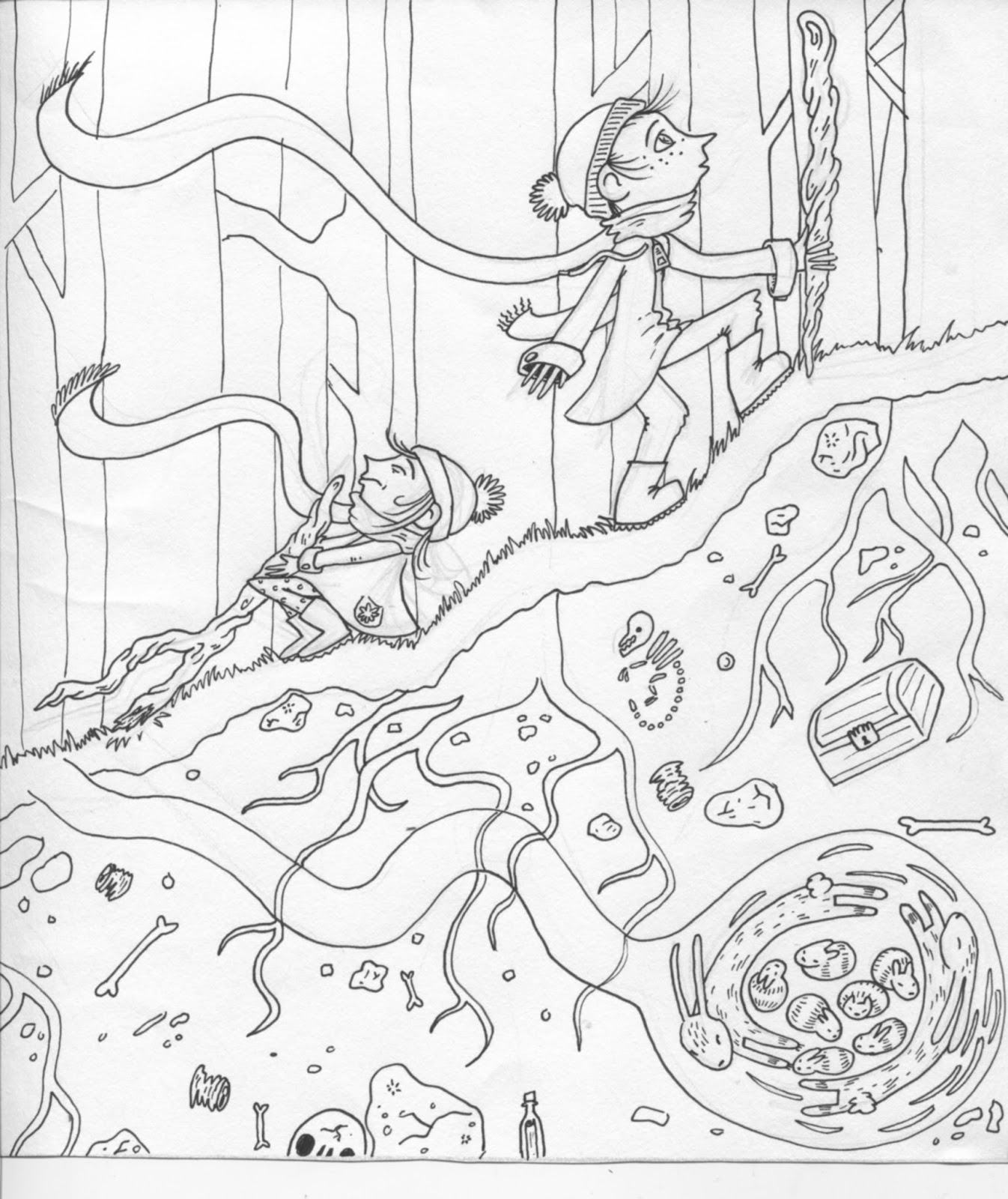
My initial line work. I had to play with the levels a lot because there was quite a bit of pencil line under the girl because her position caused me such stress. I gave them long flowing scarves because it added a sense of movement. You can understand the scene better. Also, I think, it makes it all that more relatable, for brittish people, i remember going out when i was little for 'walks' because they are a cheap outing for a single mother of two. It was always what my mother described as a brisk day. Windy with light showers, but suited and booted in wellies, a mac and hats we were all set.

I made a colour pallet on coolers again. I was using desaturated tones and then I chose the rich orange to offset them. I really like the earth tone because it's something I probably wouldn't have picked out on my own because its a deep purple tone and I would have just been clicking around in the brown setting getting annoyed that it didn't contrast enough from the orange.

At this point though I realised I hadn't considered the placing of my colours in retrospect to the children. The pale tone I was going to use for their skin was already all over the trees in the background. I was afraid that it would make them fade into the background and lessen the impact. So I decided to introduce some new colours that I picked out myself. I tried to get the skin tone so it was just different enough to stand out from the trees, then I made it more red to give rosy cheeks and cold noses, because it helped set the scene. I added red because it stood out enough and I wanted a colour for the little girl to be dressed in so that they wouldn't both be in just green. And it added a nice contrast as i swapped the colours to do their scarves.

As you'll see in my 'freeman anthology' label I got a sale on this print which lead to a job. I also made some extra's to go along with this so they worked as a little promotion pack.

No comments:
Post a Comment