Saturday 21 November 2015

My Business Card


The Table

The front view. We ended up standing up most of the time because when we were sat down we couldn't see over the stand and engage people in conversation. Also people thought we were two separate tables and weren't sure which side to pay at.

My table top was quite full, i rearranged on the second day moving my mobiles to taped to the front  of the table to free up some space to display the stickers I'd been making during the event. I put my cop book in swell at £12 because I'm still quite proud of it. it didn't sell but I enjoyed watching people pick it up and then waiting for their reaction as they opened it and saw it was super gross inside. On the second day I remembered to put an 18+ sign on it to stop kids picking it up.

Rosie was a guest illustrator on my side of the table selling her barbarella print she made for Travelling man, but scaled down.

Thought Bubble: The products

A6 postcards of 2 of my illustration friday, also the extra I made for Guy Loveridge and my travelling man print.
The life and death of Porkchop and George
Procrastination screen print sequential
Chocolate naughty words (which weren't as broken at the event)

Adult colouring book (a collaboration with Hollie smith)
Mer Mystery 

Clay badges and shrink plastic velcro badges
Stickers (mainly sexy penguins)
Jump comic
Business card (complete with qr code to my animated logo)
Ear stretchers with Rick from Rick and moray on
Packaging paper on tracing paper patterned with me dancing 

These were my price tags. On the second day I reduced a lot of my prices to try to increase my sales. I made them look like it was a sale and in the last hour I made a 'crazy end of thought bubble sale' where I reduced a lot of things to a puns and added free badges with everything.
I also sold the Terry Pratchett mobiles I made last year. My chocolate naughty words didn't really sell well over the weekend and i had a lot left over so when we were packing away our table I handed them out to the people on tables around us. The table next to us, Treehouse comics, gave me a free comic to say thank you. It was a good event and we chatted to people on tables surrounding us and got a good idea of how they had set up post uni. The Treehouse comics people used to be based in dundee in scotland but had expanded and moved to edinburgh to be closer to a big city. The people on the other side of us were twins who used to go to LCA and do the game design course. They were selling big digital art prints to advertise their game and they talked to a lot of people and just explained their whole concept rather than pointedly trying to sell stuff which I thought was a good way to deal with customers. My mermystery comics were mainly sold because I would point out the wrapping to people and tell them it was me dancing and then I would demonstrate some dance moves to break the ice and thats why people bought it. 

Strengths:
I packaged my things professionally
The stand and table made us look like proper illustrators
I talked to people
I had a variety of products
I advertised my mermystery

Weaknesses:
My work wasn't eye grabbing enough
A lot of people paid more attention to Hollie's side of the table
My badges weren't of a high quality
My chocolate naughty words didn't sell well
I only sold one badge

Things I learnt:
When you talk to people you can just talk about everything and if they like and get along with you they are more likely to buy something. A bit of emotional blackmail but its good for an up and owing illustrator such as myself.

Packaging is key, I looked a lot more professional than last year and people just assumed that this was our full time job and were surprised to find we were still in uni.

Comedy is one of the best ways to engage people.

Adding 'freebies' helps sales.

People come over and look at fan art they recognise but they don't always buy it. But it is a good way to draw people in so they look at my personal work as well.

Big clear price signs make people more comfortable when buying as some people found it very awkward last year asking about prices. Which I understand because theres the fear it will be too much and then they'll know your a cheapskate. 

I need to spend more time and care on making the physical things like badges and stickers because mine were not up to the standard of others being sold at Thought Bubble.


Ten Minute Illustration

This weeks word was animal and although I didn't start it straight away I had been mulling it over in my mind most of the week. I decided I wanted to illustrate some lyrics to a song using the word animal. The song is Animal by Miike Snow

I was on a supersmall time scale here because I was going to my mother's for tea and I forgot that I needed to submit my illustration friday because I've normally done it earlier in the week. So i had about 15 minutes and I thought that it would be a good challenge to work to. I drew a human and I wanted his head to be an animal. I also wanted the main colour to be black because it made it look more hectic and out in the wilderness at night. I made the lyrics bend around his form and fill up as much of the space as possibly so it would all be busy around him and he would be blank so there would be high contrast. I drew the wolf in his head separate because I wanted to inverse it in photoshop so that it would be draw in white lines because again I wanted to heighten the contrast.

The final piece put together. I went for rich orange and yellow because they went with the whole wilderness theme because they are very earthy autumnal colours. I am relatively pleased with the overall pice because it was done so quickly and it still turned out acceptable quality. I think this is just an exercise in letting me know that I an draw out ideas to a finished quality relatively quickly. This will help me structure my time for future projects and know how much time to dedicate to idea generating.

Also my pub tea was great and i drew a decapitated head on a napkin and the waitress took it home.


Blank character

This was one of her favourites and she was quite sure that this is the concept she wanted to go with which I was glad of because it was my favourite concept too. She said that she liked the character though, which at first surprised me because it's just the blank character I draw when i'm doing roughs because then i can put anything on top later. But we were discussing how we liked that he acted like a blank canvas which people could project on. The poems are like streams of consciousness becky says and that way they feel quite personal and relatable. So the character shouldn't assume anything of the reader. So she said she would like it to be a running character through out. Which saves me some character design time and I can concentrate on getting great concepts. 

This is a more finalised version of the responsible adult image. I think I want to have the page in black with white text so i can have the character under the spotlight. But I'll have to see and ask about these things like is it going to be a colour print or black and white? is the image part of the text or do they link in any way? does she want floating spot illustrations that can be fitted anywhere of does she want full page spreads?
These are all things I will sort out when I meet becky for a drink next week and to discuss work.

Since the character is blank I added a floor and some debris around the character so there is at least one area where I can let my love of texture flow. Because otherwise I feel like i'll be compromising too much and my voice won't be coming through in my work.

G'night


 G'Night 
We’re not talking, me and sleep 
I can never get through 
like I’m hung up on the line 
out to dry, praying for death 
in the wee small hours. 
I have always been faithful to sleep. 
Night after night I returned 
rolling in slumber, dreaming 
of the classics, good-lookin’ 
and romance! 
Is it because I stay up too late? 
Keep myself awake to tend 
menial things, my love 
I don’t wish to take the pills 
that make you stronger than I 
may one day never return 
from your state. 
You sweet sleep are forever 

bliss. 


I could


 I could've been a rhinestone cowboy 
had I only had the boots to keep me walkin'. 
I dreamt that bright lights would guide my way 
to somewhere more spectacular 
and to someone who knew the words 
and had seen what I saw. 
I used to believe in anything 
I thought would keep me flyin' high. 
Now I keep those boots flat, firm 
straight and tall. 
When you're up they'll pull you down, and down you'll go. 
When you're down it's only you 
dusting off the rhinestones 
patting down your dreams. 
No longer blinded by that light 
- see who's stood right there 
with a smile and a hand. 
We don't have to fly, dear. 
Not when we can link and do-si-do, 

travellin' this trail, together 


Responsible adult


 Responsible Adult 
Okay, group meeting. 
What happened back there? 
I need answers, people. 
I think I know 
but how am I to know 
if I really know 
what I once knew? 
Check this kid out! 
Dark and deep and doomed. 
Oh my, how sad 
but wasn’t she precious? 
I don’t begrudge her, 
she wasn’t to know 
what I’d become 
or what I’d do 
or that I’m still here 
older, a little wiser 

but no less confused 


Freeman Development

So this project has been a bit slow to start because it's working for a friend and there's a certain element of casual about the whole affair. But I think this is good because it's my first work as a professional and its nice to have myself eased in with someone I know. Also she's learning as she goes as this is her first time writing as a professional after she finished her screen writing degree.
But we spoke again and there is now an end date. They would like everything to be finished by the end of march so that it is ready to publish.
 Since my last post I did a load of concept sketches for her to look at. They were based on the 3 sample pieces she gave me. I was trying to draw things that worked as  an idea representing the poem. I also had a lot of drawing with people in because her poetry is like a stream of consciousness rather than blocked and verse like mine. It's nice because it gives you something more metaphorical and intangible to play with.
Posts of poems and sketches will follow.

Monday 9 November 2015

Whimsical

This eels illustration friday word was whimsical. To start off I searched it in pinterest and had a look at the results but it is quite a non literal word so there were loads of different images. I decided to just go for the first idea I had because this brief is about learning to get work done quickly and well.
I decided to go with an astronaut toasting a marshmallow on the moon.
I went for an grey tone instead of black so that it wouldn't look sun a stark contrast between the space and the planets. Also the line work stands out from it well.

I used a faded brush, I don't normally use these brushes because I think it normally makes my work look awkwardly coloured in, also I'm heavy on line work so it feels like the line work should define the colour rather than it fading in and out of its own accord. But I think it worked well in this piece because its representing the suns glow and I wanted to communicate the heat and glow.

I checked online to get the planets in the right order. I continued my use of the glow brush to add a reflection of the sun on the sides of the planets.

I coloured in the bigger planets in quite bright hues because I want them to stand out especially the one he's sitting on.

My marshmallow: Further use of the glowing brush and straying from the colour scheme, but not too much. I'm still trying to not include too many different colours in my pieces to avoid over crowding. 


I used the pastel brush to get a grainy edge and then went throughout dabbing it over to create a worn texture. I don't normally use an all over texture but i wanted this piece to look more tactile.

I added my name to the bottom in case of any one seeing my post on illustration friday and wanting to know who i am. I also connected my Facebook page so people can get to my work easily.

Adventure

I completely forgot to blog this at the time, this is what happens when i miss a saturday morning blogging club.
So the other week the word was adventure and I decided to try and push myself into trying something that would be appropriate for children's illustration. Because I want to enter the pan macmillan prize and I'm painfully aware that my work is not really appropriate for children so I wanted to try and push that side of my practice. I also was trying to get side profile accurately.


We just watched 'The song of the sea" which is a beautiful 2D animated film. I nicked an idea from it, when the children were travelling across fields you could see under ground and animals in their burrows.

I based my concept on my childhood, when we'd go on walks and my older brother would get a big stick to walk with so we looked like the picturesque hikers. And I would always try to pick an as big or bigger stick than my brother. Competitive sibling rivalry; I thought it would be popular because its something people can relate to. I made the younger child much younger though because it made it more endearing. It took me quite a while to figure out how the little girl would lean pulling the stick. Children's bodes are so weirdly proportioned. Their ribs are almost at their hips and they are mostly leg. But i managed out on like my 6th attempt. I also traced the boys face from my initial sketch straight onto my final, because I felt it just went right the first time and that's what caused me to make the decision to do it profile, along with being heavily influenced by the previous nights movie. 
My initial line work. I had to play with the levels a lot because there was quite a bit of pencil line under the girl because her position caused me such stress. I gave them long flowing scarves because it added a sense of movement. You can understand the scene better. Also, I think, it makes it all that more relatable, for brittish people, i remember going out when i was little for 'walks' because they are a cheap outing for a single mother of two. It was always what my mother described as a brisk day. Windy with light showers, but suited and booted in wellies, a mac and hats we were all set. 

I made a colour pallet on coolers again. I was using desaturated tones and then I chose the rich orange to offset them. I really like the earth tone because it's something I probably wouldn't have picked out on my own because its a deep purple tone and I would have just been clicking around in the brown setting getting annoyed that it didn't contrast enough from the orange. 

At this point though I realised I hadn't considered the placing of my colours in retrospect to the children. The pale tone I was going to use for their skin was already all over the trees in the background. I was afraid that it would make them fade into the background and lessen the impact. So I decided to introduce some new colours that I picked out myself. I tried to get the skin tone so it was just different enough to stand out from the trees, then I made it more red to give rosy cheeks and cold noses, because it helped set the scene. I added red because it stood out enough and I wanted a colour for the little girl to be dressed in so that they wouldn't both be in just green. And it added a nice contrast as i swapped the colours to do their scarves. 


As you'll see in my 'freeman anthology' label I got a sale on this print which lead to a job. I also made some extra's to go along with this so they worked as a little promotion pack.


My first sale lead to a job

So I've been trying to use my social media more and I'd been posting my illustration Friday's on my Facebook page. This man called Guy Loveridge commented on my post asking if he could buy it. I was going to put £5 but Hollie and Sophie goaded me into putting a tenner. But I'm glad I did because he said yes. Then I went for a drink with a friend from high school and she knows Guy. Turns out she entered a poetry competition last year and although she didn't win, Guy was one of the judges and he offered to publish her work.
She told me he was very excited about my work and that he wanted the original from my drawing, which at first I didn't understand because its digitally refined and coloured so the original is just scruffy line work. But she texted him and was our 'go-between' and he instead paid me £20 for the original. I made up a pack and included the print as well as the original. Then i made a print specifically for an extra freebie and a book mark.
He thanked me for his pack and he enjoyed the freebies. He asked me if they could possibly use the illustration friday print I did as a cover to the anthology he is publishing for her. But I didn't like the idea of my work being re-appropriated so I said I could work with them on some idea's. And now they want me to illustrate her anthology. Which is exciting. Also he's told me about another client of his who is doing a children's story book but needs an illustrator. My friend Becky is setting up an informal meeting for us to discuss work and ideas.


Saturday 7 November 2015

Bouquet

This weeks word was bouquet and I decided to use it as a break from my mermystery comic. But I made it relevant to my work now too. I did an underwater bouquet because I've been trying out lots of aquatic plant life and I've really enjoyed exploring it. And underwater plants are better because gravity doesn't really apply so things can be top heavy and ridiculous and they just float anyway.
I added little fish and eels because I'm trying to explore the cutter side of illustration. I'm deciding to tackle the charm issue in my other work. There is none. It's just gross and ugly. Which I like but I also know that it isn't the mainstream popular way to draw. I want to be prepared to do any kind of work so I'm just trying to improve my skills when the purpose is to charm.

I used coolers to choose my colours and to try and keep myself limited in colour. I went for a pastel, desaturated look because I think it gives a naivety to the piece and helps achieve that charm I'm going for. I made a background so that it wasn't completely floating spot and to just reinstate that it is underwater. I used a pastel palooza brush to rough up the edges of the square because at first the corners were too severe and I wanted to soften it a bit. So rounded corners and a grainy textured edge makes it seem hand made and there's a certain twee feeling to hand made things that I think adds charm.
I Signed this one so that if people are looking on the illustration friday sight they will see my illustration name and they can find my pages online if they want.

So my poem is massive

I didn't realise quite how big it ended up being but I kind of like working this way where I just make it up as I go along. At least with the narrative, the images I've actually been planning. But it's like when I worked on my insect educational comic last year and I was just making up my bug sequential as i went along. And it ended up being longer than I first intended but i think that i worked faster because I was excited the whole time instead of following a rigid plan.
I think in future this is my new method of work: write the whole narrative first and just play and have fun with that and make it up as I go along. Because I can always go back and change parts if they don't work. But to gives a better structure to my drawing. I have the words I'm illustrating already. I usually tend to struggle with sequential in the way of I don't know how many panels I should do and I end up making irrelevant ones that are wastes of time. This way its like each verse is a mini poem and I just have to illustrate that. I think in this project my narrative is definitely leading my drawing, but I like it. It's a lot less stressful.


I planned out my pages. I've been trying to have some pages have multiple verses in to cut down the amount of work but I've still ended up with a massive workload. But since I've been enjoying the drawing so much, I've been working way faster than usual and I've almost completed it. I just have 4 double spreads left to go. My print slot is on thursday. So by Thursday I need a cover ready. Since my comic is so many pages I'm going to print in black and white because it would be a big investment to print in colour. But I'll do colour covers to catch the eye of customers.


Completed poem

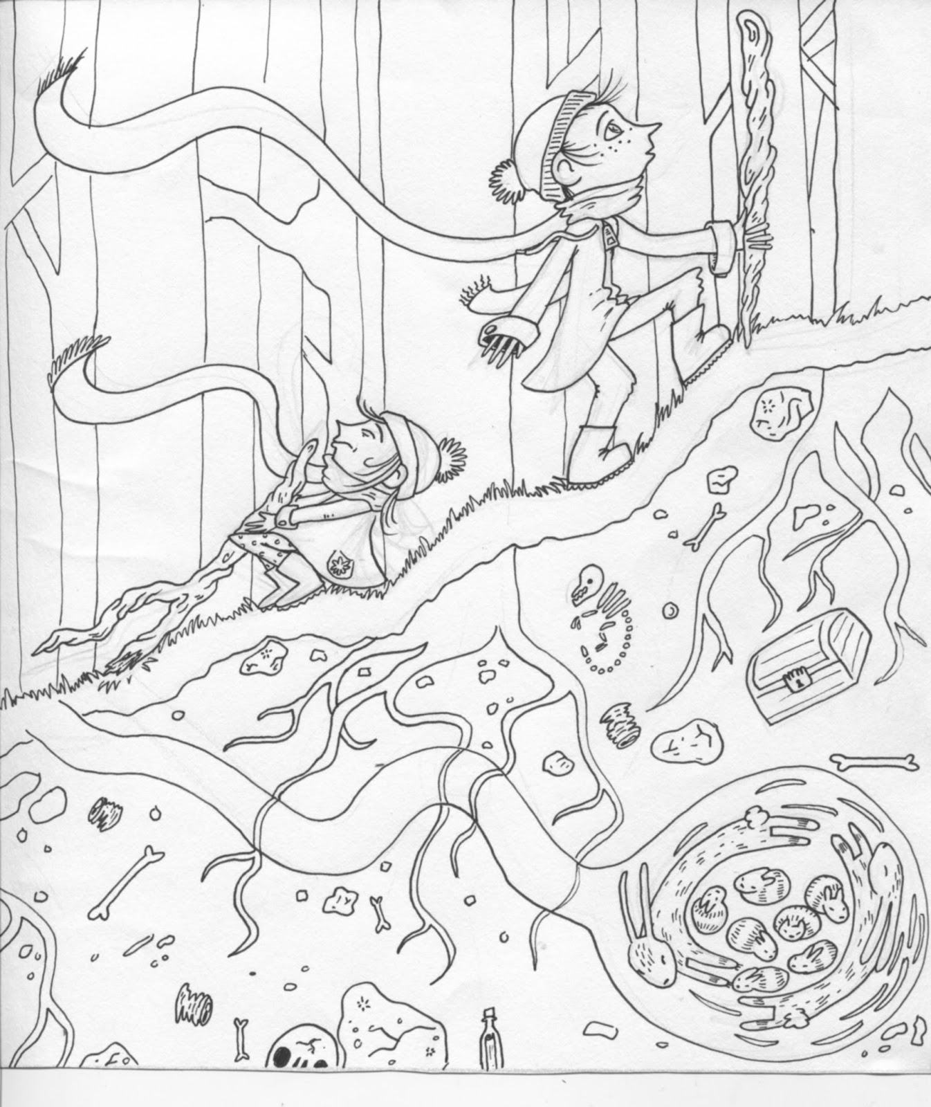
Down through the waves
Wiggle through the bubblesThere's a place between the coralsWhere you forget your troubles

Starfish lye in deep contentThe clams are happy tooThey cover up the modestyOf creatures; Green an Blue


Their long and flowing locksDance behind their headAs they swim and play in currentsOr go to work instead


Lavish buildings tower aboveWeaved in grass and weedThe mercity of Pavlovia (name subject to change)Is the place to go and succeed


Home to many merman and maidLiving peacefully in contentBut there is one that regards the peaceAs something he does resent


Day in, day out he lives his lifeAnd feels it is a boreNightly he travels outside of the citySearching for something more


It's upon one of these nights that our story beginsHe sees a beauty that lacks any finsHe's amazed and aghast, He stares at her in aweHe wishes he could stay and admire her more


At work in the 'morrow he rushes inTo excitedly tell his taleBut is met with mockery and disbeliefThey think he's gone off the rail


He returns home in the blackest of moodsHe felt the fool of the cityBut he knew if he saw her but once againHe wouldn't feel so shitty 


He returned to the spot where he first saw herAlmost every single nightHe cherished the moments she returnedIt kept his love alight


But as Summer faded into Autumn glow
he saw her less and less
Then Autumn fades to Winter snow
and caused him great distress

No more did she swim above him
She left him lone and deserted 
he felt depressed for months
people talked, faces averted

He kept himself to himself
Resigned to isolation
obsessed over what he knew 
In his self incarceration

Summer sun rose again 
The merman looked outside
It reminded him of when last he saw her
He grinned from side to side

That night he greeted every neighbour
As he swam along the street
It'd been months since they'd seen him
and he'd never looked so neat

Butterflys in his stomach
He waited in 'their' spot
Hours spent in baited breath,
Would she come or not?

Hours passed by, his smile had faded
His hopes began to drop
But a figure above him caught his eye
And caused hiss heart to stop

He puffed up his chest
He took a deep breath
He started to feel light headed
But he pushed his way through
His nerves and his fears 
And all the things he dreaded

At first she just stared at him
Shocked more than anything
As a marine biologist, she had seen many things
But this was something new
She was glued
To the hue
Of his sparkly blues

But for him, she was more beautiful
Than he could imagine
She studied him with such delight 
He was flattered by her passion

They promised to meet up the very next night
And for many nights thereafter
They shared long conversations late into the night
Barely controlling their laughter

At work people talked behind his back
About his dramatic change
His happy smile and jolly swim
Just made him seem quite strange

But his nightly trips were his fuel
To rocket through the day
'Til he could see her once again
And talk the night away

Weeks passed by, there grew a spark
He proposed the relationship he wished to embark
Young love flowed and they cherished each other
But they wished their meetings were less undercover

One day she arrived in a big machine
Carrying a see through box
There were ropes and hooks along the sides
Topped with an iron lock

A young Mermaid, who had snuck out of her room
To smoke the blue seaweed
Spotted the merman at the moment of capture
And raced to home at speed

And that was the last we ever saw him
Kidnapped by a beast
Locked under glass and metal
Likely prepared for a feast

And so young merman and maid
Beware the surface dwellers
They are brutal killers everyone
Every child, lady and fella

And thats why we live deep down in the blue
Steering clear of coastal lines
Avoiding the sight of the two tailed beast
And their awful kidnapping crimes

Little did the marking know
The merman lived a happy life
he had a tank in the living room
of the marine biologist; his wife

She had her bed onto of tank
With water level to the across
And he would sleep below her
On a luscious bed of moss

The tank was smaller than his ocean blue
And his tail began to wither
She begged and pleaded with him
'let me take you back'
But relief he would not give her

His life was shortened, that they knew
But they still had laughter and fun
And before his final days were up
She gave birth to their son

The human child, or so it seemed
The apple of his father's eye
He filled his life with happiness
Until the day he died

A lonely widow and her son
Stand upon a pier
Ashes fly along the wind
Carrying someone dear

The son dives in, teary eyed
Around him water crashes
But when he looks down to his legs
A Merman tail splashes

His father's spirit lived on in him
Let him dance between skin and scale
They lived on a boat all over the world
He swam and his mother would sail

Saturday 24 October 2015

Finding my groove with bubbles


 These are the pictures from the sketchbook I forgot to bring in.
I did the seaweed first and I was thinking it was maybe a cover or just a nice scenic shot but then I was thinking of appropriating it to go with the first verse of my poem. The main bit that stuck out was wiggle through the bubbles' So i just took that and ran with it. Like really ran. miles.
I went a bit nuts but mid way I was thinking how I would put the text on, like I could do it after and put a fade of white under to make it readable but then I figured I could just use the bubbles to frame it. Because I like using my own handwriting in my comics because I think it suits the aesthetic of my drawn work, it's so heavily line based I'd be mad not to use my own writing.


I  continued with the bubbles because those pages will probably be facing each other in one double spread so I though it would be nice if the second just carried on from the first, so I kept the main elements the same: bubbles an seaweed.
This is my towering woven building. I'm not sure about this yet because I'm considering changing/ revamping the big double spread I did in the big ideas sketch pad. And this page follows so I want there to be sythesis and flow because the text is poetry and flows from on bit to the next so my images should do the same. But I like doing the woven texture, it just looks really nice. You'll notice I also managed to squeeze some bubbles into this image as well. I was trying to exaggerate the height of th building and I already made it tiny at the top and almost off the page at the bottom to skew the line of sight. But in pictures when their trying to show a tall building often they have a little hoop of cloud to show it's so tall its touhing the clouds. I think bubbles work as an equivalent, and I think it will be read the same because it's like a known visual device for height.