Because this is going to be displayed in Travelling man the Travelling man clientele is the audience. With that in mind I decided to try a bit of fan art. Because at the moment my personal work is good (or at least i think so) but it's not recognisable to me because I'm not famous enough. So I decided to piggy back on the popularity of a ongoing show. I was picking between firefly and Rick and Morty.
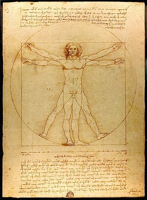
My first idea for a Rick and Morty piece was to do them like the Vitruvian man.
But in my thumbnail I realised that having a naked Rick behind a naked Morty made it look like some kind of weird child porn and I decided to steer clear of that. I moved on to think about doing something based on firefly because I thought it would be easier to translate real life people into my illustrations rather than trying to recreate an already drawn character in a new way.
My plan was to have a dinosaur playing with firefly toys because one of the most popular scenes of Firefly is when Wash (the pilot) is playing with his plastic dinosaurs on the control panel; 'Curse your sudden but inevitable betrayal' (herbivore to T-rex).
It took me a while to be happy with a composition because it was more of a floating spot illustration and I was trying to figure out what dinosaur I wanted to use and whether or not to include all the cast as figures.
This is my roughs I did for the Firefly piece. It has remained unfinished because I found it really frustrating trying to make the characters recognisable and I think that took away from my usual playful drawing and they ended up much more static and awkward. I decided to abandon this idea because I was struggling with the first two characters and there's another 7 to do. This is meant to be a small brief and it wasn't worth getting overly stressed by.
So I went back to the drawing board and back to Rick and Morty fan art. I decided that I should do it based on my favourite scene from the latest season. The show is normally full of humour and jokes about serious things. Which I think gives it a light feel as a show, like it's not a heavy thing that takes a while to get into. Its more like a guilty pleasure as you laugh at people being dismembered and robots making babies. But this scene I feel was one of the best parts of Rick and Morty. Atleast the most emotive scene. It breaks the security I felt in how this show will work and make me feel. It is paired up with a song that really makes it for me as well. The combination of the music and the animation just created such a blow of sadness, it was a shock.


No comments:
Post a Comment