Thursday 14 May 2015


Project Report

Presentation Boards

Coloured pages

These are my final coloured pages. I think that they are working well as a set. Although I think that I have too many different options for borders, it makes it look inconsistent throughout.

I did a lot of repeats on the stickers so that they would last a bit longer and so there are more combination possibilities. I am going to print them on clear sticker paper because if I did opaque I would have to cut them out perfectly since their to go on top of things. But I think that the clear stickers loose a lot of the colour quality unless stuck to something white. Next time I should look into getting some proper sticker paper and not use colleges because it is not of a professional quality; it scratches off and wears away quite quickly.

The finished notes page, I gave a little border of the ants to frame it and to add a bit of fun to it. Without them it seemed to dry educational and didn't inspire the sense of fun I wanted

Stickers #2


I've drawn out some new stickers, their bigger and clearer than the other ones I drew. I made sure there were a selection of eyes, mouths and legs before adding a couple of nondescript stickers just for fun.

Cover and pattern pages

I found a way to add my 3 pages extra. I was considering cutting one of the insects but I feel that I found a perfect range of different types of insect and I didn't want to ruin that, also there were twelve which is a nice round number whereas I'm just not comfortable about eleven, so adding pages was a must.
I decided to make a pattern in lay page, its low effort which I need for the amount of time I have left. But also the simplicity of it is charming and sweet.


For the cover I made it like I made the front cover for my responsive project report, but this time I used two different types of leave since they both featured in the insect page borders.

I decided to appropriate the book for children by adding a place to put their name, but also a very short explanation of what the book is for people who are flicking through in store.

I added a blurb to the back and made key words bold. I did this so that adults skim reading to see if its what they want for their child. This way the first thing they see is what it is, age range, educational purpose and 'get down and dirty' since most parents will know whether their child is one who loves to be mucky, then this is the book for them.
I added a bar code so it looks like a real product and priced it at £5.99 which I think is a reasonable price since it has extras and free prizes.

Organising pages

So this was a bit of a last minute panic. I hadn't even thought about pagenation because I've just been working on the narrative mostly and although I had a plot plan I was just making the panels up as I went along. So I wasn't sure how many pages it was going to be. So its 27 pages but I also want a front and back cover which takes me to 29 so I either have to cut a page or add 3.

Bug Catcher

To add to the interactive side of my book I decided it needed another activity and instructions. Suction powered insect catchers seemed appropriate because they tie in with all the other extras; Habitat, Notes, Magnifying glass, Stickers.

I went with the same kind of style as the habitat instructions mostly for continuity.

I made arrows out of my ant border because normal arrows were too block and strong compared with the light and charming instructions. This way they have the same light fluffy feel. 

I don't massively like the layout of this page because the images are unbalanced across the page and the right side is too crowded. I think I should have planned out where the instructions were going first, like sort out the basics of my page layout before I start drawing instead of compromising my drawings to try to fit them onto a poorly planned page.


Secret agender

So the character in my narrative takes the costume off and you can see them. I was having trouble deciding on a gender for the child because I felt if I made it a boy then this is a Boys book about bugs. But if it was a girl will it make boys feel like they've picked up a girls book. I wasn't sure of how a child would react or even if it would bother them at all. But just to be on the safe side and keep it open and appealing to all genders I kept it a secret. 
I've done the panels so that you never actually see their face, just hair which is relatively short but that doesn't confirm anything, just leaves it ambiguous.
I think maybe the pants make it look like a boy because I ended up drawing boxers because briefs looked a little too naked to be drawing the child in. I was originally just going for the classic Y-front / Tighty Whiteys. But in recent years there's been a rise in designing boxers for women so I think this still leaves it quite open.


Magnifying glass

I am proposing to include a magnifying glass to be used along side the note cards, I realised that the insects would be hard to identify and describe when they are so small. Again though this is something to sweeten the deal, I'm catering for kids here and I figure the best way to grab their attention is free prizes. Like in children's cereal and magazines, if they can use that tactic so can I.
I don't like the pattern I drew on it though, its too random and garish. It could do with some symmetry. I like the ants around the handle though so I drew one big one that I'm planning on  repeating as a pattern.


Notes page - encouraging exploration

So I planned to make a notes page and print a set of them to go with every book. The note page allows and encourages children to explore what they have learnt for themselves. 

I left space to draw their insect and then just four boxes of relatively simple information; name, place, quantity and then just extra information for anything they would like to say about it.
The colours have gone weird on blogger, the actual image is far more desaturated than this. But this gives you the idea of what I'm including. I did it in the colours to match the rest of the book, I chose to use the yellow/green filling the boxes because I think it is the colour that will most lend itself to being drawn on top of.  The blue/green is pale enough too I think but I was thinking of what drawing materials most children have access to; pencils, coloured pencils, crayons, possibly a biro. These can all go onto a page quite grainy and faint and I think that the blue would have had more chance of someone only having a blue biro or pencil and it wouldn't work as well.


Drawing Habitat pages

For my habitat I have drawn out the equipment they will need because when instructing children it helps to have a strong visual element. I kept the line work quite simple for it because the thing to boost in this part is recognisability. So the images are only slightly textured with some lines and dots so that they fit in with the drawing style I've been using throughout. 
My habitat example that I drew turned out really nice. It has a sense of charm, I think because nothing is in too great detail. The lines are a little wobbly and naive, I think this works well on this image because it will encourage children to make their habitats as nice looking. It gets them to consider their decisions on design. 
I put a border around because I'd finished drawing the habitat and it looked so wrong just floating since it was a landscape kind of scene and without a border it would be hard to decide when to stop colouring. I made the boarder out of tiny simple ants because I think it further pushes the charm in this image. I wish that I hadn't drawn it landscape though because I didn't think about it until after but my pages are portrait and I don't know how that will affect how it will sit on the page. It will leave big gaps of space above and below the image. I may have to put other things on that page just to fill it out. 

Things you may need.I think the plants might be a little too simple but apart from that I really like how these look. The thin line mixed with simple drawing style creates a sense of charm about it. I think this helps for adults having a flick through to approve it for the child, this kind of style is reassuring and calm, definitely child safe.

Stickers - Expanding the range

I''m thinking of including stickers in the pack.
Reasons:
1. It sweetens the deal: a way to draw in children's attention - free prizes.
2. They are body parts so they can make anything into an insect - interactive element
3. It expands my range of products and makes this a more well rounded product

I'll need to re draw these because the sizes of the parts are all random, like the mouth pincers are bigger than a leg. So when I redraw I want to try and get it roughly proportional so that the sticker may be used together on one object.

Comic drawing

The grass texture was the part of this that took all the time. There's so many small intricate lines but I think that level of dtail makes the mantis stand out. The grass lines are quite small and close together too which makes it look far away, giving the image depth.


My favourite panel here is when it is holding it's leg up. It's not exactly a humorous element but I think the images were playful enough that some may be found mildly funny just because of facial expression and pose.

I tried to re use the grass texture as wood in the home because the later panels seemed really empty and spacious compared to the earlier ones. I think the black background in the leaf igloo filled a lot of the panels and now they seem to out balance these. They are visually heavier in black and with pattern.  

Narrative Plan

So I want to include a narrative in my book because my focus has been character and narrative. I've been looking at Jesse Jacobs a lot recently, This is from his comic 'Honeymoon Safari' I like how its so simple, each panel shows simple progression from the last . I think since  the rest of my book will be informative I would like the comic part to be just for fun. Simply entertainment purpose so that it can provide a light break from the educational parts.

My plan at this point is just the mantis character taking himself apart. It's something that  would be interesting to do and have a play with.


Coloured in Crawlies

I tried to make an issuu document out of these but its adamant that one of them is corrupted (it's not) and deleting any progress I make. So long list it is.
I kept most of the colours realistic just adjusting them slightly to find the most aesthetically pleasing results. I made a border out of leaves that I drew to push the nature factor of the book. I kept the outside white so that when it comes to binding I have room to trim the book edges without having to worry about leaving blank spaces.
For the colour scheme I chose three greens but I chose ones that can almost look like other colours when places next to the clearly green one, contrast makes us see it differently. So one green is almost yellowy ad the other is very aqua. This way I can achieve a colour range without having to worry about it coming across as loud and garish.


Creepy Crawlies

For the glow worm getting the texture was the challenge because in part it has a rough shell like skin but at other parts the skin is soft and fleshy looking. I've added little lines and dots of  distress because I think that will show that is the rougher weathered side. I want to create a balance between my style and realistic. Obviously it has to be a certain amount of realistic because it is meant as a guide so it needs to be recognisable as the insect it is.
The Hawthorn  Shield bug was one of my favourites to draw the textures onto, every part of its skin is covered in different shapes and textures. I haven't been able to show the shininess of it in the line work but I think that is something I will tackle at the colouring stage.

Technically this is not an insect but an arachnid, but at 8-12 years old they have already been taught the difference and therefore I don't think that I should patronise them in any way by omitting this.

That back leg. I hate that leg. In the reference image I was using it has it's leg stuck up and out a bit but it looks relatively normal and no matter how I was trying it always looked wrong. I finally settled on inking this leg because it is the least 'detached leg' looking but it does instead make it look like its cocking its leg to pee.

The beetle had a satisfyingly bulky form so there was a lot of space to put the texture into. I think the fact that it was made out of less individual 'parts', like say the grass hopper, made it much easier to draw, it was easily broken down into shapes.

Welcome to Joe's apartment! Cockroaches already have this big rep of being awful and disgusting but I wanted to show it's just another insect, no different. I tried to keep the textures down a bit so that I wouldn't end up extenuating any pre existing ideas of what a  cockroach is. 

I think this is one of the ones I'm most proud of, the perspective is a bit of an awkward angle but it worked eventually. The cricket had already very distinctive shape and texture to its body so it was relatively easy to fill up all my blank space with textures.

I think I should be able to see it's other legs in this image. It's a weird angle to work at. I like in this one that there is a mixture of areas that have clear pattern or texture and then others that are just generally rough and worn. The contrast of pattern density makes this image more visually interesting.

I think the golden ringed Dragon Fly was the better dragonfly I drew. I wasn't sure howto show the black since I'd been working lots of texture in with black ink it seems like it would jut cover that and make it flat . I did a light half scribbling over the top, it gives the right colour but the scribbles have created a mottled texture that works well on the insect.
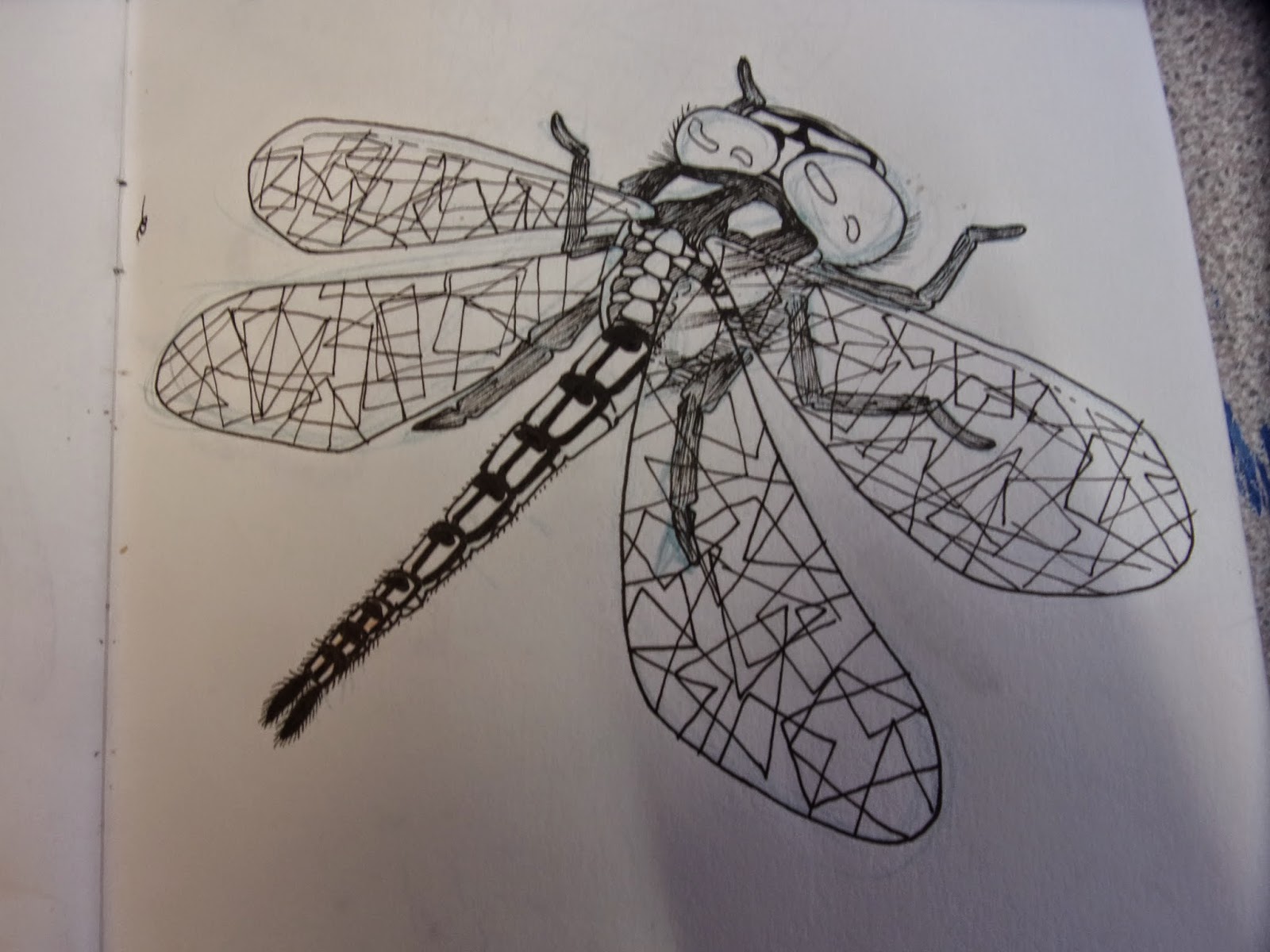
I don't really like the hairy dragon fly as much, I think that it is closer to my style rather than realistic. The head is distorted into a big cube like shape.

The earwig was good to draw because its made up of so many over lapping layers, so there is lots of room for my dot shading to go.

The zebra jumping spider was one of the hardest ones to draw I think. Mainly because it is a furry spider and I had been dealing with things with just hard exoskeletons. I wasn't sure how exactly to create the texture. I did a few attempts but the one before just ended up looking like wood instead of soft fur. Soft things are not my forte.