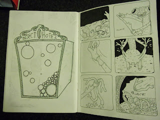
The grass texture was the part of this that took all the time. There's so many small intricate lines but I think that level of dtail makes the mantis stand out. The grass lines are quite small and close together too which makes it look far away, giving the image depth.
My favourite panel here is when it is holding it's leg up. It's not exactly a humorous element but I think the images were playful enough that some may be found mildly funny just because of facial expression and pose.
I tried to re use the grass texture as wood in the home because the later panels seemed really empty and spacious compared to the earlier ones. I think the black background in the leaf igloo filled a lot of the panels and now they seem to out balance these. They are visually heavier in black and with pattern.


No comments:
Post a Comment