Saturday, 14 May 2016
Finally something finalised
I started to colour and finalise the poems so that this project can be resolved professionally by the deadline.
This is the leaflet one, it is my main double spread in the book, because i felt like there should be at least one double spread that is bold and striking. This is the poem i did about health leaflets that tackle depression. It stands out against them because the leaflets are full of cliche and seem insulting. Especially with the known used motif for mental health which is a person with their head in their hands…like it is literally broken. Just unbelievably tactless by the health profession. Thats kind of why i drew everything in jars, because rather than talking to us on a level as individuals. It seems more like an experiment, there's not that much known and understood about mental health still and it just feels more like being watched under a microscope rather than helped by an equal. Which is one of the main reasons for this book, the lack of communication about depression in health literature.
I finished sleep. I think this one went well because i was considering the colours as i was drawing it. I knew I wanted to show the light coming out and have a big contrast between the light and dark areas. I think considering the colours in the designing stage really helps make a final balanced layout. Adding the writing was quite tricky though because i drew it as a whole scene and didn't really think about where the writing would go. I ended up having to erase overlapping parts of lines from the text to make it legible. I think when i'm drawing the remaining poems i need to think about the writing so that it doesn't bugger up all my plans when it comes to putting it all together digitally.
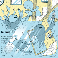
In and out, i most definitely did not consider my text in this one, leaving barely any room for it at all. But this was a concept i had come up with on a different format and i had already struggled to fit the four stages of the characters journey on.
I added the sun beams into the water because that whole bottom area was intensely blue and it was unbalancing the whole image.
I've been putting the text in, in the colours of the pallet so there is no black anywhere, just the really dark blue/green for that.
I'm pretty sure i posted this finalised before but i like how when they are all sat together you can see them working as a set. I think it was a strong decision to have such a reduced colour pallet because it really visually links the whole book together.
Labels:
OUIL603,
Poetry book,
Studio Brief 5
Subscribe to:
Post Comments (Atom)


No comments:
Post a Comment