So i did this project tuesday to friday last week. Only just got around to blogging it. The project wasn't a full success as the final box was made out of a paper that was too thin. I wanted to use the thick gloss but budget constraints meant i could only use my own paper so therefore the final product is more like a mock up of the real product. This made me realise that before starting a project i should try and work out whether i can afford to produce the object. I need to plan the materials i think i will use so that i at least have an idea of what kind of budget i'm looking at.
I drew out the packaging, i used a simple box net and made the fastening just a slot where a part of the lid can go in to fasten the lid. I made the box look like an old record player because i felt it is the most relevant box it could have and it adds to the 'cute' aesthetic, i'm basically making a miniature illustrated model.
I did lots of texture across the box so that it still represented my practice and the work within. I stuck to the same primary colour scheme so that it worked as a set.
I also did a big block of wood texture so that i can use it to line the inside of the box, because i think it would lessen in quality if the inside was not illustrated to match the outside.
I drew the wheels separate and put them on in photoshop. I did the same with the holes in the speakers on the side of the record box. I did this so that they would be even and symmetrical which fits more with the box as it would be a manufactured product.
I went back in and redesigned some of the LP records that i wasn't happy with last time i did them. I redid the star man one because i felt like the character could be bigger and less child like/ bobble head than before. Also i did the colour in a more detailed tangible way, ceasing a distinct underside to give it more depth. I also utilised some texture on the moon in the background because i felt like there wasn't enough detail on the image itself, because it is small scale and too much would over crown it. But i think there is a certain degree of detail that needs to happen for it to fit into my practice.

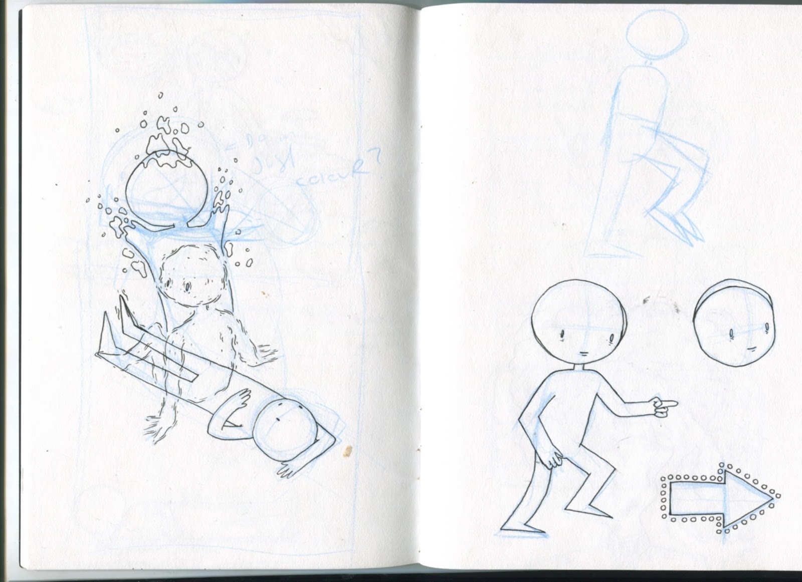
I redid go your own way here. I want exactly sure on how to do it though so i was just made elements of it, i have the character which has become a bit of a linking theme across the covers and then i made a light up arrow sign although at this point i wasn't sure on how they were going to fit together. I also redid who wants to live forever, Hollie figured out why the last one looked so weird; i had the three of them with their arms out as though they were reaching out to each other but instead it came across as three nazi salutes. So i
definitely had to redo it.
Here is the third attempt because the second didn't really consider the square format, this one uses much more of the area and i think that makes it better.
I have coloured in the packaging here and put it all together. I made the inner wood side just a big rectangle because this way i didn't have to worry about it lining up properly because that side just engulfs the whole page. I made the inner match the colour scheme, at first i tried the red to match the outside of the box but that made it all entirely too much red and the red started to seem quite garish even though its a relatively desaturated red. So i popped for the blue as i felt it offered a good balance to the red so that the colours were bringing out the best in each other and there wasn't too much of either one.

I made the records from the first drawing i did, which i know is something i said i would stop doing. But its a pretty simple design and i used a compass to make sure it was circular and there wasn't really a lot else i could do with it. When i printed them i added a bleed around each record that was about 2-3cm so that there would be a bit of leeway on the lining up of the two images. I used the circle cutter so that it would be cut cleanly.
This is the smells like teen spirit one which is easily my favourite cover so far. I was having a bit of trouble with balancing the colours because if there is too much red and blue it ends up looking full and gaudy.
I added more yellow here to brighten up the image as a who;e but then the face faded into the back so i added a blue shadow and then put bits of yellow across the creases because i think this made more sense with the direction of the light.
I tried a blue background using the highlights of yellow again but i didn't like it as much and i just don't think it worked wight he image as well as the yellow. The yellow made it seem more dire and alarming.
This is my star man piece which ended up quite red heavy but i like the little lines i did in the other colours to try and break up the red. I used little yellow highlights like in the teen spirit cover because i liked the texture they added.
This one is my least favourite and i wasn't entirely sure about it , but it fits with the set and time constraints meant there wasnt time for a fourth redesign.
I put the covers on simple coloured cases so that they would fold around the record. There is a tab so it can be glued down and keep shape permanently. I also put my logo on the back of each one. I see the updated branding logo from my creative cv as it has a layer where the colour can be changed so that it matches whatever back ground it is on. I think this links them as a set professionally and makes them look like a branded product.
Overall this project went well. The design of the box was functional and the only downfall was a few rushed designs and the paper quality of the box. But i think what i can take form this is the raw digital files and the concept of the record box. This is something i can revamp at any point making more covers to be included. I can have it at a point where there is a large selection of possible covers and the customer may pick a certain set or order a lucky dip and get a sup rose. I think this adds an element of personalisation to the product, which will help it sell in the illustrative market.
I will photograph the box and put it up on here later in the week as it is at home. To resolve this project now all i need is to create the presentation boards for the Deadline driven brief and complete the project report page.


No comments:
Post a Comment