Wednesday, 14 January 2015

Redesign cont.

Issuu won't let me type underneath its document so new post:

After a tutorial with Fred he commented on how they don't really fit as a set, contrasting compositions draw them apart. So I made some time to sit and redesign my prints.


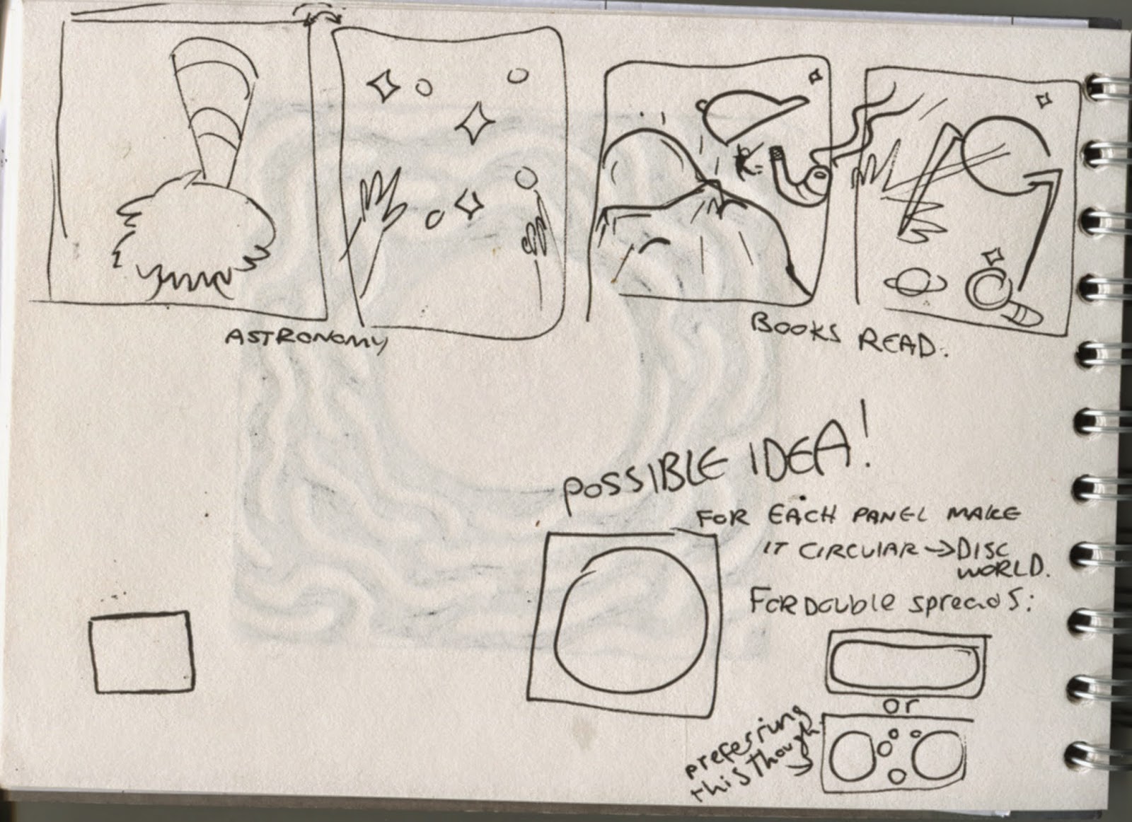
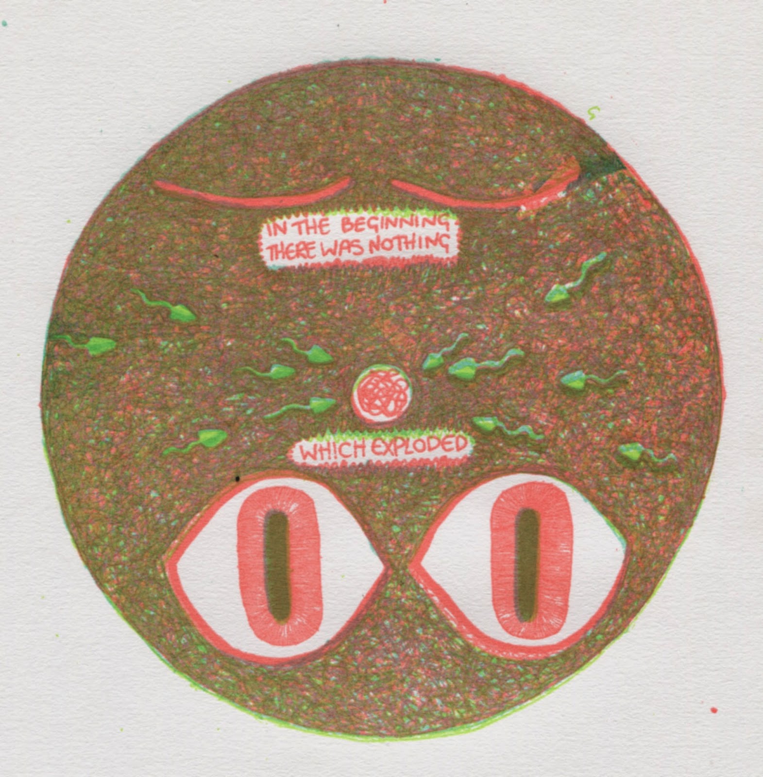
First off I did some thumbnailing. I wanted the image to be centred. I liked the design on the right but half way through inking it I realised that I hadn't left room for the text. So I used the same parts from the original but putting the egg at the top so that the eyes opening is sequential and makes more sense. I think it was unclear in the prints what the closed eyes were. I put the wool in the back though because it gave the other parts something to strongly centre them. The other designs all seemed to have a central part and without the wool this one was just floating.


 With the brain one the original was really simple and the others were more complicated so it didn't really fit into the set. I first tried making the brain the big main part but after tracing out the outline of a brain that I could draw wool into I realised that it took too long. So I decided to draw it smaller; I tried to fill the extra space by having deaths arm twist around, but I don't think it works visually.
I was thinking of this print in the design so I wanted to keep the unravelling brain in because I think it was a simple and effective visual metaphor. In the end I decided to draw all of death in it and have terry pratchett in the picture. This is the serious one because it represents the Alzheimers and I felt like the face I draw for him is a little too silly for this one so I made him a silhouette. Atleast that wasy I could show the wool inside of his head, I tried to make it look like the wool from the first print in the set, to link them. Also I cut the original quote I used because t was too text heavy and instead just used the last line 'it makes you feel quite alone'. That part pretty much sums the whole quote.


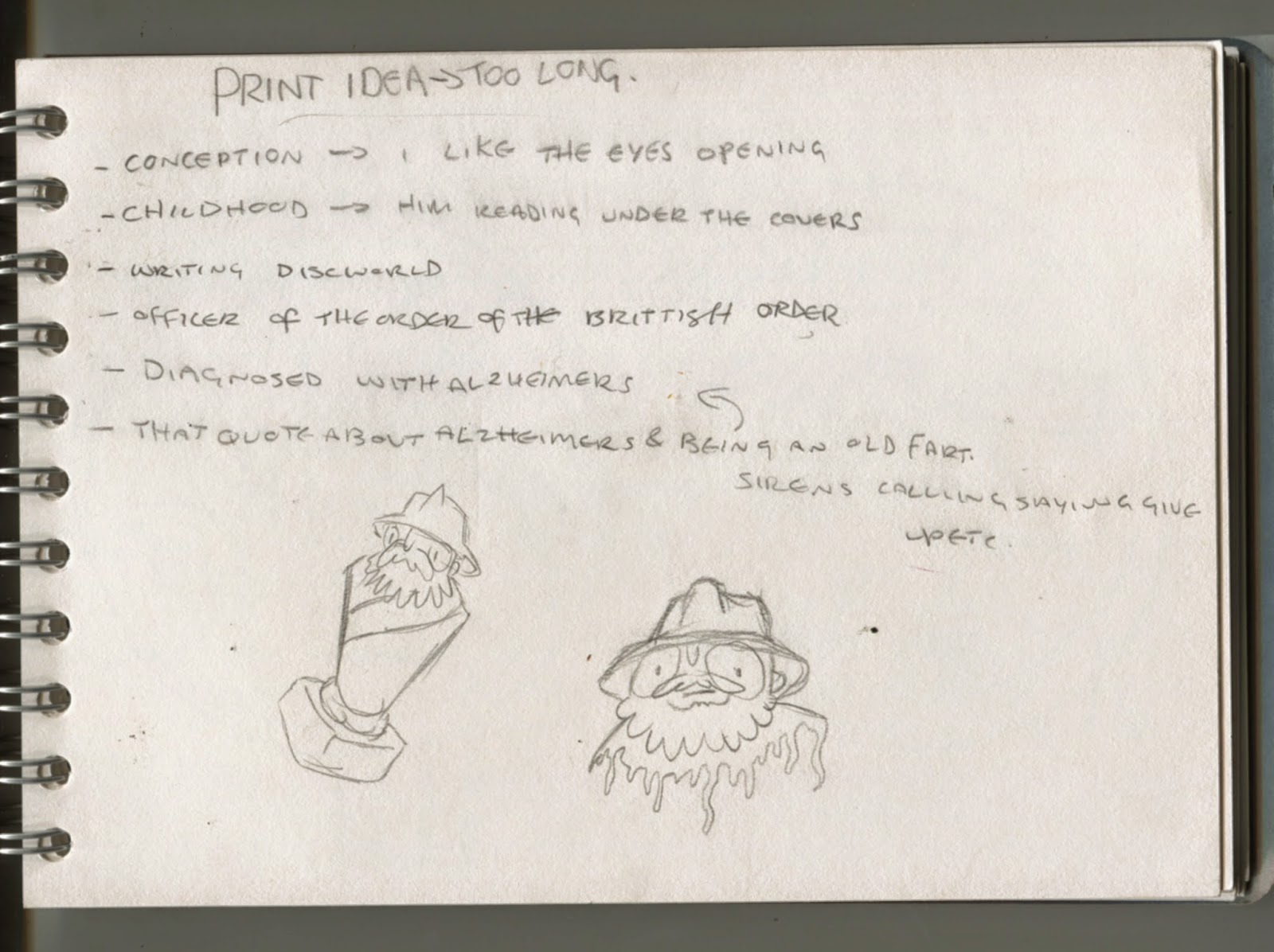
For the Officer of the British empire thing I wasn't really sure how to represent it at all. The last image I made for this one was literally a medal around his neck. Since the other ones are all visual metaphors and non literal it didn't fit in the set. I got the idea from a seperate idea I had for animation where a series of short clips of the hats of discworld being put on. I decided to use the post master hat from going postal, I used the tv movie version because it is more widely recognisable  than the book cover illustration one. It represents an honour so it's fitting to use for Pratchett's knighthood.
At first I just had the hat with the feet and it looked like it was wrong but I couldn't figure out why. After asking around the studio it came down to it being a little to empty and the other prints were busier. So I decided to have books splayed out to show that he was knighted for his work in literature.

For this one the original was over busy. I tried at first to keep the child reading under the covers because I liked the innocence and I felt it was something that everyone could relate to. But after a lot of attempts I found that its really hard to draw someone under the covers. Also compositionally it was an awkward shape to place. So I decided to have the scene coming out of his head. Because when you're reading and you get really into it you get to a point where your not aware that you're reading because you're experiencing it in your imagination.

Finally I kept the elephant one almost the same but I put the text at the top because before I think the text was too small and 'shy', it needs to be loud. Also I took out the little Pratchett writing because I realise that since my audience are pre existing Pratchett fans there was no need to have anything representing that it was his book writing because the turtle and elephants made it clear that it represented discworld. Having it there made it a little patronising to my audience.


I'd been playing around in my head with the idea of having the prints displayed like a mobile. In my tutorial with Fred I told him that and he asked me some questions about it; including what will hold them together? safe to say I hadn't thought it through properly and had no idea.
Then Fred highlighted to me: 1 I have 5 prints. 2 What has five things? Hands. 3 Where do I have hands in my work? Deaths hand unravelling Pratchetts brain. DEATH one of Pratchett's famous characters. of course.
So with this new revelation I decided to draw the hand. In honesty I'm terrible at drawing hands, they are one of my biggest foes. So you can imagine my struggle with skeleton hands. So  I got a picture printed out and traced the basic bone outlines. Then in the pink I drew each bone in my own way, I did this because I wanted the hand to be realistic and kind of scary because I also want to show a serious message concerning his Alzheimers. 


Inked up. I then drew in lght and shadow. At this point hadn't decided my colours so I was just labelling the light ones which I was thinking of going with yellow.


In the positives I decided to use the black to outline the bones; so it matched the set but also to make it look severe and angular. For the colour positives I decided to use the scribble texture I used in the  other prints so it was all linked as a set. Also because I think block colour would make it look to 'cartoon' and that would ruin all my work to make it severe and scary.


Now my positives are all ready I  scan them and arange them on A2 so that they are all in position and I can do them all for each colour in one go. I'm dong this because I need to save time where I can seen as it's so near to the deadline and i'm behind. Bad tme planning, but onwards and upwards.

Print: Redesign

       
So with the last prints there were a couple of problems with them.
The colours didn't really work the way i wanted them to, the greens were too similar so there wasn't enough contrast and from a distance you couldn't tell them apart at all.
The text wasn't bold enough and it didn't expose well so its patchy in most of my prints. 
once it was done in colour I didn't really like the composition of the elephants print, it's too crowded.
The scribble texture worked well and I liked it although I think maybe the individual positives should have more sparse scribbles so that its a mix of the colours individually and together.
The texture on its own seems a little too 'open' so I figure I could put a thick outline around it to frame it.

Saturday, 10 January 2015

Animation: the rise and fall

So I was really quite excited about animation. I tried some rough gif animation stuff last year for my ppp presentation and I really enjoyed it. I watched this video that was compiled of clips from studio ghibli films including behind the scenes clips and making of; all set to this song. The combination of the song and the images made it really emotive, proper gives you the warm and fuzzies.
I liked how since it went with the song the fact there wasn't a linear narrative to the video didn't matter. Instead the images and videos go along a theme and combined with the song create certain emotions.

I  decided to tailor my animation around a song too, coincidentally I really like the song they used on that video, so I decided to use 'something beautiful'. I thought if it was put with animation of Pratchett and the world he created in the discworld series it would create a video that would cause the audience (pre-existing Pratchett fans)  a reminiscent piece that would open up that world of imagination to them again.
Seen as the limits are 30-60 seconds I sat and listened to the song countless times trying to get the right snippit. unfortunatly I couldn't find anything less that 60 seconds in it without it sounding abruptly cut off.

So I aimed high and decided that I could definitely do this much animation. sixty seconds is seven hundred and twenty frames. At the time of this planning I wasn't aware of that, and was clearly ignoring my previous lesson in animation which is; it takes a really long time, it took me a day to do one second.

But ignoring all warning signs I started drawing out my first frames.

I was really pleased with this mainly beause its the first animation I've ddone where it actually looks like my drawing while still moving. SUCCESS.

I roughly planned some of my seconds. The lyrics the song clip open on are 'the tide crashes over me'  so I decided to try and set the scene. I  was going to have some legs kicking in water then it cuts to a book on a lap and the kicking legs splash a bit of water on the page and a hand wipes it away. Alternatively it could zoom out to show the whole sky above with planets and stars.


I decided to go for the big open sky. Thinking about maybe making it linear and this is like his childhood where he got into astronomy.


I used stencils to make these two because it was easier to understand where it would be next if i could just literally move it. Also drawing feet s hard and i doubt i can draw 36 the same.


This was going to be a section where I wanted to have a child reading under the covers but that's really hard to draw. Even with reference I was sucking at it. so i decided to not do it literally, the hand come outs from behind the pillow and into it, opens the book adn turns the torch on.

After this point I had my tutorial with Fred. Realising that i set my sights too high for someone with such low organisation skills. So it's not possible for me to finish a sixty second animation. Fred suggests I aim for the 3-6 10 second stings instead. I'm still planning on using music to structure it because I found it easier to think about when could split it in to blocks of a second or two.


Friday, 9 January 2015

Print


I decided that to tell Pratchett's life story I should start at the beginning. Then very beginning. Conception and birth.

I figured I could make 3 books, each to signify a different stage in his life.


Sunday, 30 November 2014

Thought Bubble: An Afterthought

Quantity
I think I printed too  much of my prints. I was being overly optimistic with it, some sets had 20 or 30 copies. I only sold a handful of things and by printing so much I only increased my losses.
Next time I will do small set of between 5-10 copies at most, this will make transport easier and storage.

Pricing
The prices I gave my things were quite under priced I think my screen print was £5 and everything else was between £1-3. I think by giving them such low prices it made it obvious that I was not a professional or at least not up to the standards of the other people in the main room. I was pricing with myself in mind because normally when I go to thought bubble I only have a certain amount of money with me and so I'm very picky about what I buy and like to get lots of small cheap things. But I think that it's not really down to price, it's really about whether people like your work or not.

Presentation
The stands worked well on space saving but by being individual stands they were flimsy and easily knocked over, next time I would like to make a tiered stand that could hold multiple prints. Its a more sturdy design and the majority of table display stands were of a similar design. The price tags we used were just arrow shaped post its and I think that we should have used something sturdier, the post its fell off quite a lot and we had to stick them directly on the comics and it made people unsure on which they were allowed to pick up and purchase.

Student Life prints
These didn't sell well at all and they received little interest. I think the issue was that at first people thought that they were three different sets because they are packaged together. And then I put a little sign but it would have been clearer if I put individual stickers on them and packaged them properly. I think doing a project on being a student was a little cliché, most people have done something on being a student before. But I never considered it from a buying perspective, I don't tend to buy prints specifically aimed at student because they normally make sweeping generalisation. The idea of a student buying it seems weird now its more like a present you'd receive off some relation who doesn't know much more about you other than you are a student.

Jump
I think this was one of my most successful comics. It still didn't sell masses but more than most of my other products. I think the size caught a lot of peoples attention, mainly women. As a woman I am always drawn to things that are miniature versions, like travel shampoo and baby shoes. So I think the size added a lot of charm to the piece.
This was a comic I ended up trading with another person who was selling. I had been over to her table earlier and bought a comic but expressed great interest in a tiny comic she made about ant puns. She came over to our table and offered it up as a swap. I never realised that I could go round and offer up trades to other sellers. It was a good way to chat to people.

Procrastination
This was my favourite comic I did, I enjoyed making it and it was something everyone could relate to. Unfortunately my screen printing skills leave much to be desired and I think I butchered my design with it. But I sold two of them and they were my proudest sales. The first one paid £5 and I was really excited that someone would hand over note money for my work. The second one was on the second day though at which point I'd reduced the price to £4 in the hopes of encouraging more sales.

Ugly Simpsons
I think this piece didn't work because it had an unclear audience. The recognisable characters drew in children which I thought was great because I figured since it was only a pound a print it was within a child's price range. But a couple hours in I realised that I'd drawn Maggie holding the middle finger up. Children had been coming over interested in the Simpsons and then the parents would swoop in when they saw the obscenity. I think in future if I do any work aimed at kids I should have it in a separate section and obviously labelled so. If we have a tiered display stand next time then the things with adult references in can go at the top out of reach of children.

Amazon woman
I only sold one of these and it was to Hollie because she was sad no one bought one because it was her favourite. I think that having an illustration class around all the time we've started to appreciate work for different reasons and we see it in a design aspect. But to some one without any of that it was just a woman's face in green and purple for no apparent reason. I think my projects need a clear purpose and audience before I start  because otherwise I end up making just a random drawing, its not illustration because it illustrates nothing.

Socialising
The event was really good for making creative acquaintances, we went round and chatted to people who were selling. One guy works in Leeds and was a recent graduate, he rested our minds on certain things and says that he doesn't really have any trouble getting illustrative jobs, which is reassuring.
Our table was next to Dilraj Mann who I ended up chatting to because Hollie was still at college printing off comics when the convention started. I had been singing to myself under the assumption that no one could hear me since no one had reacted to my noise. It turned out he could hear me. The whole time. But after the initial embarrassment we had a lovely chat. It feels encouraging to have some one like him liking my work.
Kristyna Baczynski came over to our table and bought two of my comics which I was really happy about. Because most of the day people hadn't even approached our table so I'd spent most of it chatting and eating snacks continuously.
We also chatted to these american guys who had done a load of risograph prints, the layering of colours and textures in their work was highly enviable and beautiful. We chatted to them about how they started up their own studio and got their first risograph printer.
I think going around and chatting to people was the most useful thing that I did at thought bubble. It answered a lot of questions about what happens to us after uni and how hard it is to get jobs. It was also just nice making friends in the illustrative world. I like talking to the people at similar stages in their career as me because it's a fun comparison and in 1 years or so they'll be my competition and it'd be great to already have those connections.