The strengths in this project was running with a comic idea, i like using ideas that i've just wrote to myself at some point. It also shows me that writing down any and every idea i have for a comic gives me a good idea catalogue to look through when it comes to a brief that is as open as this one is.
I'm proud of the fact that i redrew in this brief, admittedly I'm a lazy illustrator and often i will settle for my first drawing but i worked to demand the best in this brief and i like how that helped me to produce a quality comic that i can feel pleased with.
I think one weakness was that I was doing other projects at the same time as this one and i didn't prioritise this one which i should of seen as it had the sooner deadline. But i settled with just doing one comic instead of pushing myself to do two. So i think that this wasn't a great example of working under pressure as i had four days and i just did a four page comic. I think next time i could push myself more. But I'm still pleased with the final product.
This could possibly be the base of a book of mini comics like this where i could just do all my silly ideas that i send to myself.
Wednesday, 24 February 2016
Colour


Monday, 22 February 2016
Demanding the best

So in the last post this is what i had for off life. My comic was going to be called Karen and about how this man names everything but what if his wife cheated on him?
I didn't like the baby so i was thinking of redrawing that element alone.
But I decided to redraw the whole thing, because last time i submitted to off life my comic was of a really low level of quality and that was a first draw of it.
I AM DEMANDING THE BEST
of myself
no let offs
So i planned the pages out in my sketchpad and then measured them onto A4. I made sure all the panels were equally spaced and that each image was using it to it's advantage.
My final drawings were as follows:


Saturday, 20 February 2016
Context: Hildafolk

Hilda is much more contemporary a children's book and is the right age range that i am aiming for. The cover is using a big image to capture the attention but also adding pattern rather than realistic back grounds. I think this is because the pattern draws the attention to Hilda, it directs the line of sight. Rather than in the other books they were just large bright images without areal concentrated view point. I think i want my cover to be more resemblant of this one as it represents what i see as successful in children's illustration now.

I like how on the pages that are panelling there is a continuous image running behind them. It makes the story seem more flowing rather than jumping from plot point to plot point. I'm not sure if this would work for mine as the long format limits the panelling i can do. But i guess it could just work horizontal. All the writing in this book is speech as this is a much more sequential story wherea since i am dealing with poetry mine is more of a narrated story.


Pattern inlays seem to be a running thing in the children's books i've been looking at. I think this is something I definitely have to invest in. I like how this one uses elements of the book but much more simplified while keeping the recognisability. the simplicity of the images makes the pattern seem less crowded even though it is.
Also i like the little fold in part to have the information on and a logo, it looks really cute and it means the back of the book can be a beautiful image as well and not have to be plastered in text. I think this is something i will try to employ to get the best out of my book.
Context: Six Dinner Sid
This is a personal favourite from child hood. It is aimed at younger children but i think th quality of the book makes it enjoyable at all ages. As a child I found this book very funny even though there aren't particular jokes or anything. Children tend to find situation very funny as jokes tend to become wordy and some won't understand. But an awkward or silly situation tends to create the same humour in a child as a well thought out pun in an adult.
So with that in mind I might add some silly moments like getting things stuck on each other. I'm having them meet snails in the book so maybe to of them can get suck together with slime. and some general slapstick style comedy would work i think.


So with that in mind I might add some silly moments like getting things stuck on each other. I'm having them meet snails in the book so maybe to of them can get suck together with slime. and some general slapstick style comedy would work i think.

Again a bog image as the front cover is popular.

This book uses a mixture of full page spreads and panelling. I think because this is for an older audience than the bear hunt an the little raindrop, it's still young but there is more sophistication in the way the story is told in this.

The facial expressions vary a lot in the images to make every part of the image interesting to look at. The images work hard to engage the child in the story. I will try and have more breadth of facial expressions to make my characters more aesthetically distinguished and interesting.
Context: The Little Raindrop

The front of the book is very bright and eye catching. I think this is because they are trying to catch the eye of a child at this stage of selling it. They want the child to pick out the book and show the parents. Mine is for an older audience so i don't think it needs to be as simple as this but I like the idea of making the front cover undeniably bright and eye catching.

Inside a lot of the pages use the double spread and have one piece of writing per spread. I think i will do some double spreads because with my page size already being really long and thin a double spread will look really interesting. And it will be a useful format to show a journey or to just display all the characters at once.

The blurb on the back is clearly aimed for parents to read. I think this is because this book is or a younger age rang and will not necessarily know the words in the blurb to read. At young ages the parent chooses the books for the child so it makes sense to aim the blurb at them. My audience is older and it would be patronising to aim the blurb at their parents. But i think I'll keep in mind that it is for the parents too. So i will aim it so it is directly talking to the child who is to read it. But include information about the educational learning n morals within it.
Context: Monster Poems

This is another personal favourite. I was really happy to find it in a charity shop the other day because there are no decent pictures of any of the pages online and i kept trying to reference this book in past projects. This is a poetry book so it doesn't really work the same as the kind of children's book i'm writing but i think there is still stuff i can tke to this to put into my on practice.

This contents page is great, its so bold and it links with the content. Also the writers are falling down it's throat which always entertained me as a child (on the previous page they are shown precariously balanced in it's mouth). It seems in a children's book it is best to make the most of every page, every page must be interesting. I think this is because if a child flicks through a book they are not necessarily going to do it in a regular way. You don't want them to flick to a boring page and put the book down immediately so by making every page exciting they eliminate this problem.

On the inside spreads the words normally take advantage of space left by the image or work with the flow of the image. I like this idea because i don't want all my writing to rigidly appear in the same place on every page i want it to flow through the story.


I just included this bit because as a child this one scared me silly. I'm not sure why because his story isn't about hurting anyone it was about being lonely. I think it may be because it was talking about being broken hearted and being so sad ou didn't want to live, which as a child was something that i could neither rellate to or understand. So i think i'll avoid anything going too deep into dark emotion, although dont think that was going to come up anyway.

Drawing!
I've starting drawing it out. I went with a middle ages balding man to really exaggerate the state of affairs. I feel its the most fitting character to the circumstances. I'm using my own writing for the font because it fits with the drawing and also it saves me time in digital messing about with fonts.

I don't really like the baby though, he's drawn weird so i might redraw that one separately and photoshop it in later when it gets to the colouring stage. I haven't added texture to the image yet because i was playing with the idea of doing the texture on a separate sheet so that i can colour it to be complimentary tones when its being digitally coloured.
Context: We're going on a Bear hunt

This book is aimed at younger children around key stage 1 which is 4-5/6 year old's and i under the age range i am looking at. I was looking at reviews and they said that the repetition of words is good for the language development of young children. I think this means a repetitive rhythm for my book would be too patronising. But the review also commented that it has a good use of sensory descriptions ( long, wavy grass, a deep, cold river, thick, oozy mud, a big, dark forest, a swirling, whirling snowstorms, and a narrow, gloomy cave). It says that this helps the child imagine themselves in the adventure. I think this is a bit simple thinking but the description words do make the story line more tangible and helps the children to learn a wide range of descriptive words. I think i'll try and get some more description words into my verses instead of just gunning for the plot points.

The pages are a mix of black and white and colour, usually alternating. I think this might partly be due to the printing costs of the time so they pre planned and did some in blak and white. I think i would prefer my book to b in full colour though.
The text in it is either clearly displayed in a blank area or is given a box. It seems important in children's literature to make it as legible as possible, pushing the clarity. I've inly tried out one page so far and im having the writing white ontop of a black background. I was thinking of adding texture in the background of it but with this in miind i won't and just try to keep the words as clear as possible.

Verses So Far
In a land of trees and grass
Beside a big blue lake
The ground is full of tit and tat
Ad all the mess we make
There's bottle, paper, cigarettes
There's food wrappers and cans
How will all the animals cope
In the destruction left by man?
Sprig is head of his family
He plans all their hideouts
Creating home and shelter
For Soil, Root and the Sprouts
But every home is short-lived
Because it is destroyed
Through the careless actions
Of thoughtless girls and boys
Then one day Sprig saw it!
The spark to his idea
They could live upon the water
And float away from fear
At this point i'm looking at putting minimum two verses per page maybe sometimes more. Because this book is aimed at the 7-11 age category (I'm not sure if that's changed from before but that's what i've decided upon now) i want there to be a substantial amount of reading in it. I've been trying to have a mix of smaller words and larger ones because i don't want to patronise my audience. And even if there is a couple words in there that they would struggle with i think that would be good because it challenges them and encourages them to find the meaning and add it to their growing vocabulary.
Idea
I send myself texts of comic ideas i have over time. Most of them are terrible but some are worth giving a go. This is one of the ones i'm going to give a go.
What if there was a man whose job it was to name everything. Like absolutely everything, from new babies to inventions and newly discovered species/ fossils. Thats just his job. But then one day his wife leaves him or cheats on him or something horrible. and then for weeks would he passive aggressively name things?
Like Karensabitchamabob or whydidwehavetopartasaurus
Its a bit of silly humour which is my strong point in the humour world as i don't have a particularly strong sense of wit. I'm quite excited to start drawing this out. I'm going to use the weekend to get the line drawing done because i can't colour til i get to college on monday and can take out a graphics tablet. So if i finish drawing out the first one before monday i am to just go for it and draw a second one.
Deadline Driven Brief Numero Dos
Brief: To submit a comic to Off Life
Product: A comic between 1 and 4 pages
Tone of voice: Humorous
Audience: Off life followers, Adults, Art community
Context: To be published in off life 13
Mandatory requirements: One comic made between 1 and 4 pages, fit within 160mm wide x 220mm tall.
Deliverables: comic
I totally forgot about off life, i entered a comic into it last year but was unsuccessful. I think that was because of the quality of my work, the idea itself was relatively funny and i enjoyed it but looking back the actual aesthetic of the finished piece is awful. So I'm going to attempt again this year. I want to try and get one chosen this year so i can be published in off life 13. the official deadline is the 1st of March but I'm going to give myself until Wednesday, which gives me 4 days for this brief. I want to get one successful one completed but if i finnish earlier I should attempt to get a second one done within the time limit i have set. I think it's quite likely i'll mange two though because the length of the comic isn't particularly taxing and i think i've already got an idea for one of them.
Long Page

I decided that since my doulbe spread images worked better than the single pages i will make my pages really long. It works well with the characters as they are low on the ground so they do not need the height of the book but there are a lot of characters and the length of the book makes it much easier to space out the characters on their trails.
I'm making the narrative of the book in poetry as it always works better for me and makes the writing more interesting to read.
The first two verses are to set the scene and go with this page;
In a land of trees and grass
Beside a big, blue lake
The ground is full of tit and tat
And all the mess we make
There's bottles, paper, cigarettes,
There's food wrappers and cans
How will all the animals cope
In the destruction left by man?
I've not yet decided on the exact dimensions of the pages, i think i need to do more experimentation before settling on that but i know it will be roughly in the format shown about with a short height but long length.
Drawing Fun

I've just been having fun playing with characters and drawing them outing different situations. I like playing with the way they would interact. The more i draw them the easier it is becoming to remember their scale and shape and the size of them in comparison with each other as well as the objects around them.

These two double spreads did very well on social media when i posted them. I think the length of the image is good because i tgives more room for the characters to run around in. Also the backgrounds are relatively complicated in these images but they get the scene across that they are surrounded by grass and nature. I included pieces of abandoned rubbish in some of these images so that the recycling theme is continued through all my work and it makes people more aware of the effect of their littering.


I've been trying to vary the facial expressions so that the characters seem more life like and interacting rather than just mirroring the same face of stiff happiness across them all.
Pots and feedback

I made these pots from clay with the idea that they would work along side the book. They would be packaged and provided with seeds and instruction on how to grow your own plants in it. I wanted to encourage children to grow things.

In the feedback Fred told my that i am not a maker and I shouldn't be making pots.
Because the book is about recycling I should be making pots from rubbish that I find because then it links more heavily to my book.
Things Fred wanted me to consider:
Not making the book for mascmillan and also completing all 32 pages instead of just 4 double spreads.
Do things on non A-format
Do other things; think big
using rubbish as media
On the other side though he really liked my character work. I'm quite pleased with it too and it was quite fun. I think i've found a good medium of character in terms of detail. Because these are easy enough that a
i can draw out the roughs for an image relatively easily but there is enough detail fort them to work in my usual practice of heavy detail and line as texture work.
A Kindness

For this one i was just concentrating on the second line of the poem 'Congratulations' I tried to make it look like a bit of a party scene. But since she wanted the character to be a running thing throughout the poems i thried to make the glass his face as well. I don't like how it turned out, the shape is awkward and the bubbles could have been more thought out perhaps to create and ear shape. I like the colour pencils as the party popper mess stuff because it gets the right texture, although it doesn't fit in well with the style of the image which is much more hard edged so I'm hoping this isn't one she picks to develop.

For the next one my idea was based on the part that says 'you sat down and emptied your head' I went in the direction of meditation as it is used to clear the mind and can be a technique recommended to people with anxiety based depressions. I traced the basic outline from a buddhist monk. There were lots of stock photos of people meditating but they all seemed to be doing the cliched thumb and finger making an 'O' resting not heir laps and loudly humming. I went with the monk because it seemed the most restful and spiritual position and i wanted the position to be accurate.
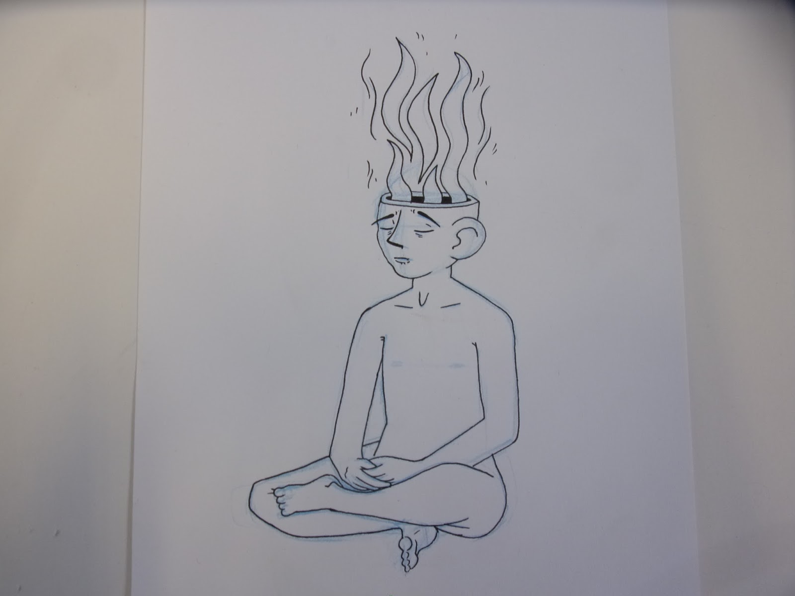
I make the heads of my characters much bigger because i like to have stupidly large appendages like the big flapping ears. I tried to get the sense of serene calmness on his face. The fumes coming out the top are to represent the negative emotions and the release of them.

For this one I concentrate don the idea of renewal. I have the new happy character climbing from the shell of the old sad one, like a snake shedding it's skin. I traced for the lying down character because i struggled with the perspective but i still had to redraw the hands myself as the image had them twisted at an odd angle and in drawing it just looked like a mistake of perspective.

I lost my spark once

In this poem there was a part about the shadow of the depression but the poem ends with the overcoming of the emotions and feeling able to breath again and speak again. I concentrated on the speech and the shadows. So i have illustrated the moments the words come back and the shadows are expelled. I made little hands coming out of the shadows to give it a more sinister nature rather than just being a regular shadow.

I'm not massively keen on this image, there was a part of the poem about looking in to see her smiling back at you. I took it to mean looking within yourself and so drew my character looking at itself through a mirror with one unhappy and the other happy. But it seems rather cliche and not an very intelligent design. I sent it with the others though to show the breadth of ideas but i feel relatively confident that she won't pick this one.

For this one i was concentrating on the writers block aspect of the poem and integrated the separation of mind and body. I wanted a floating head at first but i couldn't get the angle right. I had the mouth taped up to represent the lack of words. I ended up including a neck and shoulders underneath so it defined the angle of the head and i added a quill in to represent the writing aspect and i had the ink flowing out in swirls around the head because it loosely frames the head and creates a more balanced and centred looking image. This is my favourite of the illustrations for this poem and i think it is mainly because of the swirls of ink, i like it lookingso balanced and centred while having parts that go off the page (the rest of the body). I just think this is the most aesthetically pleasing image from the three and i hope this is the one she chooses to develop.

Setraline

I did tracing for this one. The image i traced was two policemen dragging a homeless man. I was originally trying to find an image of someone puling someone else up off the ground because i was going to use it in an image to represent the separation of body and mind. The mind would have been desperately trying to pull up the body. But when i found this other image i had a better idea. I made the two policemen into pill people and had my character being dragged to show the relationship between the anti-depressants and the depress-ee.

I did relatively simple outlines as these images are just to show the concept ideas. Which i then send over to the author and she responds telling me which she liked and what she wants changing and then I will develop the image in to a finalised state and we'll have another review to make sure the image is up to the standard tat she wants.

For this image i was concentrating on th last couple of lines of the poem; 'Sometimes the bitch is still on my back (,) trying to claw round my neck.'
I just concentrated on the display of war wounds, the idea that there would be physical damage is interesting as normally it is a completely invisible illness. I like the gashes better than the bandage parts because they have a more interesting texture and look more fitting within the characters i draw.
Rough Ideas

'A kindness'
For this one I was looking at things that represented 'congratulations' and the idea of new emerging from old.

'Lost my Spark'
For this one I was looking at the idea of the writers block that emerges from depression. And also looking at the revival of energy, getting life back on track and finding yourself.

'Setraline'
Setraline is an anti depressant and so I was looking at the interaction between drugs and the body. Also i was looking at the separation of body and mind.
Subscribe to:
Comments (Atom)