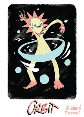
So i ended up combining the planets and my original concept.
I coloured in some of my line work on this image. I was just doing the texture because i think it will make more sense of the lines if they are complimentary to their back ground. I really like the writing on the title in this one, it was just a moment where my writing was working out and it looks bold and expressive which is what i want as i think it matches the imagery. I went back t my uniform layout with the title and my illustration name.

No comments:
Post a Comment